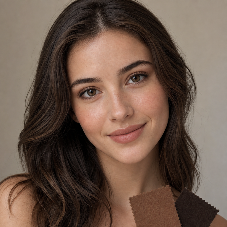
My short answer: I choose Muse Brown or Muse Coffee by comparing the two labeled catalog options under the same crop, screen, lighting reference, makeup plan, and wardrobe palette. I do not treat either shade name as proof of undertone, opacity, coverage, enlargement, a limbal ring, performance on dark eyes, comfort, or an on-eye result. Both options sit on the same Muse Series product listing, so the published series specifications are shared. That does not mean the two colors will look identical on a person, or that either one will fit or feel right for a particular wearer.
If my edit needs a clear answer, I pick the variant whose product photography aligns with the clothing, makeup, and overall color story after I normalize the comparison. If the evidence is too close, I keep both on the shortlist rather than inventing a difference. For a US order, color comes after a current contact lens prescription, a professional fitting, and confirmation that the exact prescribed brand and parameters can be legally supplied.
Muse Brown vs Muse Coffee at a glance
As a brand editor, I separate what the live listing states from what an image merely suggests. The live page identifies model HE1101 and offers Muse Brown and Muse Coffee as color choices. Its primary specification area lists HEMA+NVP material, 14.2 mm diameter, 8.6 mm base curve, 38% water content, powers from 0.00 through -4.50, and a six-month period after opening. Those are listing facts for the Muse Series. They are not a prediction of fit, comfort, appearance, or a safe wear schedule for an individual.
| Decision point | Muse Brown | Muse Coffee | How I use it |
|---|---|---|---|
| Live listing identity | Named color option under model HE1101 | Named color option under model HE1101 | I verify the selected label before adding to cart. |
| Published series specifications | HEMA+NVP, 14.2 mm DIA, 8.6 mm BC, 38% water | HEMA+NVP, 14.2 mm DIA, 8.6 mm BC, 38% water | The shared specs do not resolve the color decision or establish personal suitability. |
| Published power menu | 0.00 to -4.50 | 0.00 to -4.50 | I match only an eye doctor’s valid contact lens prescription, not a glasses prescription. |
| Catalog-image review | Judge only from the Brown-labeled asset | Judge only from the Coffee-labeled asset | I use equal-size crops and the same display settings. |
| Styling test | Place beside the same makeup and wardrobe references | Place beside the same makeup and wardrobe references | I select the more coherent edit, not the more persuasive color name. |
| What remains unknown | Individual fit, comfort, and on-eye appearance | Individual fit, comfort, and on-eye appearance | A qualified eye care professional and a real fitting must address suitability. |
Why I do not choose from the names alone
“Brown” and “Coffee” are useful stock-keeping labels, but language is not a calibrated color measurement. A coffee reference can mean different things across campaigns, displays, and viewers. Brown covers an equally wide creative range. I therefore use each name to keep assets and cart selections organized, not to make claims about warmth, coolness, depth, pattern, translucency, or how much of the iris might remain visible.
This restraint matters because colored contact photography is unusually sensitive to context. Exposure, white balance, nearby skin and fabric colors, retouching, compression, and screen calibration can all change what a shopper perceives. A mobile screen in night mode is not the same viewing condition as a color-managed desktop display. Even two catalog frames on one page may have been produced at different times. I can compare the supplied visuals as merchandising assets, but I cannot convert them into a promised wearer result.
The same rule applies to familiar assumptions about brown eye color. I do not say one Muse option is better for dark eyes, more opaque, more enlarging, or more defined unless the listing provides measured or explicit evidence for that claim. For broader shopping context, Yilala’s colored contacts for brown eyes guide can help frame questions, but a guide still cannot replace an individual fitting or an on-eye assessment by an eye care professional.
My controlled catalog-image method
I start by saving the current Brown-labeled and Coffee-labeled product images from the same live listing session. I record the label beside each file so there is no chance of swapping them later. Then I place the assets on a neutral canvas at equal dimensions. If the original framing differs, I make same-size crops around equivalent visual areas without stretching either image. The purpose is not to force a scientific test from marketing photography. It is to remove avoidable presentation bias before making an editorial choice.
Next I lock the display conditions. I turn off night mode and automatic color shifts, use one screen, keep brightness stable, and review both options against the same neutral background. I do not compare one image on a phone and the other on a laptop. If an asset carries visibly different lighting or processing, I note that limitation rather than “correcting” it until it supports a preferred answer. Editing can create false certainty just as easily as inconsistent capture conditions can.
I also test the images at the sizes in which the campaign will actually use them. A close crop for a beauty story, a mid-shot for an outfit edit, and a small product tile ask different visual questions. I keep every pair of comparisons equal in size. If the choice changes when the crop changes, that is useful art-direction information. It is not evidence that the lens itself changes, performs differently, or produces a particular effect on an eye.
Finally, I repeat the review after a short break and ask another editor to confirm that the asset labels are correct. The second look is not a vote on which color is universally flattering. It checks whether my shortlist is stable and whether the visual distinction survives a consistent workflow. If it does not, I describe the result honestly: the catalog evidence does not support a decisive preference for this brief.
How makeup changes my shortlist
I choose the makeup direction before I choose between Muse Brown and Muse Coffee. For a clean daytime story, I build a reference strip with the planned base, brow, cheek, lip, and eye products. For an evening edit, I make a separate strip rather than mixing both briefs. Each Muse asset is placed beside the identical references. I then judge composition, repetition, and contrast only within those supplied images.
I never use makeup to promise a wearer outcome. Shadow texture, liner placement, mascara, lashes, camera angle, and post-production can alter the surrounding frame. They cannot tell me whether a contact lens will fit, remain comfortable, or appear a certain way on someone else’s iris. Yilala’s makeup tips for colored contacts and eye makeup removal guide are useful planning references, especially for keeping cosmetic handling separate from lens care.
My practical tie-breaker is the campaign hierarchy. If the lip or garment is meant to lead, I choose the labeled lens image that competes less in the controlled layout. If the eye crop is the lead, I choose the one that gives the page a clearer focal sequence. That is an editorial decision about photographs and styling. It is not a medical recommendation or a claim that one variant is subtler, stronger, or more natural in real life.
How wardrobe and occasion shape the decision
I build a small wardrobe board using the actual pieces planned for the shoot or event: top, jacket, jewelry, and one backup option. Product photos for Muse Brown and Muse Coffee are dropped into matching frames beside that board. I avoid generic rules such as pairing a shade name with a season or skin undertone. Those shortcuts sound convenient, but they turn labels into unsupported appearance claims.
For a work-focused edit, I check the lens asset at normal page scale next to the full outfit. For a portrait, I check a closer crop. For a wedding or formal brief, I also review the planned venue lighting and flash references, while remembering that catalog imagery cannot forecast the real on-eye result. The colored contacts for weddings guide and photographing colored contacts guide can support the production checklist.
I keep the final reason concrete: “Muse Brown labeled imagery integrates more cleanly with look two in our approved daylight layout,” or “Muse Coffee labeled imagery keeps the eye crop visually distinct in this specific campaign comp.” I do not rewrite that as a universal recommendation. A different wardrobe, crop, monitor, or art direction could lead me to the other choice without either decision being wrong.
What the shared Muse specifications do and do not tell me
On the live listing, Muse Brown and Muse Coffee belong to the same HE1101 series entry. The page lists HEMA+NVP, 14.2 mm diameter, 8.6 mm base curve, 38% water content, 0.00 to -4.50 powers, and six months after opening. I treat those numbers as product-selection data to discuss with an eye care professional. I do not translate water content or material into a comfort promise. I do not translate diameter into visible enlargement. I do not assume a listed base curve will fit because it resembles a previous lens.
Diameter and base curve are part of a contact lens specification, but a safe match requires more than spotting familiar numbers. An eye doctor measures the eyes, evaluates the lens on the eye, and prescribes the appropriate brand and parameters. The FDA states that decorative contacts are medical devices, are not one size fits all, and require a valid prescription that includes brand and lens measurements. A glasses prescription cannot be copied into a contact lens order. Yilala’s BC, DIA, and water content guide and contact lens prescription guide explain the vocabulary, but the prescriber makes the fitting decision.
The six-month statement is also a replacement ceiling from the listing, not permission to wear the lenses continuously or for any chosen number of hours. Follow the product labeling and the schedule set by the eye care professional. Replace earlier if instructed. Never stretch a replacement period to justify continued use of a damaged, contaminated, or problematic lens.
US prescription and fitting safety comes first
In the United States, decorative and colored contacts require a prescription even at 0.00 power. The FDA advises getting an eye exam, obtaining a valid prescription with the brand name, measurements, and expiration date, and buying from a seller that requires prescription information. A color preference does not override those requirements. If the prescribed product or parameter is unavailable, I do not suggest substituting a similarly named or similarly sized lens without the prescriber’s approval.
Handling and storage are part of the decision because the Muse listing describes a reusable replacement cycle. The CDC advises washing and drying hands before handling contacts, keeping lenses away from water, using recommended disinfecting solution, avoiding old-and-new solution mixing, and following the eye care provider’s instructions. The CDC’s cleaning guidance also distinguishes cleaning from disinfection and says saline does not disinfect lenses. Read the supplied instructions and use only the care system recommended for the lens and wearer.
Do not sleep, shower, swim, or use a hot tub in lenses unless a qualified provider has given specific directions that permit the activity. Never share contacts. If redness, persistent pain, discharge, light sensitivity, blurred or decreased vision, or other concerning symptoms occur, remove the lenses and contact an eye care professional promptly. The FDA specifically tells wearers to seek care for redness, ongoing pain, or decreased vision. Keep current backup glasses available so removing a lens is an easy decision, not a negotiation with the day’s plans.
My final selection checklist
First, I confirm that both assets come from the current Muse listing and that their Brown and Coffee labels are attached correctly. Second, I confirm the prescription and fitted brand before treating either variant as orderable. Third, I compare equal-size crops on one calibrated display with automatic color modes disabled. Fourth, I place both beside the exact makeup, wardrobe, and lighting references for the brief. Fifth, I record the reason for the shortlist in image-specific language.
Then I run a claims check. Have I implied an undertone from a name? Have I claimed opacity, coverage, enlargement, a limbal ring, a dark-eye effect, comfort, or a wearer result without direct evidence? Have I confused shared series specifications with certain fit? If any answer is yes, I revise the copy. This is the standard I use across the Muse Series guide and wider Yilala series comparison.
If one labeled image clearly serves the approved creative brief, that is my pick. If the decision remains close, I keep Muse Brown and Muse Coffee as parallel options until the styling board or eye care requirements narrow the field. “Not enough evidence to separate them” is a valid editorial conclusion. It is more useful than dressing a shade name up as a technical fact.
Frequently asked questions
Is Muse Brown warmer than Muse Coffee?
I do not infer warmth or undertone from the names. I compare the current labeled catalog images under identical screen, crop, and styling conditions, then describe only what the specific editorial layout supports.
Which one looks more natural?
The listing and names do not establish a universal natural-looking result. Appearance can vary with the eye, fit, lighting, camera, makeup, and display. I choose only for a defined image brief, not for every wearer.
Which variant works better on dark brown eyes?
I cannot determine that from variant names or catalog images. Do not assume coverage or opacity. Ask an eye care professional about the fitted product and assess any appearance question without treating marketing photography as a guarantee.
Do Muse Brown and Muse Coffee have the same specifications?
They appear as color options on the same HE1101 listing, which publishes HEMA+NVP, 14.2 mm diameter, 8.6 mm base curve, 38% water, 0.00 to -4.50, and six months after opening. Shared listing data does not guarantee identical appearance, fit, or comfort.
Can I order 0.00 without a prescription in the US?
No. The FDA says decorative contacts are prescription medical devices, including lenses that do not correct vision. Get an eye exam and a valid contact lens prescription for the exact brand and fitted measurements.
Can I use my eyeglass power for these lenses?
Do not copy an eyeglass prescription into a contact lens order. Contact lens prescriptions include product and fitting information. Use the power and exact product authorized by the prescribing eye care professional.
Does six months mean I can wear them all day for six months?
No. It is the listing’s replacement period after opening, not a continuous-wear promise or a daily wear-time recommendation. Follow the label and your provider’s schedule, and replace sooner whenever instructed.
What should I do if a lens feels wrong?
Remove it rather than pushing through symptoms. For redness, persistent pain, discharge, decreased or blurred vision, light sensitivity, or other concerning changes, contact an eye care professional promptly and use backup glasses.
Official Sources
- FDA: Colored and Decorative Contact Lenses, A Prescription Is a Must
- FDA: Decorative Contact Lenses for Halloween and More
- CDC: Preventing Eye Infections When Wearing Contacts
- CDC: Cleaning, Disinfecting, and Storing Contact Lenses
My decision remains simple: prescription and fit first, controlled visual comparison second. Between Muse Brown and Muse Coffee, I choose the correctly labeled catalog option that serves the specific makeup, wardrobe, crop, and lighting brief without claiming that an image can predict an individual wearer’s result.