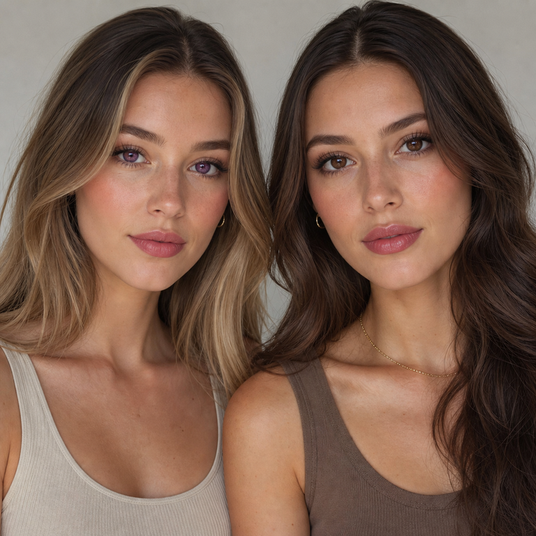
I compare Berry Purple and Berry Brown as a brand editor, not as a wearer. My job here is to read the current listing, study the catalog images on equal terms, and decide which color direction belongs on a particular mood board.
The short answer: choose Berry Purple when your brief needs the more expressive, editorial color cue; choose Berry Brown when you want the quieter, easier-to-coordinate direction. If your decision is about fit, prescription, eye health, or the result on your own eyes, neither color wins on a web page. That decision belongs with a licensed eye care professional and a valid prescription.
Both colors sit under the same Berry Series colored contact lens listing, model HC1420. The current primary product panel lists HEMA+NVP material, a 14.2 mm diameter, an 8.6 mm base curve, 38% water content, powers from 0.00 through -4.50, and a six-month replacement period after opening. Because those specifications are shared, I treat this as a styling comparison, not evidence that the two options will fit, feel, or appear the same for every person.
My editor’s verdict in one glance
| Decision point | Berry Purple | Berry Brown |
|---|---|---|
| Creative role | An intentional color statement | A restrained, familiar color direction |
| Useful starting brief | Editorial beauty, character-led styling, color-focused portraits | Neutral beauty, tonal outfits, adaptable wardrobe planning |
| Makeup planning | Give the eye area room and repeat purple sparingly | Build through browns, taupes, creams, or a contrasting accent |
| Wardrobe planning | Black, charcoal, silver, cool pink, or one controlled clash | Cream, denim, olive, camel, navy, or black |
| Editorial risk | Can compete with a busy face and outfit | Can become too quiet if every element is neutral |
| My shortlist rule | Pick when the eye color is part of the concept | Pick when the rest of the look should lead |
This table describes creative intent seen through catalog presentation. It does not predict how either lens will render on an individual iris or under real-world conditions. Screen calibration, camera processing, crop, light direction, makeup, and the model’s own features can all change the impression of a product image.
What the shared listing tells me, and what it cannot
I start with the boring details because they prevent a color comparison from drifting into fiction. The current primary listing identifies the product as HC1420 and presents Berry Purple and Berry Brown as color variants of that model. It lists HEMA+NVP, 14.2 mm diameter, 8.6 mm base curve, 38% water, plano 0.00 and minus powers down to -4.50, plus six months after opening.
There is one discrepancy worth flagging. The lower description on the same page says 14.5 mm, while the primary purchasing panel says 14.2 mm. I use 14.2 mm here because it is the current primary listing value, but I would check the live selection page, unopened packaging, and prescription before ordering or opening anything. A blog post should never overrule the label or an eye doctor’s instructions.
Shared numbers simplify the catalog comparison, but they do not settle suitability. Diameter and base curve are not decorative trivia, and the same listed measurements do not guarantee the same fit, comfort, movement, vision, or visual result from one person to another. In the United States, the FDA states that decorative lenses are medical devices and require a prescription, including lenses that do not correct vision. Its colored and decorative lens guidance also explains that an eye doctor needs to measure each eye and evaluate the response to contact lens wear.
How I compare catalog images fairly
A comparison can go wrong before color preference even enters the room. A tighter crop makes an eye detail feel more prominent. A ring light can flatten shadows, while side light makes texture and contrast read differently. Warm white balance can pull a whole frame toward amber; cool white balance can push skin, makeup, and nearby colors in another direction. Retouching, exposure, and phone display settings add more variation.
My rule is to place the Berry Purple and Berry Brown images at equal size, use matching crops, and inspect them on the same calibrated screen. I hide product names for a first pass if I want to catch my own bias. Then I note only what the images can support: where the eye sits in the composition, whether the overall look reads quiet or assertive, what colors appear in the makeup, and whether the wardrobe repeats or contrasts the named lens color.
I do not turn that image review into promises about a buyer’s eyes. Catalog photography is styling evidence, not a controlled clinical comparison. Even a clear side-by-side cannot tell me whether a prescription is suitable. It cannot replace slit-lamp evaluation, measurements, lens assessment, or follow-up with an eye care professional.
Readers building a broader shortlist can compare the colored contact lens catalog and the colored contacts buying guide. I would still use the same equal-crop method. Otherwise the image with the brighter exposure or closer framing often wins for reasons that have little to do with the intended styling.
When Berry Purple makes more sense to me
Berry Purple earns a place on my shortlist when the color itself is part of the brief. I might be planning a graphic beauty story, a character-led portrait, a concert look, or a controlled studio image where one unexpected color carries the concept. Purple gives the art direction a clear premise before I choose liner, lip color, fabric, or backdrop.
I would keep the supporting palette disciplined. Charcoal, black, silver, soft gray, and cool pink let purple remain intentional without turning every surface into a theme. Another route is a deliberate contrast, such as muted olive or warm tan, but I would use it once rather than repeat it across eye makeup, top, jewelry, and background. Repetition can make a look read like a costume even when that was not the assignment.
For makeup, I prefer one of two routes on the mood board. The first is restraint: clean skin, defined lashes, a neutral lip, and little competing color near the eye. The second is a precise echo, perhaps a small violet detail or a cool metallic accent. I would avoid assuming that the product image tells me how the lens will look outside that exact photograph. This recommendation is about composition, not a claim about the lens on light eyes, dark eyes, or any eye color.
Berry Purple is not automatically the bolder purchase in every context. A black outfit and minimal makeup may make its named color the single editorial note. A heavily patterned outfit can bury the idea. I choose it only when I can explain its job in one sentence: the eye color is meant to be noticed as part of the styling concept.
When Berry Brown is the cleaner edit
Berry Brown is my default when the brief needs flexibility. Brown sits comfortably beside denim, cream knitwear, camel, olive, navy, black, and most metals. That gives the wardrobe more room to speak. It also makes sense when the photograph is about skin, hair, jewelry, or a strong lip and I do not want every detail competing for first place.
A neutral direction still needs editing. If the backdrop, clothing, makeup, and accessories all sit in nearly identical browns, the frame can lose separation. I would vary value rather than pile on more color: deep espresso liner beside a pale cream top, or dark denim against a warmer neutral background. A red lip, blue shirt, or silver earring can also provide a single point of contrast.
I would not call Berry Brown universally natural. “Brown” is a product color name, not proof of an outcome, and a catalog photo cannot predict a personal result. For readers researching the subject, Yilala’s guide to colored contacts for brown eyes offers more shopping context, but the fitting and prescription still come first.
My simple test is whether I want the viewer to register the eye-color choice as a styling statement. If yes, Purple usually stays on the board. If I want the color direction to cooperate with changing clothes, makeup, and locations, Brown is usually the cleaner edit. That is an editorial preference, not a performance ranking.
Makeup and wardrobe boards I would build
For Berry Purple, I would make three small boards rather than one crowded collage. Board one would pair black tailoring with a soft neutral lip and silver jewelry. Board two would use gray knitwear, cool pink cheeks, and a clean background. Board three would test a controlled color clash with olive fabric and otherwise quiet makeup. I would keep all eye photographs at the same scale so the board does not manufacture a winner through crop size.
For Berry Brown, my boards would cover range. One would use cream and camel with brushed gold. Another would put the color direction beside a white tee, faded denim, and a red lip. The third would use navy or black for an evening frame. Brown can support several aesthetics, but that does not mean every brown outfit will work. Contrast, fabric texture, and lighting still need decisions.
Makeup hygiene belongs in the plan, not in a footnote. I would follow the eye care professional’s sequence and product guidance, keep cosmetic products from contaminating lenses or the case, and stop if an eye becomes red, painful, unusually sensitive to light, or vision changes. The FDA’s page on contact lens risks advises removing lenses and contacting an eye care professional when irritation or warning signs occur.
My shortlist process before anyone orders
First, I write the visual job: “expressive eye-color cue” or “quiet support for the outfit.” If the sentence is vague, I have not made a choice. Second, I compare equal crops under the same viewing conditions. Third, I remove any option that is outside the prescription and fitting requirements supplied by the eye care professional. Plano 0.00 changes no vision power, but it does not remove the need for a prescription in the United States.
Fourth, I confirm the exact variant and power in the cart rather than trusting a screenshot or an old note. Fifth, I check the current product page and package for model, measurements, material, replacement instructions, and expiry information. The “six months after opening” listing is a maximum replacement schedule, not permission to wear lenses continuously or ignore earlier replacement directed by a professional or the labeling.
Finally, I keep a backup option that does not depend on contact lenses. A makeup look, glasses-friendly concept, or wardrobe change can save a shoot if the prescribed lens is unavailable or an eye care professional advises against use. For more catalog comparison, the INYX Series listing, natural-look lens category, and full Yilala shop give me additional directions without forcing Berry Purple or Berry Brown into every brief.
Care and U.S. prescription safety
Color is the optional part. Safe fitting and care are not. In the United States, I would only proceed with a valid contact lens prescription for the specific brand and lens parameters, purchased from a seller that verifies it. The FDA says decorative lenses are not over-the-counter cosmetics, even when they carry no corrective power.
I would wash and dry my hands before handling any lens, use the care system directed by the eye care professional and labeling, and use fresh solution rather than topping off old solution. Water stays away from lenses and cases. That means no showering, swimming, or hot-tub use in lenses unless an eye care professional has provided different, specific instructions. The CDC’s current contact lens infection prevention guidance recommends removing lenses before sleeping, showering, or swimming and following the prescribed replacement schedule.
Never share lenses. Do not transfer them into decorative containers, use saliva, or improvise with tap water. Replace the case on the schedule given by the eye care professional or care-system instructions. If there is redness, discharge, persistent pain, light sensitivity, or decreased vision, remove the lenses and seek prompt professional care. Do not put them back in to see whether the problem settles.
Long nails change handling technique, not the need for clean hands and professional instruction. Yilala’s long-nail removal guide can help readers frame questions, but personal training from an eye care professional is the standard I would follow.
Frequently asked questions
Is Berry Purple or Berry Brown better for everyday styling?
I would choose Berry Brown for a rotating wardrobe and Berry Purple when the eye-color choice has a defined creative role. “Everyday” does not answer whether either lens is prescribed, fitted, or suitable for the wearer, so style comes after professional clearance.
Do Berry Purple and Berry Brown have the same specifications?
The current primary listing presents both under model HC1420 with HEMA+NVP, 14.2 mm diameter, 8.6 mm base curve, 38% water, powers from 0.00 to -4.50, and six months after opening. Shared specifications do not guarantee fit, comfort, or the same visual result.
Why does the product description also mention 14.5 mm?
The lower description currently conflicts with the primary panel. I use the primary value of 14.2 mm for this article, but buyers should verify the live listing, unopened package, and prescription before use and ask the seller or prescriber about any mismatch.
Will Berry Purple look brighter than Berry Brown on my eyes?
I cannot determine that from catalog imagery. Camera settings, light, display calibration, makeup, and individual eyes affect how a photo reads. A licensed eye care professional can address suitability, while a seller’s image can only provide styling reference.
Can I buy 0.00 power without a prescription in the United States?
No. The FDA says decorative contacts require a prescription even when they do not correct vision. Plano describes optical power; it does not turn a contact lens into an over-the-counter cosmetic.
Does the six-month schedule mean I can wear the lenses every day for six months?
No. It is the listed replacement period after opening, not a continuous-wear instruction or a daily wearing-time promise. Follow the package, care system, and eye care professional’s schedule, and replace sooner if directed.
Can the same base curve and diameter guarantee that either color will fit me?
No. Matching two listing numbers does not establish a safe fit. An eye doctor must evaluate the lens on the eye and consider the complete prescription, brand, material, movement, eye health, and follow-up findings.
What should I do if my eyes become red or painful?
Remove the lenses, do not reinsert them, and contact an eye care professional promptly. Seek urgent care for persistent pain, discharge, light sensitivity, or reduced vision. Keep the lenses and packaging available if the clinician asks to inspect them.
Official Sources
- FDA: Colored and Decorative Contact Lenses: A Prescription Is a Must
- FDA: Contact Lens Risks
- CDC: Preventing Eye Infections When Wearing Contacts
My final pick
For a fashion image where the eye color is written into the concept, I would shortlist Berry Purple. For a flexible beauty wardrobe where clothes, skin, hair, or accessories should lead, I would shortlist Berry Brown. I would then confirm the current HC1420 listing, resolve the 14.2 mm versus 14.5 mm discrepancy before purchase, and use only the variant and power covered by a valid prescription and professional fitting. That keeps the comparison honest: color can guide the edit, but it cannot decide eye health.