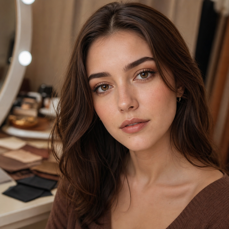
Brown is not a single mood. In a contact-lens catalog, it can read romantic, fashion-led, artistic, earthy, or tailored before a lens ever reaches an eye. That is why I do not begin a shortlist by asking which brown is “best.” I begin by asking which visual direction belongs in the life, wardrobe, and photographs I am planning for.
For this edit, I narrowed Yilala’s live brown selection to five product families: Berry Brown, Thai Brown, the two-shade Muse Brown and Muse Coffee decision, Olive Brown, and Earl Brown. That is five shortlist positions and six named variants, because I think the Muse family deserves an internal brown-versus-coffee fork rather than an arbitrary omission.
This is a catalog and lighting comparison, not a wear test. I have not personally worn these lenses, and I will not infer comfort, opacity, enlargement, edge definition, undertone, or coverage on dark irises from a product name or a polished image. Instead, I use the live variant names, the brand’s stated style language, its displayed specifications, and a disciplined way of reading imagery. The result is a more intimate shortlist without pretending a screen can predict an individual eye.
My five-position shortlist at a glance
| Product family | Named live shade | Catalog-led style direction |
|---|---|---|
| Berry Series | Berry Brown | My romantic, dreamy direction; the series description emphasizes soft blended tones. |
| Thai Series | Thai Brown | My bolder, fashion-forward direction; the catalog frames the family through Southeast Asian-inspired vibrancy. |
| Muse Series | Muse Brown / Muse Coffee | My artistic, elegant direction, with an internal choice between the explicitly named brown and coffee variants. |
| Olive Series | Olive Brown | My earthy, natural-leaning direction; the catalog describes warm, Mediterranean-inspired hues. |
| Earl Series | Earl Brown | My refined, sophisticated direction; the product language centers a premium aesthetic. |
I treat those directions as editorial labels, not promises about on-eye color. They help me decide what to inspect first. They do not tell me how pigmented a lens is, whether it will transform a dark brown eye, or how it will photograph on a particular person.
The shared specification baseline
Before separating the aesthetics, I check what the five product summaries have in common. Each primary summary lists HEMA+NVP material, a 14.2 mm diameter, an 8.6 mm base curve, 38% water content, power options from 0.00 through -4.50, and a six-month period after opening. I use the primary summary as the comparison baseline, including for Berry, rather than mixing in inconsistent secondary-page copy.
Those shared numbers are useful for catalog organization, but they do not establish personal suitability. A 14.2 mm diameter and 8.6 base curve are not a universal fit. “0.00” does not make a decorative lens an over-the-counter cosmetic, and the presence of negative powers does not replace an eye examination or valid contact-lens prescription. If I were filtering for prescription brown beauty contacts, I would first note whether my prescribed power appears in the displayed range, then have the exact product and fit reviewed by an eye-care professional.
I also read “six months after opening” as the brand’s replacement window, not permission to wear lenses continuously, sleep in them, stretch hygiene, or ignore a clinician’s shorter schedule. The clock is only one part of care. Handling, cleaning, storage, wear time, eye health, and professional instructions still govern every use.
1. Berry Brown: the romantic edit
Berry Brown earns the first slot when the brief begins with softness and romance. Yilala describes the Berry Series with “soft blended tones” and a “romantic, dreamy” eye-look direction. I keep my language that precise: this is how the collection is positioned in the catalog, not a claim that Berry Brown will blend softly on every iris.
When I examine the product imagery, I would save the dedicated Berry Brown images beside the other shortlisted variants at the same screen size. I would not compare a tightly cropped eye shot against a distant portrait and call the difference a lens property. Crop, exposure, makeup, white balance, and screen settings can all change the impression. My question is simply whether the catalog’s romantic direction supports the styling brief better than the other four lanes.
Berry Brown is therefore my first click for diffused makeup, gentle color stories, and portraits where I want the eye styling to sit inside the overall composition rather than dictate it. That is an art-direction choice. It says nothing about opacity or the result on brown eyes. Anyone specifically researching brown colored contact lenses for dark eyes should keep the base iris in the decision and use our guide to shortlisting colored contacts for dark brown eyes before assuming a catalog image will transfer directly.
2. Thai Brown: the fashion-led edit
Thai Brown moves to the front when I want the shortlist to feel more assertive. The Thai Series description uses “vibrancy” and “bold, fashion-forward looks,” giving me a clear catalog reason to place it opposite Berry Brown. I do not translate “bold” into a technical statement about pigmentation, coverage, or visible change; it is the brand’s style direction for the series.
This is the option I would board beside stronger styling: cleaner lines, a deliberate lip, graphic accessories, or an editorial outfit. Again, the lens is not being claimed to produce those results. I am matching the brand’s stated mood to a creative brief. If my brief is understated office polish, Thai Brown may remain on the board as a contrast option rather than the automatic finalist. If the brief is a fashion portrait, it may become the first image set I inspect.
I also separate color-family decisions from shade decisions. A shopper wavering between brown and gray should resolve that larger question before comparing five browns. My brown-versus-gray colored contacts guide is the cleaner first step. Once brown wins, Thai Brown can compete fairly with the other named brown variants rather than with an entirely different color concept.
3. Muse Brown and Muse Coffee: the elegant internal fork
Muse is the only shortlist position where I deliberately keep two live variants: Muse Brown and Muse Coffee. The family is described through artistic tones, classic beauty, and soft, elegant blending. That gives both names a shared editorial frame, but it does not tell me that they are interchangeable. “Coffee” is a product name, not a standardized color measurement, and “Brown” is equally broad.
For someone searching specifically for coffee brown contacts, Muse Coffee is the most direct catalog match because coffee appears in the live variant name. I would still compare its dedicated imagery with Muse Brown under identical conditions. I would not invent a warmer, deeper, lighter, cooler, or more opaque result unless reliable product information explicitly documented it. The honest decision is visual: which set of catalog images better supports the intended styling?
My Muse comparison board has only two columns. I place the clearest Muse Brown and Muse Coffee assets at equal dimensions, cover the shade labels for a first pass, and write three nontechnical words about the overall styling impression. Then I reveal the labels and check whether the name had been steering me. This small exercise prevents “coffee” from automatically becoming rich, dark, or warm in my imagination.
Muse is my favorite decision point conceptually because it rewards restraint. Both variants sit within one artistic, elegant family, so the choice can be made quietly, by composition rather than superlative. It is also where I remind myself that natural brown colored contacts are not defined by a poetic shade name. Natural-looking results depend on the eye, fit, lens design, light, camera, and styling, several variables a product title cannot settle.
4. Olive Brown: the earthy edit
Olive Brown occupies the earthy position. Yilala’s collection copy describes Mediterranean-inspired hues and “warm natural undertones.” Because the brief specifically prohibits unsupported undertone claims, I attribute that wording to the collection and do not present it as my own measured finding about Olive Brown on-eye. The important catalog fact is that Olive Brown is a live named variant within the Olive Series.
I shortlist it when the mood board includes linen, leather, muted botanicals, sunlit neutrals, or an otherwise grounded palette. Those are styling associations I bring to the catalog direction, not promised effects of the lens. They help me decide whether to open Olive imagery before Berry or Earl imagery; they cannot tell another person what the lens will look like.
Olive Brown also gives me a useful discipline: I do not assume that a family name changes the variant out of the brown category. The selected option is explicitly Olive Brown. If the goal is everyday colored contacts, I would compare the imagery against the colors, makeup, and lighting that actually appear in the wearer’s routine, not only against a campaign mood. Everyday relevance is personal and practical; it is not a comfort claim or a universal statement of subtlety.
5. Earl Brown: the tailored edit
Earl Brown closes the shortlist with the most tailored catalog story. Yilala describes the Earl Series as refined and sophisticated, inspired by a premium aesthetic. I use it when the brief calls for polished restraint: a precise brow, clean jewelry, a dark jacket, or a composed studio portrait. These are editorial pairings, not evidence about lens performance.
Where Berry offers the romantic lane and Thai the fashion-led lane, Earl gives me a formal counterpoint. It may suit the mood board that needs fewer visual adjectives. Yet “refined” does not mean naturally invisible, and “premium” does not establish a medical, material, or comfort advantage over the other products. The displayed material, diameter, base curve, water content, power span, and after-opening period are shared across this comparison.
If I had to reduce the board to two finalists without on-eye evidence, I would choose by contrast: Earl Brown for the tailored direction and whichever of Berry, Thai, Muse, or Olive best represents the project’s secondary mood. That creates a meaningful final comparison instead of six near-identical browser tabs.
My lighting method before I choose
Catalog imagery is a starting point, not a controlled experiment. I use it to form questions. First, I confirm that the selected thumbnail or variation actually says Berry Brown, Thai Brown, Muse Brown, Muse Coffee, Olive Brown, or Earl Brown. Second, I compare like with like: close-up with close-up, portrait with portrait, similar crop with similar crop. Third, I note obvious environmental variables such as daylight, studio light, shadow, flash, makeup, and editing without treating them as lens characteristics.
For personal evaluation after a professional fitting, I would plan three honest checkpoints: indirect window light, ordinary indoor light, and the camera setup used most often. No beauty filter, no dramatic color-grade, and no switching cameras midway. I would keep distance, exposure, and white balance as consistent as practical. Our guide to making colored contacts look natural in photos expands that method.
I would also photograph the bare-eye reference in the same setup. The point is not to publish a transformation claim; it is to stop memory from becoming the control image. Dark brown eyes can interact with colored lenses differently from lighter eyes, and catalog photography may use a model whose starting iris, lighting, and camera are unlike yours. The broader colored contacts for brown eyes guide explains why the base eye belongs in the shortlist.
The final decision should be descriptive rather than dramatic: “This direction works with my usual indoor lighting,” or “This is the image set I want to discuss at my fitting.” I avoid “certain natural,” “made for dark eyes,” and similar claims that the live summaries do not establish.
Safety is part of the premium decision
In the United States, decorative and colored contact lenses are medical devices, not ordinary cosmetics. The FDA says all contact lenses, including decorative lenses, require a prescription. It also warns that lenses obtained without a prescription or used incorrectly can cause corneal abrasions, infection, decreased vision, and blindness. Read the FDA’s decorative contact lens guidance and its fuller page on colored-contact risks and prescriptions.
My sequence is nonnegotiable: schedule an eye exam, receive a valid prescription that includes the appropriate lens details, buy from a seller that requires it, and follow the eye-care professional’s instructions. Our primers on eye exams for colored contacts and FDA compliance for colored contacts make that sequence easier to audit.
The CDC’s contact-lens health guidance reinforces careful wear and care. Wash and dry hands before handling lenses; use recommended contact-lens solution rather than water; do not share lenses; and do not sleep, swim, or shower in them unless an eye-care professional and the lens instructions specifically allow the relevant use. Never use a six-month replacement label as a reason to override those rules.
If there is eye pain, unusual redness, light sensitivity, discharge, swelling, or sudden blurred vision, remove the lenses and contact an eye-care professional promptly. Premium selection is not only a sophisticated shade board. It is the willingness to stop when an eye is signaling a problem.
How I make the final call
I return to the intended scene. For romantic softness, I open Berry Brown first. For a bolder fashion frame, Thai Brown leads. For artistic elegance, I compare Muse Brown and Muse Coffee without letting the names invent technical differences. For an earthy wardrobe story, Olive Brown has the clearest catalog rationale. For tailored polish, Earl Brown is my final lane.
Then I verify the shared specifications against the current product selector, confirm the required power with the prescription, and ask the prescribing professional about fit and care. Availability, page copy, and options can change, so the live product page, not this article, gets the last catalog check.
That is my version of a premium shortlist: fewer assumptions, cleaner comparisons, and enough room for an individual eye to remain individual. The five positions are not a ranking. They are five creative doors, with Muse opening into two carefully named brown choices.
Frequently Asked Questions
Which Yilala shade is the most natural brown?
I would not name a universal winner from catalog images alone. Berry Brown, Thai Brown, Muse Brown, Muse Coffee, Olive Brown, and Earl Brown are presented through different style directions, but naturalness depends on the wearer’s iris, professional fit, lighting, camera, and styling. I shortlist by mood, then evaluate consistently after a proper fitting.
Which option should I consider for dark brown eyes?
Start with an eye-care professional and a valid prescription, then compare the named variant imagery without assuming opacity or coverage. The live summaries do not provide enough evidence for me to promise how any shade will change dark brown eyes. Use a same-light bare-eye reference during your own professionally guided evaluation.
What is the difference between Muse Brown and Muse Coffee?
They are two separately named live variants in the Muse Series. The series shares an artistic, elegant catalog direction, but the page does not justify invented claims about relative warmth, depth, opacity, or undertone. I compare their dedicated images side by side at the same size and let the intended styling brief decide.
Do these Yilala brown lenses come in prescription powers?
The primary product summaries display 0.00 through -4.50. That visible range does not replace a valid contact-lens prescription, and it may not suit every prescription. Confirm the current selector and have an eye-care professional prescribe the appropriate lens and fit.
What specifications do the compared products share?
Their primary summaries list HEMA+NVP material, 14.2 mm diameter, 8.6 mm base curve, 38% water content, powers from 0.00 to -4.50, and six months after opening. Those numbers are product information, not a guarantee of fit, comfort, or suitability.
Can I wear these contacts for six months continuously?
No. Six months after opening is a replacement-window statement, not continuous-wear permission. Follow the prescribed daily wear time, cleaning and storage instructions, and any shorter schedule from your eye-care professional. Do not sleep, shower, or swim in lenses unless specifically directed for that use.
Do I need a prescription for colored contacts with 0.00 power?
Yes in the United States. The FDA treats decorative contact lenses as medical devices and says they require a prescription even when they do not correct vision. A clinician must evaluate the eyes and fit; 0.00 describes optical power, not over-the-counter status.
How should I compare the shades in photos?
Use the same camera, distance, exposure, white balance, and three practical lighting settings: indirect window light, ordinary indoor light, and your usual camera setup. Avoid filters, keep a same-light bare-eye reference, and compare equivalent crops. This reduces photographic noise without turning a photo into a medical or performance guarantee.