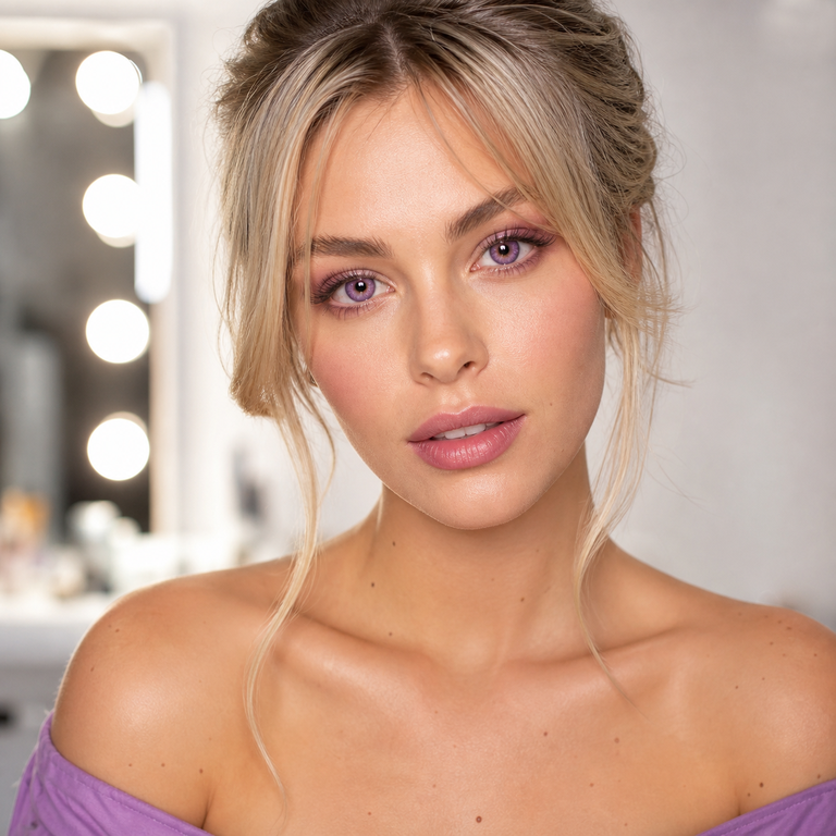
My short answer: I would shortlist INYX Green for the coolest, clearest color shift, INYX Pink for a playful beauty look, and INYX Purple for a more graphic, editorial direction. All three are color variants of model HC1421 and share the same listed core specifications, so this is primarily a style decision, not evidence that one variant will fit, feel, or appear better on a particular eye. A valid prescription and professional fitting still come first.
How I approach the INYX color choice
When I edit a three-color collection, I begin with the job the color needs to do. Is it meant to sharpen a monochrome outfit, support a rosy makeup story, or become the unmistakable focal point? That question is more useful than asking which color is “best.” INYX Green, INYX Pink, and INYX Purple occupy different visual lanes in the catalog, but none has a universal outcome.
I am writing here as a brand editor who compares names, product specifications, and catalog imagery. I am not reporting personal wear, comfort, fit, compliments, or a customer experience. That distinction matters with INYX colored contacts. A studio image helps with color direction; it cannot reproduce every iris color, pupil size, light source, camera setting, screen, or real-world environment. Think of the images as a creative reference, not a promise.
The product listing describes the collection as bold and vivid, with a noticeable ring-led effect. In the published imagery, I see pale-to-bright fashion color framed with visible definition around the iris area. Green reads minty and cool, Pink reads candy-rose, and Purple reads blue-violet. Those are visual editing notes rather than guarantees of on-eye color. Your natural iris remains part of the final picture.
INYX Green, Pink, and Purple at a glance
This is the table I would use during a selection session. The color and styling observations come only from the variant names and the catalog presentation. I deliberately keep fit and performance out of it.
| Variant | Catalog color impression | Styling lane I would explore | Useful palette pairings | What the image cannot tell us |
|---|---|---|---|---|
| INYX Green | Cool mint-to-aqua green with distinct framing | Futurist, silver-toned, cyber, icy, or high-contrast beauty | Black, graphite, silver, white, cool taupe | Actual color on your iris, fit, comfort, or visibility in your lighting |
| INYX Pink | Clear candy pink with a rosy fashion effect | Doll-inspired, pop, romantic, blush-led, or playful editorial looks | Rose, mauve, cream, charcoal, soft brown | Actual saturation, opacity on your iris, fit, comfort, or movement |
| INYX Purple | Cool blue-violet/lavender with graphic definition | Night-out, metallic, alt-fashion, violet monochrome, or dramatic editorial looks | Plum, pewter, navy, black, lilac | Actual undertone, enlargement effect, fit, comfort, or photographic result |
My read on INYX Green
INYX Green is the first option I would pull when the brief asks for contrast without moving into pink or violet. The catalog presentation leans cool rather than botanical: less leaf green, more mint, sea glass, or pale aqua. That makes it an intuitive partner for metallic texture, black liner, clean white space, and graphite clothing.
For makeup, I would avoid matching every element to the lens. A small green accent can be enough. Neutral taupe around the eye, a precise black line, and a muted lip give the color room to register. For a more maximal frame, silver at the inner corner and a charcoal outer eye can reinforce the cool palette. Our colored contacts makeup guide offers a broader way to coordinate color without turning the whole face into one swatch.
Green can also be the most versatile choice of these three for a wardrobe built around neutrals, but “versatile” is a styling judgment, not a naturalness claim. On-eye appearance may shift with the wearer’s iris and environment. If your target is a subtler photograph, review the practical lighting and camera checks in how to make colored contacts look natural in photos before assuming a product image will translate directly.
My read on INYX Pink
INYX Pink is the collection’s most openly playful choice. In the catalog, it reads as a recognizable pink rather than a brown lens with a faint rosy cast. I would select it when the color itself belongs in the concept: a blush-heavy beauty edit, a graphic pop look, a romantic palette with an unexpected edge, or a character-inspired outfit.
The cleanest styling route is tonal but controlled. Rose or mauve can appear on the lid or cheek while the lip stays softly neutral. Another option is deliberate contrast: crisp black liner, minimal shadow, and one pink garment or accessory. That prevents the lens color from competing with several saturated areas at once.
Pink and purple are close enough to invite indecision, but they do different visual work. Pink feels warmer, sweeter, and more pop-coded in this catalog; Purple feels cooler and more nocturnal. I break down that fork more fully in pink vs. purple colored contacts. The useful question is not which shade is more flattering in the abstract. It is which undertone supports the makeup, wardrobe, and lighting you have already chosen.
My read on INYX Purple
INYX Purple is where I would go for the strongest editorial signal. The catalog imagery reads blue-violet to lavender, giving it a cooler and slightly more graphic identity than INYX Pink. It pairs naturally with pewter, black, navy, cool plum, and reflective finishes.
I would style Purple in one of two ways. The first is restrained: neutral skin, black lashes or liner, and a muted lip, letting violet be the only conspicuous color. The second is a deliberate after-dark palette with plum shadow, silver detail, and dark clothing. Both strategies give the color a clear role. What I would not do automatically is add violet to every surface; repetition can flatten the hierarchy of a look.
Purple may photograph differently under warm indoor bulbs, cool LEDs, daylight, or flash. A camera can also change white balance and saturation. That is why I treat catalog Purple as a direction, not a sampled paint code. If matching is important for an event or shoot, test the complete makeup and wardrobe setup in the actual lighting, but only after an eye care professional has prescribed and fitted the lenses.
The specifications all three variants share
According to the live INYX Series product page, the selectable variants are INYX Green, INYX Pink, and INYX Purple. The listing identifies model HC1421 and gives these specifications:
- Material: HEMA+NVP
- Diameter: 14.2 mm
- Base curve: 8.6 mm
- Water content: 38%
- Power options: 0.00 through -4.50, in the increments shown on the product selector
- Listed replacement timing: six months after opening
I use the structured specification panel as the reference where page elements conflict. In particular, shoppers may encounter image text or descriptive copy that shows a different diameter; the structured listing says 14.2 mm, which is the value used throughout this guide. If any label on the package you receive differs from the online listing, stop and ask the seller and your eye care professional to clarify before use.
These numbers describe the product; they do not approve it for a particular person. Diameter and base curve are not a do-it-yourself fitting method. Material and water percentage do not prove comfort, oxygen performance, safe wear time, or compatibility with your eye. A six-month-after-opening listing is not permission to wear a lens continuously, sleep in it, ignore the care system, or keep using a damaged, contaminated, uncomfortable, or clinically unsuitable lens.
Plano and prescription colored contacts need the same care
The 0.00 option is plano, meaning it does not provide refractive correction. The negative powers run to -4.50 on the current selector, so the collection also sits within the category of prescription colored contacts. That range does not mean every prescription is covered. The listing does not show positive powers, cylinder, axis, or add power, and a sphere value alone is not the full contact-lens prescription.
In the United States, decorative lenses are medical devices. The FDA’s decorative contact lens guidance states that all contact lenses, including decorative lenses, require a prescription. The prescription should identify the brand and appropriate lens measurements, not merely copy an eyeglass power. Read our guide to eye exams for colored contacts for the distinction between a vision check, a contact-lens fitting, and a valid lens prescription.
I would therefore narrow the color first for creative planning, then let professional suitability determine whether that shortlist can become a purchase. If the prescribed brand or measurements do not match INYX HC1421, color preference does not override the prescription.
What the specs cannot guarantee
A contact lens is not selected like lipstick. Two shoppers can read the same 14.2 mm diameter, 8.6 mm base curve, 38% water content, and HEMA+NVP material and still need different clinical decisions. Corneal shape, tear film, ocular health, lens movement, centration, and the practitioner’s evaluation matter. The product numbers alone cannot establish safe fit.
They cannot establish the finished color either. Natural iris tone, limbal definition, pupil size, lens position, ambient light, camera processing, and screen rendering all influence what a viewer sees. Catalog imagery is especially useful for comparing the direction of Green, Pink, and Purple because the presentation is controlled. It is much less useful as a guarantee of exact saturation or coverage.
Comfort is also not a conclusion I draw from material or water percentage. “38% water” is a composition specification, not a personal comfort score. If comfort changes, vision blurs, or redness appears, the correct response is not to reason backward from a product bullet and keep wearing the lens.
My practical selection sequence
- Start with the prescription. Confirm that you have a current contact-lens prescription and that this exact product is suitable. Do not begin with color and try to make the fit conform.
- Name the visual brief. For cool and crisp, shortlist Green. For playful and rosy, shortlist Pink. For cool, graphic drama, shortlist Purple.
- Audit the full palette. Put clothing, makeup references, hair color, and lighting in one mood board. Look for one lead color and supporting neutrals.
- Review real lighting conditions. Daylight, warm interiors, stage light, and flash can pull color in different directions. A catalog image cannot account for the setting.
- Confirm the exact boxes and labels. Check model, color, power, expiration, package integrity, and instructions against the prescription before opening.
- Keep expectations precise. You are choosing among three catalog color directions, not ordering a certain eye transformation.
This sequence keeps green pink purple colored contact lenses in their proper order: eye health and prescription first, visual editing second. It also makes the creative decision easier because each variant has a defined job.
Safety is part of the beauty decision
Fashion beauty contact lenses still contact the eye. The FDA’s contact lens risk guidance lists infections and corneal ulcers among serious hazards and advises immediate removal plus prompt contact with an eye care professional when irritation or infection symptoms occur. Warning signs listed by FDA include pain, unusual redness, blurred vision, swelling, discharge, excess tearing, light sensitivity, itching, burning, or a gritty feeling.
For prevention, never expose lenses to tap, bottled, distilled, lake, pool, hot-tub, or ocean water. Use the care system and schedule prescribed for you; do not reuse or “top off” old solution. Wash and thoroughly dry hands before handling. Do not share lenses. Do not sleep, shower, or swim in them. Replace the case as directed and keep follow-up appointments.
The CDC’s contact lens prevention guidance is a useful habit checklist; the live page was access-restricted during editorial verification, and I also checked an archived CDC snapshot dated August 6, 2026. For a brand-specific explanation of claims and regulatory language, see our FDA compliance guide. A website statement is not a substitute for the prescription, package labeling, professional fitting, and care directions that apply to you.
My final edit: choose the mood, then verify the match
If I were laying out a three-panel INYX story, Green would open with cool clarity, Pink would supply the playful center, and Purple would close with the most graphic mood. That is the cleanest expression of how I compare them. The decision can be as simple as cool mint, clear rose, or blue-violet, provided it follows a valid prescription and professional fit.
INYX Green is my visual shortlist for icy neutrals and metallic styling. INYX Pink is the direct route to a rosy pop concept. INYX Purple suits an after-dark or alternative editorial palette. None wins on fit, safety, comfort, or universality because the catalog cannot answer those questions. Use the color comparison to refine your brief, and use your eye care professional to decide what belongs on your eyes.
Frequently asked questions
What colors are available in the INYX Series?
The current product selector lists three variants: INYX Green, INYX Pink, and INYX Purple.
Are INYX colored contacts available with power?
Yes. The live selector lists plano 0.00 and negative sphere powers from -1.00 through -4.50. Availability in that range does not mean the lenses match every prescription; use the exact product your eye care professional prescribes.
What are the INYX HC1421 specifications?
The structured listing gives HEMA+NVP material, 14.2 mm diameter, 8.6 mm base curve, 38% water content, and a listed six-month replacement point after opening.
Does an 8.6 mm base curve mean INYX will fit me?
No. Base curve and diameter are product measurements, not a fit guarantee. A licensed eye care professional must evaluate the lens on your eye and prescribe the appropriate brand and measurements.
Which looks more natural, INYX Green, Pink, or Purple?
The catalog does not establish a universal “most natural” option. Iris color, pupil size, lighting, lens position, makeup, camera processing, and personal expectations all affect the result. I compare Green, Pink, and Purple as styling directions, not certain outcomes.
Can I buy the 0.00 INYX option without a prescription?
Not legally in the United States. FDA guidance says decorative contacts are medical devices and all contact lenses, including non-corrective plano lenses, require a prescription.
Does “six months after opening” mean I can wear the lenses every day for six months?
No. It is the product’s listed replacement timing, not a promise of daily suitability or continuous wear. Follow the wearing schedule, cleaning system, replacement instructions, and earlier-disposal advice provided by your eye care professional and the labeling.
What should I do if my eyes become red, painful, or blurry?
Remove the lenses immediately, do not put them back in, and contact an eye care professional promptly. Seek urgent professional advice for pain, persistent redness, blurred or reduced vision, discharge, swelling, or light sensitivity.