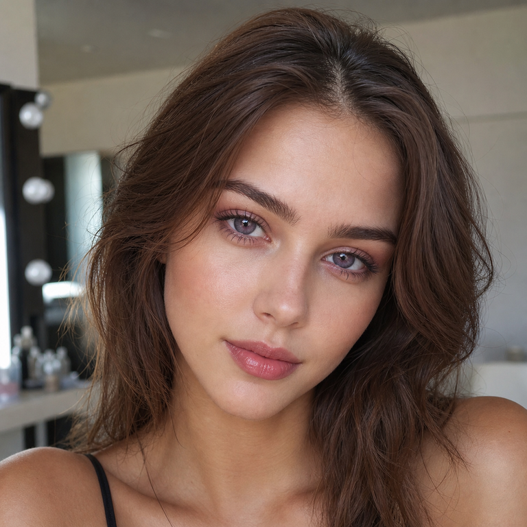
When I edit a color-contact collection, I do not begin by asking which shade is the most dramatic. I begin with a more useful question: what kind of presence should the eyes have before anyone consciously notices the lens? That is the lens through which I compare the three Berry colored contacts, Berry Brown, Berry Grey, and Berry Purple. They share one technical foundation, yet each color tells a distinctly different visual story.
Brown is the quietest and warmest choice. Grey introduces cool structure. Purple is the artistic outlier: still softened by the Berry concept, but unmistakably more expressive. I see them less as three versions of the same product than as three levels of visual temperature and intention. This guide is my catalog-side edit of those differences, not a report of personal wear or a promise of how any shade will look on a particular eye.
The product page identifies the series as model HC1420, made from HEMA+NVP, with a listed 14.2 mm diameter, 8.6 mm base curve, 38% water content, powers from plano 0.00 through -4.50, and a six-month replacement schedule after opening. Those shared specifications make color, not a change in geometry or material, the central decision among the three variants. Fit, prescription, and care remain individual medical matters, however, and should be settled with an eye-care professional before color enters the conversation.
The Berry design language: softened color with a clear point of view
“Berry” is an apt collection name because the palette feels saturated in concept but softened in presentation. The family moves through roasted brown, smoke-like grey, and fruit-toned purple without abandoning a polished beauty direction. I would place it between an ultra-natural lens edit and a costume-led collection: more intentional than a barely-there tint, less literal than an opaque character lens.
That middle ground is why the comparison deserves nuance. Brown is not automatically natural on every iris, grey is not automatically icy, and purple is not automatically theatrical. The naturalness of colored contacts is created by the relationship among the printed color, the wearer’s iris, pupil size, lighting, makeup, camera processing, and lens position. For a more detailed framework, I use our guide to making colored contacts look natural in photos. It helps separate the color seen in a product image from the color a camera may record in real conditions.
I also keep the product claim in proportion. A 14.2 mm listed diameter tells me the lens belongs in a familiar beauty-lens scale, but diameter alone cannot predict visible enlargement or fit. The printed graphic diameter is not provided on the product page, and a base curve number is not a substitute for a professional fitting. My edit therefore focuses on color direction and styling logic rather than manufacturing a certainty that the available specifications cannot support.
At a glance: my Brown, Grey, and Purple edit
| Variant | Visual direction | Best styling lane | Contrast approach | My catalog note |
|---|---|---|---|---|
| Berry Brown | Warm, mellow, softly defining | Neutral makeup, warm tailoring, everyday polish | Usually the most tonal choice within this trio | Choose it when cohesion matters more than obvious color change |
| Berry Grey | Cool, smoky, cleanly sculpted | Monochrome looks, silver jewelry, modern evening beauty | Creates a cooler break from warm iris tones | Choose it for restraint with a sharper editorial edge |
| Berry Purple | Romantic, creative, color-forward | Mauve, berry, plum, or deliberate contrast styling | The most chromatically expressive option | Choose it when the lens should participate in the look |
This is a selection map, not an outcome guarantee. On brown eyes, for example, each print will interact with the natural iris rather than appearing as a flat swatch. If that is your starting point, read our dedicated guide to colored contacts for brown eyes before treating any catalog image as a forecast.
Berry Brown: the tonal, quietly polished choice
Berry Brown is my first recommendation when the brief is “enhanced, but not loudly transformed.” Within a collection of brown grey purple colored contact lenses, brown naturally occupies the most tonal position. It can echo warm hair, bronzed skin, camel knitwear, tortoiseshell frames, or softly smoked liner without asking the rest of the look to change direction.
What I like about brown as an editorial choice is its ability to complete a composition. It does not need to be the headline. If the wardrobe already carries cream, chocolate, rust, olive, or muted gold, Berry Brown is the variant I would shortlist first because it keeps the eye color inside the same visual temperature. That makes it especially useful for portraits where texture, skin, lashes, brows, fabric, should remain more important than a conspicuous hue shift.
Yet “brown” should never be used as shorthand for invisible. A printed brown may still create noticeable definition, and its relationship with a naturally dark iris depends on opacity and pattern details that are not fully quantified on the product page. I would choose it for tonal harmony, not on an unsupported promise that no one will detect it.
Brown also gives makeup the broadest neutral runway. Soft black or espresso liner, peach or rose blush, and satin beige lids all make sense. For contrast, I would add one cooler accent, a slate garment, silver earring, or muted blue shadow, rather than overloading the face with more warmth. Readers deciding specifically between the two quieter color families may find my brown vs. gray colored contacts comparison useful.
Berry Grey: cool structure without abandoning softness
Berry Grey is the collection’s cleanest change of temperature. Where Brown blends into a warm story, Grey edits warmth away. I think of it as visual contour for the iris: cooler, more graphic, and slightly more distant in mood. It is the shade I would place beside charcoal tailoring, a white shirt, brushed silver, washed denim, black liner, or a restrained taupe eye.
Grey is often selected for drama, but my preferred use is disciplined. I would let it create one cool point in an otherwise minimal face: groomed brows, separated lashes, a neutral lip, and skin that still looks like skin. This keeps the result modern rather than overdesigned. For evening, the same color can support smoked liner and a deeper lip, but the lens does not need every feature to compete with it.
Compared with Berry Brown, Berry Grey will generally read as the clearer chromatic departure on a warm brown iris. Compared with Berry Purple, it is less narratively specific. Grey can move between minimalist, romantic, streetwear, and formal styling because it behaves almost like a neutral, even when its effect is noticeable.
My caution is against assuming that “grey” means one exact finish. It can photograph warmer, bluer, greener, or more silver depending on ambient light, white balance, and the wearer’s underlying iris. I would review unfiltered images in several lighting conditions and keep expectations flexible. The product title supplies the color name; it does not supply a guarantee of an identical final shade across people or cameras.
Berry Purple: the romantic statement
Berry Purple is the variant I choose when color is part of the creative thesis. It has the strongest fashion identity of the trio, yet purple can be remarkably sophisticated when its surrounding palette is controlled. Mauve, aubergine, burgundy, cocoa, dusty rose, and pewter can all support it without turning the face into a costume.
I prefer to style purple through repetition or deliberate contrast. Repetition means picking up one related note elsewhere, a plum lash accent, berry lip stain, violet stone, or wine-colored fabric. Deliberate contrast means keeping everything else nearly neutral so the iris color is the only unexpected element. Both approaches feel intentional; placing purple beside several unrelated bright colors can make the eye look lose hierarchy.
Among the three, Berry Purple is the least likely to disappear into a conventional neutral story. That is not a flaw. It is the reason to select it. I would shortlist it for beauty editorials, convention styling, portraits with a romantic palette, or any look where the eyes are meant to hold attention. I would not describe the result as subtle without seeing it on the intended iris in the intended light.
If your decision is really between pink-adjacent romance and a cooler violet direction, our pink vs. purple colored contacts guide offers a broader color-theory comparison. In this Berry trio, Purple is my expressive choice; Brown is my harmonious choice; Grey is my structural choice.
How I narrow the choice for brown eyes
For colored contacts for brown eyes, I start with the desired relationship to the natural iris. If the goal is tonal continuity, I begin with Berry Brown. If the goal is a cooler interruption, I begin with Berry Grey. If the goal is an intentionally unusual color note, I begin with Berry Purple. This sequence is more honest than promising that one shade is universally “best.”
Dark irises can influence the perceived depth and temperature of a colored print. Lighting then changes the reading again: direct daylight can reveal pattern and tonal variation that soft indoor light compresses, while phone cameras may alter contrast or white balance. I recommend evaluating the idea in plain daylight, indirect indoor light, and a no-filter camera preview. That is a styling assessment only; the first actual lens trial should still follow the fitting and wear instructions given by an eye-care professional.
I would also separate color ambition from correction needs. The Berry Series is listed in plano and minus powers from 0.00 to -4.50, but the availability of a number on a menu does not establish that it matches a current contact-lens prescription. Contact-lens prescriptions include fit and product information, not merely spectacle power. The FDA states that all contact lenses, including decorative lenses, require a prescription. A licensed eye-care professional should determine whether this specific product and parameters are appropriate.
Prescription beauty contacts: read the specifications as a system
The phrase prescription beauty contacts can make color and vision correction sound like two independent shopping filters. They are not. A contact lens sits on living tissue, so power, base curve, diameter, material, replacement schedule, and care system all belong to one decision. For model HC1420, the catalog lists HEMA+NVP material, 14.2 mm diameter, 8.6 mm base curve, 38% water content, and powers from plano through -4.50.
I treat those numbers as product identifiers, not as comfort predictions. Water percentage alone does not guarantee hydration, and a material name alone does not establish suitability for a particular wearer. Likewise, the listed six-month schedule is a maximum replacement interval after opening, not permission to wear the lenses continuously, sleep in them, ignore a damaged lens, or continue through symptoms. The clock begins when the package is opened, and the wearer must still follow the shorter limit or disposal instruction given by the prescriber or manufacturer.
There is also an important catalog detail worth checking at purchase: the top specification block on the product page lists 14.2 mm, while a lower description block currently says 14.5 mm. This guide uses the 14.2 mm value supplied in the primary product specifications, but I would ask the seller and prescribing professional to verify the package labeling before ordering. Premium selection means noticing inconsistencies, not styling around them.
My non-negotiable safety edit
Colored lenses are medical devices, even when the objective is purely decorative. The FDA’s decorative contact lens guidance says all contact lenses must be prescribed by a doctor and warns against buying them without a prescription. The agency lists possible harms from incorrectly obtained or used decorative lenses, including corneal abrasion, allergic reactions, decreased vision, infection, and blindness.
The FDA’s separate page on contact lens risks emphasizes that contact-lens wear can be associated with serious eye infections and corneal ulcers. I never frame redness, persistent pain, discharge, light sensitivity, or reduced vision as a beauty inconvenience. Remove the lenses and contact a licensed eye-care professional promptly; urgent symptoms warrant urgent professional advice.
Care is equally unglamorous and essential. The CDC’s healthy contact-lens guidance advises wearers to keep water away from contact lenses, remove lenses before showering or swimming, avoid sleeping in lenses unless directed by an eye-care provider, use fresh recommended disinfecting solution, and replace the case regularly. Never use tap water or saliva, never share lenses, and never “top off” old solution.
I also distinguish a marketing statement from regulatory proof. The product page uses “FDA” and “FDA Registered” language. Registration or listing language is not, by itself, the same as FDA clearance or approval for a specific device. Before purchasing, I would verify the exact manufacturer and lens in the relevant FDA records and confirm the seller requires a valid prescription. Our FDA compliance overview explains the questions to ask and the records to check.
My final selection: harmony, structure, or expression
If I were arranging the Berry Series on an editorial rail, I would label the choices with three words. Berry Brown is harmony. It stays close to a warm, cohesive beauty language. Berry Grey is structure. It cools the composition and gives the eye a cleaner edge. Berry Purple is expression. It makes color an intentional part of the story.
That is the most useful way I know to compare them without inventing personal wear results. The shared model specifications make the shades siblings, but the styling outcomes remain individual and conditional. Begin with the mood you want, verify the exact product labeling, obtain a valid contact-lens prescription and professional fit, and treat care as part of the aesthetic. Beautiful color is never improved by compromising eye health.
Frequently asked questions
1. Which Berry color looks the most natural?
Within this trio, Berry Brown is my most tonal, conventionally natural-leaning edit, while Grey and Purple create cooler or more expressive shifts. “Natural” still depends on the wearer’s iris, lighting, print opacity, pupil size, and styling, so no color can be certain to look undetectable.
2. Which Berry colored contacts should I consider for brown eyes?
I use intention as the filter: Brown for warm continuity, Grey for cool contrast, and Purple for a romantic statement. Review unfiltered imagery on a similar iris when available, but rely on an eye-care professional, not a photo, to determine fit and prescription suitability.
3. Are Berry Series lenses available with prescription power?
The product page lists plano 0.00 and minus powers from -1.00 to -4.50, including quarter-step options shown in its selector. Availability does not replace a current contact-lens prescription, and spectacle power should not be self-converted into a contact-lens order.
4. What are the Berry Series specifications?
Model HC1420 is listed as HEMA+NVP with 38% water content, an 8.6 mm base curve, and a 14.2 mm diameter in the primary specifications. Because a lower page section currently says 14.5 mm, verify the sealed package and prescription details before purchase.
5. Can I wear these lenses for six months continuously?
No. “Six months after opening” is presented as a replacement cycle, not continuous wear time. It does not authorize overnight wear. Follow the daily wearing schedule, cleaning method, and earlier-disposal instructions provided by your eye-care professional and the verified manufacturer labeling.
6. Do I need a prescription for plano Berry contacts?
Yes in the United States. The FDA says decorative contacts are medical devices and all contact lenses require a prescription, including lenses with no vision-correcting power. A professional exam also checks whether the lens measurements and fit are appropriate.
7. How should reusable colored contacts be cleaned and stored?
Use the disinfecting system recommended by your eye-care professional, fresh solution every time, and a clean case replaced on schedule. Do not use water or saliva, do not top off used solution, and keep lenses out before swimming or showering.
8. What should I do if my eyes become red or painful?
Remove the lenses and contact a licensed eye-care professional promptly. Persistent pain, redness, discharge, light sensitivity, or decreased vision can signal a serious problem and should never be managed by simply shortening wear time or changing the makeup around the eye.