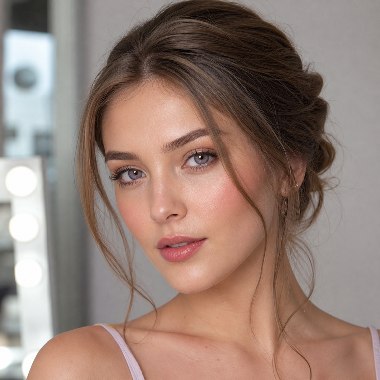
When I open a page of pink lenses beside a page of purple lenses, I am not asking which color is prettier in the abstract. I am asking what job I want the lens to do in the whole look. Does it need to echo blush, a satin bow, and a glossy lip? Or should it create a sharper break against a black liner, silver jewelry, or a deep evening palette? That change in intention is what settles the pink vs purple colored contacts question for me.
My direct answer: I would choose pink for a rosy, playful, or deliberately monochromatic statement, and purple for a cooler, more graphic, or evening-led statement. Neither is automatically subtle, and neither has one predictable appearance on every person. The wearer’s natural iris, the prescribed fit, the surrounding makeup, and the light all affect what the viewer sees. I treat the product gallery as art direction, not a promise of an exact on-eye result.
Pink vs purple colored contacts: the decision I make first
I begin with the rest of the frame. If the outfit already contains pink, rose, red, or soft metallic details, a pink lens can continue that color story rather than introduce a new one. If the wardrobe is black, navy, chrome, or cool white, purple can become the intentional color interruption. This is visual editing, not color science. I am choosing a relationship among elements that will be photographed or seen together.
Pink and purple both sit outside the everyday iris colors most people expect, so I consider them statement colors even when the makeup is quiet. “Statement” does not have to mean costume. It simply means the color is part of the message. A neat wing, clean skin, and one visible pink or purple detail can feel more controlled than piling every dramatic element into the same look.
When I compare searches for “pink colored contact lenses for a statement look” and “purple contacts for brown eyes,” I pause over the implied promises. A shopping phrase cannot tell me how a lens will appear over a particular brown iris. Product photography can guide a mood, but the natural iris remains part of the visual equation, and phone processing, exposure, white balance, and indoor or outdoor light can change the recorded color. I would never select solely from a bright campaign crop and assume the same result will appear in a bathroom mirror.
I treat “fashion circle lenses” as a style phrase, not a fitting conclusion. Diameter and base curve are measurements, not aesthetic guarantees or substitutes for an individual fitting.
I use our enhancement tint versus opaque contacts guide to frame design vocabulary without assigning an undocumented design type to these products.
When I open the three Yilala product pages
When I open the product pages, I keep the visible facts in one column and my styling notes in another. That boundary matters. The INYX Series page lists Green, Pink, and Purple variants under model HC1421. The Berry Series page lists Brown, Grey, and Purple under HC1420. The Nova Series page lists Blue, Brown, and Pink under HF190.
Across the three product summaries, I see the same listed core specifications: HEMA+NVP material, 14.2 mm diameter, 8.6 mm base curve, 38% water content, powers from 0.00 through -4.50, and a stated replacement point of six months after opening. I report those as catalog facts only. I do not turn material, water percentage, or replacement schedule into a comfort claim, and I do not treat 14.2 mm as proof of enlargement or of how a border will look on a specific eye.
| Product and visible variants | Statement-color option | Styling direction I take from the catalog image |
|---|---|---|
| INYX, HC1421 Green, Pink, Purple |
INYX Pink | The Pink gallery image pairs the named variant with pink eye makeup, a glossy lip, and a plaid beret. I would use that as a cue for a coordinated, youthful editorial story, not as evidence of an identical lens result. |
| INYX, HC1421 Green, Pink, Purple |
INYX Purple | The Purple image uses a metallic head covering, graphic liner, pale lashes, and silver jewelry. I would choose this direction when the eye color needs to sit inside a sharper, high-contrast frame. |
| Berry, HC1420 Brown, Grey, Purple |
Berry Purple | The Purple image is presented against a pink background with pink shadow, a glossy neutral lip, and polished jewelry. I read it as a controlled beauty direction where purple belongs to a softer, tonal composition. |
| Nova, HF190 Blue, Brown, Pink |
Nova Pink | The Pink image is framed by smoky dark eye makeup, textured cropped hair, freckles, and facial jewelry. I would borrow that tougher editorial contrast when I want pink to feel less sweet. |
This table is intentionally about names and visible art direction. It does not rank opacity, coverage, comfort, enlargement, undertone, or performance on brown eyes. Those conclusions are not established by the product names or catalog compositions.
How I choose pink without making everything sugary
Pink becomes more interesting to me when I decide whether it will harmonize or clash. For harmony, I repeat pink once or twice: perhaps in a thin wash of shadow, a hair accessory, or a small fabric detail. I keep the repetitions edited so the lens still has room. For contrast, I place pink beside charcoal, black, faded denim, or steel-toned accessories. That visual tension can move the color away from a purely romantic reading.
The INYX Pink gallery offers one coherent route: pink makeup, gloss, and a patterned hat. Nova Pink offers another: smoky eyes, textured hair, and visible metal jewelry. I compare those pages because they demonstrate how the label “pink” can be styled into very different narratives without my claiming that the lenses themselves share or differ in undertone. If I want a more coordinated fashion portrait, I would start with the INYX image language. If I want an edgier contrast, I would start with the Nova image language.
Placement matters. Strong blush plus pink shadow plus a bright lip plus a pink lens can make every feature compete at equal volume. I would normally nominate one lead and let the others support it. If the lens is the lead, the lip can be sheer and the cheek restrained. If the lip is saturated, the eye makeup can become simpler. Our colored contacts makeup guide expands that planning process without pretending one palette works for everyone.
Before an event, I would also build a small lighting test rather than trust a single mirror. I would look at the complete styling in window light, ordinary indoor light, and the actual venue or camera setup when possible. The aim is not to “prove” the lens color. It is to see whether the overall composition still communicates the intended mood as lighting changes.
How I choose purple, especially around brown eyes
Purple carries a different kind of visual authority for me. It can sit comfortably beside black liner and silver details, or it can be softened through pink surroundings, as the two Purple gallery directions show. INYX Purple is photographed with a metallic head covering and a more graphic eye frame. Berry Purple appears in a smoother pink setting. When I compare them, I am choosing between two editorial worlds before I ever try to predict an iris result.
The phrase purple contacts for brown eyes deserves restraint. Brown eyes are not one standardized background, and a product image is not a simulation of every iris. Darker or lighter natural iris color, pupil size, the lens design, room light, flash, and camera processing may all affect perceived appearance. I would choose from the prescribed options with an eye-care professional, then evaluate the approved lens under the lighting that matters for the event. I would not promise that purple will read as a particular shade or level of visibility.
For makeup, I compare structure before hue. A defined liner can give purple a deliberate boundary in the composition. A pink or neutral wash can make the same color family feel more continuous. Metallic accessories can repeat the graphic energy visible in the INYX image, while a clean background and polished jewelry can echo the Berry presentation. These are styling references only, and they are useful precisely because they do not require me to invent opacity or coverage.
If the goal is a believable portrait rather than an overt fantasy frame, I would review our guide to making colored contacts look natural in photos. “Natural” in a photograph often depends on the relationship among exposure, makeup edges, catchlights, and retouching choices, not on dialing down every creative color.
I plan the lens, makeup, wardrobe, and lighting together
I use a simple sequence. First, I write one sentence for the look: “pink is the only playful element,” “purple interrupts an all-black outfit,” or “the whole portrait stays in a pink-purple family.” Second, I pick the product variant that belongs in that sentence. Third, I select makeup and wardrobe around it. This prevents me from buying a statement color and only afterward asking what it is supposed to say.
For prom, where formalwear, venue lighting, and a long schedule all matter, I would plan early and use the practical checks in our colored contacts for prom guide.
I compare the look on a phone screen at ordinary size, not only zoomed into the iris. Most viewers meet the entire face first. If the color disappears from the composition, I can adjust nearby makeup or wardrobe rather than assume I need a more dramatic lens. If the eye area overwhelms everything else, I can simplify the lip, jewelry, or background. That is an editorial correction, not a medical or product-performance judgment.
I am careful with post-production. Heavy saturation or selective iris edits can turn a reference into a false expectation. I would not present an engineered color as a certain on-eye outcome.
Prescription colored contacts are still contact lenses
Style is only the second decision. Fit and prescription come first. The FDA says decorative contact lenses are medical devices and that all contact lenses, including decorative lenses, require a prescription. A licensed eye doctor examines the eyes and determines whether the lenses fit properly. A 0.00 option is plano, not permission to skip the exam.
The three Yilala pages list powers from 0.00 to -4.50, but an available dropdown is not the same thing as a valid prescription. Prescription colored contacts must match the wearer’s actual contact-lens prescription and fitting guidance. An eyeglass prescription alone does not automatically provide the lens measurements and fit assessment needed for contacts. I would begin with our guide to eye exams for colored contacts, then follow the eye-care professional’s instructions about brand, measurements, schedule, cleaning, and replacement.
I also keep the product-page replacement statement in its proper place. “Six months after opening” is the listed cycle for these products; it is not a promise that every wearer can use a pair for six months regardless of condition, frequency, care, or professional advice. A lens should not be worn past the prescribed schedule, and symptoms override an editorial plan.
The FDA lists risks that include corneal abrasion, allergic reactions, decreased vision, infection, and blindness when decorative contacts are obtained without a prescription or used incorrectly. The agency advises removing lenses and contacting an eye doctor for signs such as redness, eye pain that does not go away, decreased vision, or discharge. I would abandon the shoot, party, or outfit immediately if a wearer develops a concerning symptom. No statement look earns priority over an eye.
For sourcing and regulatory context, I would also read Yilala’s FDA compliance overview alongside the FDA’s own guidance. A brand page can explain its product context; the official agency page remains the authority for U.S. safety requirements.
The care boundaries I will not style around
The CDC’s prevention guidance is practical: wash and dry hands before handling contacts, keep lenses away from water, use recommended contact lens solution, and replace the case as directed. The FDA’s contact-lens risk page warns against exposure during swimming and notes infection risk from pool water, hot tubs, lakes, and the ocean. I would not plan a pool portrait around wearing colored lenses, and I would not treat a fashion image as an exception to care instructions.
Makeup has its own hygiene boundary. The FDA’s eye cosmetic safety guidance advises washing hands before applying eye cosmetics, keeping applicators clean, and not sharing cosmetics. I would keep powder fallout, old mascara, and shared testers away from the lens routine. If an eye cosmetic causes irritation, the answer is not to push through for continuity.
I schedule enough time so clean handling is not squeezed between hair, makeup, and departure. I would insert or remove lenses only as directed by the eye-care professional and product instructions, with clean, dry hands and an appropriate setup. I would never share lenses, swap a color with a friend, use tap water or saliva, or sleep in lenses unless a practitioner has specifically prescribed a lens for overnight wear. These limits are part of the creative brief, not interruptions to it.
My final edit: choose the color story, then verify the fit
When I make the final pink vs purple colored contacts call, I return to the first sentence of the look. Pink wins when I want rosy continuity, a playful focal point, or a deliberate contrast with darker styling. Purple wins when I want a cooler graphic break, a metallic or evening frame, or a softer purple-with-pink composition. INYX gives me both Pink and Purple within one named series; Berry gives me a Purple route; Nova gives me a Pink route. That makes the comparison easy to organize without pretending the products will look identical across different eyes.
I would save the product links, take the listed model and measurements to the appointment, and ask the eye-care professional whether the specific lens is appropriate. Once the wearer has a valid prescription and fitting instructions, I can return to the enjoyable part: liner shape, lip finish, jewelry, fabric, background, and light. The editorial choice stays expressive because the medical choice has already been handled correctly.
Frequently asked questions
Are pink or purple colored contacts more noticeable?
There is no universal winner. Noticeability can change with the natural iris, lens design, lighting, makeup, distance, and camera processing. I would compare the approved lens in the intended setting rather than infer visibility from the color name.
Which color would I choose for a soft statement?
I would usually begin with a tonal composition: INYX Pink with restrained pink details, or Berry Purple within a pink and polished beauty frame. “Soft” describes the styling direction here, not the lens opacity or its result on an individual eye.
Which color would I choose for an edgier look?
I would look first at Nova Pink with smoky dark eye styling or INYX Purple with metallic accessories and a graphic eye frame. Those directions come from the visible catalog compositions, not from a claim about how either lens performs.
Do purple contacts work on brown eyes?
A fitted purple lens may be an option for a person with brown eyes, but the exact appearance cannot be promised from the product page. I would have the lens prescribed and fitted, then assess the approved option under relevant lighting without expecting one standardized shade.
Can I buy 0.00 colored contacts without a prescription?
No. In the United States, decorative contacts are medical devices and require a prescription even when they have no vision-correcting power. The 0.00 listing on these product pages is a plano power option, not an exemption from an eye exam and fitting.
Are the INYX, Berry, and Nova specifications the same?
The product summaries list the same material, diameter, base curve, water content, power range, and six-month-after-opening cycle. Their model numbers and visible color variants differ. Matching listed specifications still does not make the fit interchangeable for every wearer.
Can I rely on a product photo to choose my exact color?
I would use it for composition and mood, not an exact forecast. Studio lighting, makeup, the model’s iris, camera exposure, editing, and screen settings can all influence the image. A gallery is most useful as a styling reference.
What should I do if my eyes become red or painful?
Remove the lenses and contact an eye-care professional promptly, following FDA guidance and the practitioner’s instructions. Decreased vision, ongoing pain, discharge, or other concerning symptoms are not styling problems to work around.