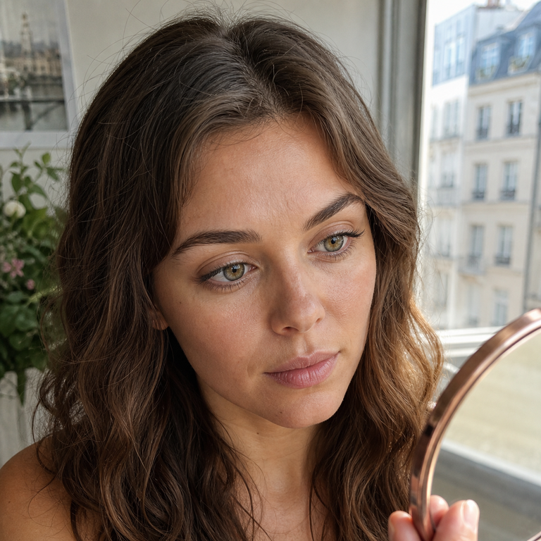
You are standing by the bathroom window at 8:10 a.m., holding two contact lens cases. One pair looked almost invisible in the product photo, promising a small lift in color. The other showed a detailed olive print with a defined outer ring. In the mirror, the decision is not simply “subtle or dramatic.” Your brown iris, the cloudy morning light, the size of the clear pupil opening, and the way the lens centers will all change what you see.
The direct answer: choose an enhancement tint when your natural iris is light enough for a translucent color layer to influence it and you want your own pattern to remain dominant. Consider an opaque design when you need more coverage or a clearer color shift, especially over a medium-to-dark iris. That is a starting point, not a promise. A softly printed opaque lens can look understated, while an enhancement tint may show very little on a dark eye. The result depends on the actual print, your iris, lighting, pupil opening, and fit.
“Enhancement tint” and “opaque” are common design and retail terms. They are not a universal, standardized performance scale applied identically by every brand. One company’s enhancement lens may carry more pigment than another company’s lightest opaque print. Compare the lens itself, not only the label on its box.
First, separate the three tint terms
Contact lens descriptions often place visibility tint, enhancement tint, and opaque color next to one another, even though they serve different purposes. The FDA’s overview of contact lens types distinguishes visibility tint, enhancement tint, and opaque color tint while also noting the broader soft and rigid gas permeable categories.
- Visibility tint: a faint handling color, commonly blue or green, intended to make a lens easier to see during insertion, removal, or cleaning. It is generally not meant to change the apparent color of the eye.
- Enhancement tint: a translucent color intended to intensify or adjust the color already present. Because the iris remains visible through the tinted area, the wearer’s starting eye color contributes strongly to the outcome.
- Opaque color: a more covering printed color intended to make a noticeable apparent color change. The design usually uses dots, strokes, rings, or layered zones rather than one flat painted circle.
These labels describe broad design intentions, not a dependable ranking from “most natural” to “least natural.” They also do not tell you how dense the print is, how wide the colored zone is, or how the color is distributed. Those details often explain the appearance better than the category name.
What an enhancement tint changes
An enhancement tint behaves more like a transparent color wash than a replacement iris. Light interacts with the printed tint and the wearer’s visible iris beneath it, so the final appearance is a blend. On gray, blue, green, or light hazel eyes, a blue enhancement tint may cool the overall tone, a green tint may emphasize existing green areas, and a warm tint may pull hazel forward.
The same translucent lens over a deep brown iris can be quiet or nearly imperceptible. That does not make the lens defective. There may simply be too little contrast between the tint and the underlying iris for the intended change to read at normal conversation distance. If dark-eye transformation is the goal, see the more specific guide on how colored contacts work on dark eyes.
Because more of the wearer’s own iris texture remains visible, enhancement tints can preserve familiar radial lines and color variation. Yet “transparent” does not automatically mean natural-looking. A tint can become obvious if its hue clashes with the iris, if its edge forms an even color band, or if the lens shifts enough for the overlay to sit off-center.
What an opaque design changes
An opaque colored contact uses a print with enough visual coverage to compete with or mask much of the natural iris color beneath it. This makes a stronger shift possible across a wider range of starting eye colors. Brown eyes can appear olive, gray, blue, or another shade when the print density and color balance provide sufficient coverage.
Opaque does not have to mean a solid costume-like disk. Many designs use a field of separated dots, broken spokes, translucent gaps, several colors, and a feathered inner transition. From a normal viewing distance, the eye blends those small elements into one impression. A sparse, irregular opaque print may look softer than a uniformly saturated enhancement tint with a hard edge.
The tradeoff is that printed structure contributes more to the visible result. If the dot field is too regular for the wearer’s features, the color is unusually bright, or the inner boundary ends abruptly around the pupil, the lens may read more clearly as a lens. For ideas centered on realism rather than maximum change, compare natural-looking colored contact shades by undertone and contrast.
Enhancement tint vs opaque contacts at a glance
| Factor | Enhancement tint | Opaque colored design |
|---|---|---|
| How color is created | Translucent tint blends with the visible natural iris | Denser print supplies more of the apparent iris color |
| Typical change on light eyes | Can intensify, cool, warm, or slightly redirect the existing shade | Can create a clearer new shade or pattern |
| Typical change on dark eyes | Often limited, but varies with tint strength and iris color | Usually offers more coverage, depending on print density and design |
| Natural iris visibility | High through much of the colored zone | Lower in dense zones; may remain visible through gaps and inner blending |
| Main realism risk | A mismatched wash, hard outer band, or off-center overlay | Overly regular dots, abrupt pupil transition, or excessive contrast |
| Useful for | Keeping the wearer’s base color central to the result | Creating more visible color change or dark-eye coverage |
| What the label cannot tell you | Actual saturation, distribution, fit, or effect on your iris | Actual density, softness, pattern scale, fit, or realism |
Use the table to narrow the design family, then look at close-up product images, model images across relevant eye colors, diameter information, and the prescription parameters. A category label cannot substitute for those details.
Dark-eye coverage is about more than “opaque”
On a dark brown iris, successful coverage depends on contrast and print engineering. Pale gray dots may read strongly against brown, while a low-saturation olive print may blend into it. A design can be classified as opaque and still allow brown to influence the result through intentionally spaced dots or an open inner zone.
Printed dot density describes how closely the colored elements sit together and how much underlying iris shows between them. Higher density usually increases visual coverage. Lower or varied density can create a softer transition. Density is not identical to darkness: a dense field of light beige dots and a sparse field of dark green dots can behave very differently.
Color layering also matters. A single flat shade may struggle to imitate an iris, which normally contains variation. Multiple tones can build depth, but more colors do not guarantee realism. Placement matters more than a long palette.
The limbal ring is the outer printed boundary. A darker, defined ring can make the iris appear more outlined or somewhat larger. A broken or faded ring tends to merge more quietly with the sclera. Neither treatment is universally more flattering. Read the detailed explanation of how limbal rings affect a natural look before deciding whether “no ring” or “strong ring” fits your goal.
The pupil opening can change the whole impression
Colored lenses leave a clear central area so light can enter through the pupil. The National Eye Institute explains that the pupil is the opening through which some light enters, while the iris controls how much light the pupil lets in. Your pupil does not stay one size: it generally responds to illumination.
In bright conditions, a smaller pupil may sit well inside the clear opening, revealing a ring of natural iris between the pupil and printed color. If that inner transition is feathered, the blend can look intentional. If the print ends abruptly, the contrast may be noticeable. In dimmer conditions, a larger pupil may approach or extend beneath the inner printed area, depending on the design and the wearer’s response. Visual experience is individual, which is one reason appearance and comfort should be assessed in real use rather than inferred from a product photo.
A small-looking opening is not automatically more realistic, and a wide opening is not automatically easier-looking. The opening must be considered alongside the print gradient, the wearer’s iris color near the pupil, and how the lens positions on the eye.
Lighting can reverse your first impression
A lens judged only under a bright vanity bulb may surprise you outside. Direct daylight reveals dot structure, edge transitions, and color contrast. Open shade tends to soften them. Warm indoor light can bring out honey and olive tones, while cool office lighting may push the same lens toward gray or blue-green. A phone camera adds another variable through exposure, white balance, sharpening, and screen settings.
Evaluate a new look in at least three ordinary settings: indirect daylight, the indoor lighting where you spend time, and a normal phone photo without a beauty filter. This is not checklist padding; each view answers a different question. Daylight shows print behavior, familiar indoor light shows daily wear appearance, and the camera reveals how the design may translate in photos.
Distance matters too. A print that looks pixelated inches from a magnifying mirror can blend smoothly at conversation range. Judge close detail, then step back. The social impression of eye color is usually formed from farther away than an application mirror.
Fit is part of the visual design
A beautiful print cannot look settled if the lens does not center and move appropriately on your eye. A lens that sits off-center may expose a crescent of natural iris on one side, shift the limbal ring, or make the pupil opening look uneven. Excessive movement can make the pattern appear to float. A lens that is not appropriate for the eye may also create comfort or vision concerns, which should never be treated as a beauty compromise.
Base curve and diameter are useful specifications, but they do not independently prove fit. Eye shape, lens material, lens design, tear film, and professional assessment all contribute. Compare series details with the Yilala colored contacts series guide, then use the prescription and fitting advice given for your eyes.
Colored contacts are medical devices in the United States, including lenses worn only to change appearance. The FDA’s decorative contact lens guidance states that all contact lenses require a prescription and warns against buying decorative lenses from sellers that do not require one. The FTC Contact Lens Rule addresses prescription release and seller verification requirements. Yilala’s FDA compliance information provides additional brand-specific context.
Do not share lenses. Follow the prescribed replacement schedule and care directions, and stop wearing a lens if you develop pain, marked redness, discharge, light sensitivity, or a sudden vision change. Seek prompt eye-care advice rather than waiting to see whether a troubling symptom becomes less noticeable.
How to choose for the look you actually want
Start with the degree of change, not a category badge. If you want people to register “your eye color, only clearer,” and your iris is light enough to interact with a translucent tint, enhancement may suit the brief. If you want brown eyes to read distinctly olive or gray, a design with meaningful coverage is the more realistic direction.
Next, decide how much visible print you enjoy. Some wearers prefer a soft field without a distinct outer line. Others like the definition of a limbal ring. Consider your contrast level: an icy blue print against very dark brows and a warm complexion can be intentionally striking, while muted olive or brown-gray may create a quieter shift.
Then inspect the inner transition and outer edge. Look for real close-ups rather than relying on a color swatch. Check whether images show a relevant starting eye color and whether the result is photographed under believable light. If a brand offers several series, compare print density and ring style rather than assuming the shade name behaves the same across them.
Finally, keep appearance secondary to prescription, fit, handling, and care. You are choosing a contact lens that also has a color design, not choosing a cosmetic filter that happens to touch the eye.
Common buying mistakes
Assuming every “enhancement” lens is sheer enough to disappear. Saturation and edge design vary. Read the description and inspect the actual print.
Assuming every opaque lens creates a theatrical result. Broken dots, muted pigment, and feathered transitions can produce a restrained change. Opaque describes coverage intent, not an automatic style verdict.
Matching only the color name. “Olive” can mean yellow-green, gray-green, or a brown-based blend. The same name can look unrelated across different patterns.
Ignoring the starting iris. Model photos on light eyes cannot reliably predict dark-eye coverage, and dark-eye photos may not show how the same lens blends over blue or hazel.
Buying without a valid prescription. Decorative status does not remove the need for a prescription in the United States. A plano lens has no vision correction, but it is still a contact lens.
FAQ
Are enhancement tint contacts the same as visibility tint contacts?
No. A visibility tint is mainly a faint handling aid that helps you see the lens. An enhancement tint is intended to influence the apparent eye color while allowing much of the natural iris to remain visible.
Will enhancement tint contacts change dark brown eyes?
They may add a slight cast under some lighting, but the change can be limited because the natural iris remains visible through the tint. Do not assume an enhancement label guarantees a noticeable result on dark eyes.
Do opaque colored contacts always look less natural?
No. A muted opaque design with irregular dots and soft transitions can look restrained. Realism depends on print density, pattern, color contrast, pupil transition, limbal ring, centering, and lighting.
Can opaque lenses fully hide my natural eye color?
Some provide strong coverage, but “opaque” is not a universal promise of total masking. Natural color may remain visible through print gaps, around the pupil opening, or if the lens does not center as expected.
What does dot density mean in colored contacts?
It refers to how closely printed color elements are arranged. Denser printing usually lets less of the underlying iris show, while spaced or varied dots can create a more blended effect.
Does a limbal ring make colored contacts look bigger?
A defined outer ring can make the iris boundary appear stronger and may create an enlarging impression. The effect also depends on graphic diameter, ring width, contrast, and the wearer’s visible eye area.
Why do my colored contacts look different indoors and outdoors?
Light intensity and color temperature change pupil size, contrast, and which pigment tones stand out. Cameras may alter the result again through exposure and white balance.
Do I need a prescription for colored contacts with no vision correction?
Yes, in the United States. Decorative and plano colored contacts are still medical devices, so obtain a valid prescription and buy from a seller that follows prescription requirements.
Choose the print, not just the label
Enhancement tint and opaque are useful directions, but the decision becomes clearer when you translate them into visible features: how much natural iris should remain, how dense the dots should be, whether you want a limbal ring, and how softly the print should meet the pupil. Add realistic lighting checks and a properly assessed fit, and you have a far better basis for choosing than two retail terms alone.
If a muted olive shift with visible printed structure fits your goal, review the Olive Series colored contact lenses near the end of your comparison. Treat the product page as one design option, then confirm prescription, parameters, care, and the likely effect on your starting eye color before ordering.