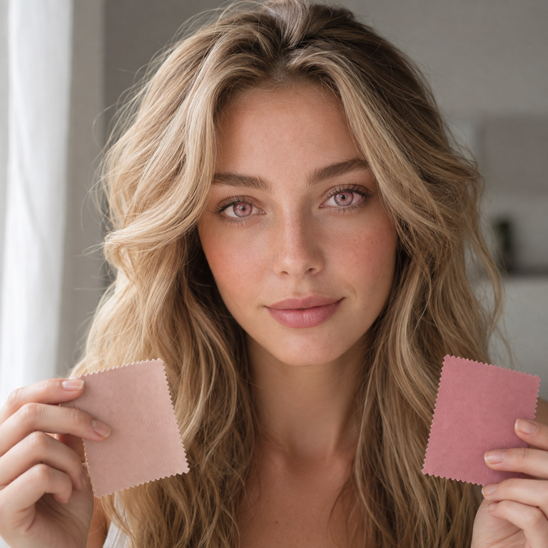
My short answer: I would shortlist Nova Pink when the creative direction calls for a lighter, more open pink story, and INYX Pink when the mood board needs a moodier, more graphic pink accent. That is an editorial read of Yilala’s current catalog photography, not a prediction of how either lens will look on any person’s eyes.
I compare these two pink colored contacts by starting with the images, then checking the product identity and listed specifications, and only then placing each option beside makeup, wardrobe, lighting, and the final use of the pictures. Nova Pink is the pink option in model HF190. INYX Pink is the pink option in model HC1421. Their current primary listings show the same material, diameter, base curve, water content, power range, and after-opening replacement period. The different model numbers still matter, and matching headline specifications do not establish identical fit, comfort, or appearance.
I have not worn or personally tested either lens. I am writing as a brand editor looking at the live product pages and catalog assets. Photography can shift color through exposure, white balance, retouching, screen settings, makeup, and the color already present in the eye. I use the images to build a visual shortlist, never as proof of a wearer result.
For a U.S. purchase, the aesthetic shortlist comes after professional fitting. Colored contacts are medical devices, including plano lenses with 0.00 power. The FDA says decorative contacts require a prescription, and the prescription identifies the prescribed brand and lens measurements. An eye care professional should decide whether a particular lens is appropriate for your eyes.
Nova Pink vs INYX Pink: my quick editorial verdict
If I were building two separate campaign boards, I would place Nova Pink with airy blush, pearl, cool silver, pale denim, and diffused daylight. I would place INYX Pink with berry, charcoal, black liner, chrome details, and more directional light. Those are styling routes suggested by the catalog presentation, not fixed rules built into the products.
Nova Pink is my first click for a romantic, celestial, or softly futuristic brief. INYX Pink is my first click for a sharper nightlife, cyber, alt-beauty, or stage-led brief. If the shoot sits between those worlds, I would save both product pages and test the whole visual plan with the same camera, lighting position, makeup intensity, and color grade. A fair creative comparison needs controlled conditions even when the goal is only to choose an image direction.
I would not choose between them from the shared numbers alone. The identical listed diameter and base curve do not make HF190 and HC1421 interchangeable. The FDA’s guidance for buying contact lenses warns against accepting a different brand without eye care professional approval and notes that prescriptions include identifying details such as brand, power, base curve, and diameter.
The current primary listings side by side
I rechecked both live Yilala pages for this comparison. The table records the primary specification block visible on each listing, rather than secondary promotional wording elsewhere on a page. That distinction is useful because ecommerce pages can contain older copy in expandable or descriptive sections. Before ordering, I would confirm the selected color, power, packaging, current labeling, and prescription details on the live page.
| Comparison point | Nova Pink | INYX Pink |
|---|---|---|
| Series model | HF190 | HC1421 |
| Current color option | Nova Pink | INYX Pink |
| Primary listed material | HEMA+NVP | HEMA+NVP |
| Primary listed diameter | 14.2 mm | 14.2 mm |
| Primary listed base curve | 8.6 mm | 8.6 mm |
| Primary listed water content | 38% | 38% |
| Primary listed power range | 0.00 to -4.50 | 0.00 to -4.50 |
| Primary listed replacement period | 6 months after opening | 6 months after opening |
| My catalog styling lane | Light, blush-led, celestial | Graphic, berry-led, nocturnal |
The shared specification rows make the creative comparison cleaner, but they do not answer the clinical question. A diameter of 14.2 mm and base curve of 8.6 mm are product measurements, not a universal fit statement. Water content is also not a comfort score. I would bring the exact model details to an eye care professional rather than assuming that approval for one colored lens transfers to the other.
The listed power range includes 0.00 and minus powers through -4.50. I read that only as current catalog availability. It does not replace a contact lens prescription, and it does not mean every displayed power is appropriate for every shopper. I would use the prescription exactly as written and ask the prescriber about any product or parameter change.
How I read the Nova Pink catalog direction
Nova Pink’s current product imagery gives me a lighter starting point for art direction. I read the pink as part of a luminous, space-tinged beauty story, so my instinct is to protect breathing room around it. I would avoid crowding the frame with several competing accent colors. A restrained set lets the pink reference remain the focal idea without asking the lens image to carry the entire concept.
For makeup, I would begin with cool blush, a satin or softly reflective lid, clean lashes, and a lip that stays near rose, mauve, or neutral pink. If the brief needs more structure, I would add a narrow charcoal line rather than a heavy black shape. That choice belongs to the makeup plan, not to any claimed feature of the lens.
For wardrobe, pearl gray, winter white, washed blue, pale lilac, and silver hardware make sense to me. Texture would do more work than saturation: fine knit, sheer layers, satin, glass beads, or a small metallic accessory. In a product-led social crop, I would keep jewelry away from the eye line so the viewer can read the beauty story quickly.
Lighting is where I would be most careful. A soft source near the camera can support the airy direction, while a neutral white balance gives the editor a more useful reference. I would also capture a simple daylight-adjacent frame and a neutral gray card for the production team. Catalog photos viewed on different phones are not a color standard, so I would not match makeup pigment by sampling a screenshot.
Nova Pink would reach my shortlist for a spring beauty edit, a dreamy character portrait, a pastel streetwear story, or a bridal-adjacent concept that wants an unconventional pink note. I would still check the image set at full size, compare crops, and separate the visual idea from any assumption about real-eye appearance.
How I read the INYX Pink catalog direction
INYX Pink gives me a more graphic starting point in the current catalog presentation. My mood board would move toward contrast: berry against black, pink against gunmetal, or a focused color note inside an otherwise restrained frame. I would treat it as a choice for a defined creative attitude, not as evidence that it will produce a particular intensity on a wearer.
For makeup, I would sketch two routes. The first is editorial minimalism: prepared skin, brushed brows, a precise liner shape, and a muted lip. The second is tonal drama: plum shadow, berry blush placed high, and a deeper rose lip. I would not use all of those ideas at once. One disciplined color relationship usually photographs more clearly than a pile of trend references.
Wardrobe can support that clarity. Black tailoring, graphite jersey, dark denim, silver mesh, or one saturated magenta detail would fit my INYX board. For cosplay or character work, I would pull the pink into one repeat element, perhaps a ribbon, nail color, or prop light, rather than matching every surface. Repetition creates cohesion; exact color matching often looks forced once lighting and grading enter the workflow.
I would test both hard and soft light during preproduction. Directional light can build the nocturnal mood, while a broad fill preserves information for retouching. I would keep exposure and white balance notes with every frame. If INYX Pink and Nova Pink are being compared for the same campaign, I would not change the lighting recipe between them and then call the resulting pictures a product difference.
INYX Pink would reach my shortlist for a club-inspired beauty story, a cyber wardrobe, a graphic music look, or a character design with a concentrated pink cue. Shoppers building a broader color board can also browse Yilala’s colored contact lenses collection, while costume-led teams may find the cosplay contact lenses collection easier to scan by project.
My controlled shortlist method
I start with the deliverable. A close beauty crop, full-body fashion image, stage look, and casual portrait ask different things from styling. Then I write three mood words. For Nova Pink, mine might be “luminous, cool, weightless.” For INYX Pink, they might be “graphic, nocturnal, precise.” The words keep a team from drifting toward whatever reference was just added to the chat.
Next, I collect the current catalog images directly from the product pages and label every screenshot with the model number. “Pink lens” is not a useful production filename when two products are under review. I note the image’s apparent light direction, makeup palette, crop, and background. I do not note imagined performance attributes that the photograph cannot establish.
Then I create parallel boards with the same number of references. Each board gets one face chart, one wardrobe palette, one lighting sketch, and one crop example. This prevents a richly developed board from beating a sparse board simply because it received more attention. I also place a neutral option between them for a few minutes. That pause makes it easier to see whether I am choosing the product direction or reacting to whatever reference was just added.
Finally, I check practical constraints. I confirm the exact product page, model, selected color, prescription power, production date, and care supplies. The Yilala shop is useful for returning to the wider catalog, and the About Yilala page provides brand context. For order-specific questions, I would use the site’s contact page rather than infer details from a campaign image.
What the shared specifications do and do not tell me
The two primary listings currently align on HEMA+NVP, 14.2 mm diameter, 8.6 mm base curve, 38% water content, 0.00 to -4.50 power availability, and six months after opening. That is meaningful catalog information. It lets me spot the key difference in product identity: HF190 versus HC1421, with different named pink options and separate image systems.
Those rows do not tell me how the products will fit a particular cornea, feel through a day, or appear over an individual’s iris. They also do not establish color coverage, visual enlargement, edge definition, or an outcome on dark eyes. I leave all of those claims out because a catalog comparison cannot verify them.
A six-month after-opening listing should not be read as permission to wear lenses continuously or to ignore the schedule from a prescriber and the product labeling. I treat it as a replacement-period statement that begins after opening, subject to the instructions supplied with the exact product. I would record the opening date, follow the prescribed wearing and replacement schedule, and discard a lens sooner if an eye care professional directs it.
For anyone still exploring the catalog, another product page such as the Berry Series can help clarify whether the brief is truly pink-led or simply needs a related fashion color. That comparison should remain a visual planning exercise until the prescriber confirms the exact lens.
U.S. prescription, fitting, and care come first
I keep the safety edit plain. In the United States, decorative and colored contacts are prescription medical devices, even without vision correction. The FDA’s page on colored and decorative contact lenses says an eye doctor should examine and measure the eyes, write a valid prescription with the brand and measurements, and that buyers should use a seller that requires the prescription.
I would never treat 0.00 as an exception. Plano describes optical power, not whether the lens needs fitting. I also would not swap HF190 for HC1421 merely because the visible specification rows match. If a prescriber approves one, the other remains a separate product identity to discuss.
Care matters after selection. The CDC advises wearers to wash and dry hands before handling lenses, avoid sleeping in lenses unless directed, remove lenses before swimming or showering, use recommended contact lens solution rather than water, and replace the case at least every three months. I would follow the eye care professional’s instructions and the exact product and solution labels rather than build a routine from social posts.
The FDA lists warning signs that can include discomfort, unusual redness, blurred vision, swelling, pain, light sensitivity, or discharge. If a problem appears, I would remove the lenses and contact an eye care professional promptly. A shoot is replaceable. Vision is not a styling variable.
My final pick by creative brief
I would choose Nova Pink for a brief built around soft space, pale color, diffused light, and romantic styling. I would choose INYX Pink for a brief built around contrast, night color, clean graphic shapes, and a more assertive wardrobe. If the concept relies on claims about how either product performs on the eye, I would stop the copy there because the catalog does not support that conclusion.
If the two directions still feel equally useful, I would let the surrounding production decide. Put both named products into separate mockups, keep the crop and grading consistent, and ask which version serves the campaign message. Then confirm the winner with the eye care professional and exact prescription. That sequence keeps creative taste in its lane and clinical fit in the professional’s lane.
Frequently asked questions
What is the main difference between Nova Pink and INYX Pink?
The clearest factual difference is product identity: Nova Pink is model HF190, while INYX Pink is model HC1421. From the current catalog images, I place Nova Pink in a lighter, celestial styling lane and INYX Pink in a darker, more graphic lane. That is an editorial interpretation, not a promised on-eye result.
Do Nova Pink and INYX Pink have the same listed specifications?
The current primary listings show the same HEMA+NVP material, 14.2 mm diameter, 8.6 mm base curve, 38% water content, 0.00 to -4.50 power range, and six-month after-opening period. Shared rows do not establish identical fit, comfort, or appearance, so I would not treat the models as interchangeable.
Which pink contact lens should I choose for soft makeup?
For a soft editorial brief, I would begin my visual shortlist with Nova Pink and pair its catalog direction with cool blush, satin texture, pearl gray, or pale blue. I would still compare both live product image sets because lighting, makeup, retouching, and screens can change how color references are perceived.
Which option fits a darker fashion mood board?
I would start with INYX Pink for a board using black tailoring, graphite, berry makeup, metallic details, or directional lighting. That recommendation concerns art direction only. It does not predict color intensity, coverage, or appearance on any eye color.
Can I buy 0.00 pink contacts in the United States without a prescription?
No. The FDA treats decorative contacts as prescription medical devices, including lenses that do not correct vision. I would get an eye exam, a professional fitting, and a valid prescription for the exact brand and lens details before buying either 0.00 option.
Can I switch between HF190 and HC1421 because the numbers match?
I would not switch on that basis. Matching listed diameter, base curve, material, water content, and power do not make two model numbers the same prescribed product. The FDA advises buyers not to accept a brand substitution unless an eye care professional approves it.
Does six months after opening mean I can wear the lenses every day?
No. I read six months after opening as the listed replacement period, not a daily wearing instruction. The eye care professional’s wearing schedule and the exact label directions control use, cleaning, storage, and replacement. Never sleep, shower, or swim in lenses unless the professional and labeling specifically direct otherwise.
How should I compare the catalog photos fairly?
I would compare the original product pages on the same screen, note lighting and makeup differences, and build equal-size mood boards. For a shoot test, I would hold camera, light, exposure, white balance, makeup intensity, and color grade constant. Even then, the result is a production reference, not a universal wearer result.