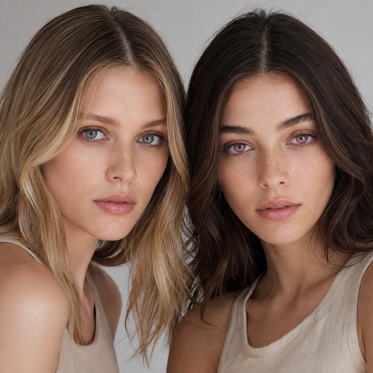
Choose Nova Blue when your creative brief calls for a cool blue color direction, and choose Nova Pink when it calls for a rosy pink direction. That is the useful answer I can give from the current catalog. I do not treat either label as a promise of how the lens will appear on a particular eye, because iris color, pupil size, lighting, camera settings, makeup, and individual fit can all affect the final presentation.
As a Yilala brand editor, I compare these two options as color variants within the same Nova Series Colored Contact Lenses listing. Both are model HF190 and share the specifications currently shown on the live product page: HEMA+NVP material, 14.2 mm diameter in the primary specification area, 8.6 mm base curve, 38% water content, powers from 0.00 through -4.50, and a listed replacement period of six months after opening. Shared numbers make the color decision easier to isolate, but they do not establish that either option will fit, feel, or look the same on every wearer. In the United States, even 0.00-power colored contacts require a valid prescription and professional fitting.
Nova Blue vs Nova Pink at a Glance
| Decision point | Nova Blue | Nova Pink |
|---|---|---|
| Catalog color identity | Blue option in the Nova HF190 listing | Pink option in the Nova HF190 listing |
| Creative direction | Useful starting point for cool, icy, aquatic, celestial, or blue-led concepts | Useful starting point for rosy, candy, romantic, magical, or pink-led concepts |
| Makeup planning | Compare with silver, navy, cool taupe, or deliberately contrasting warm accents | Compare with rose, mauve, berry, neutral brown, or deliberately contrasting cool accents |
| Wardrobe planning | Test beside denim, blue, white, black, silver, or orange accents | Test beside blush, burgundy, cream, black, lavender, or green accents |
| Shared listed specifications | HF190; HEMA+NVP; 14.2 mm; BC 8.6 mm; 38% water; 0.00 to -4.50; listing says six months after opening | |
| What the listing cannot decide | Prescription accuracy, clinical fit, comfort, safe wear time, and the color result on an individual eye | |
How I Make a Fair Catalog Comparison
I begin with the live product listing rather than a remembered social post or a saved screenshot. Product pages can change, and a comparison should identify what is stated now. I confirm the model, available color names, material, diameter, base curve, water percentage, power range, and replacement wording. I also separate the primary specification panel from promotional copy. On the current page, the primary panel says 14.2 mm while a description section says 14.5 mm. I use 14.2 mm as the primary supplied specification for this article, flag the inconsistency rather than hiding it, and advise buyers to have the exact packaged lens details checked before ordering.
Next, I compare like with like. If I assess catalog images, I use equally sized crops, similar screen brightness, and the same surrounding background. A blue swatch beside a gray interface can read differently from that same swatch beside warm skin or orange clothing. Pink can shift in our perception when it is surrounded by red, violet, beige, or white. This is a color-context issue, not proof that the lens itself changed.
I then write down observations in restrained language. “The variant is labeled Nova Blue” is a fact. “The blue will make every dark brown eye look icy” would be an unsupported outcome claim. The same standard applies to Nova Pink. Catalog art can support a styling brief, but it cannot reproduce each reader’s iris pattern, tear film, pupil, room light, phone processing, or prescription fit.
For readers who want another same-series reference, my Nova Pink vs INYX Pink comparison shows how I keep a shared pink label separate from assumptions about two different series. The broader Yilala Color Comparisons archive follows the same catalog-first approach.
What the Shared HF190 Specifications Mean
Nova Blue and Nova Pink sit on the same HF190 product listing, so the listed construction data is shared. HEMA+NVP identifies the material blend. The primary panel gives a 14.2 mm overall diameter and an 8.6 mm base curve. Water content is listed as 38%. The available power menu runs from plano, written as 0.00, to -4.50 in steps shown on the page. Nova Brown is the third color option, although this article keeps the decision focused on Blue and Pink.
Those details help an eye care professional identify the product under discussion. They are not a self-fitting formula. Diameter and base curve are only part of a clinical fit, and matching numbers from a lens a person already owns does not confirm interchangeability. Lens design, material behavior, movement, centration, corneal health, tear film, and the prescribed brand all matter. The FDA explains that decorative and colored contact lenses require a prescription, including lenses with no vision correction.
I also read the replacement wording narrowly. The listing says six months after opening. That is a maximum product schedule stated by the seller, not permission to wear the lenses continuously, sleep in them, ignore their condition, or override a clinician’s directions. Actual use must follow the label and the schedule given by the prescribing eye care professional. A lens should never be kept in service simply to reach a calendar date if a professional says to replace it sooner or if there is damage, contamination, or an eye-health concern.
Choosing by Color Story, Not by a Promised Eye Result
When I edit a blue-versus-pink brief, I ask which color needs to carry the concept. Nova Blue is the direct candidate when blue is part of the character, wardrobe, prop, or campaign palette. It can be shortlisted for an ice-themed costume, a water-inspired set, a blue-haired character, or an editorial plan built around cool colors. These are styling categories, not claims about opacity or transformation on a wearer.
Nova Pink is the direct candidate when pink is the named design cue. It can enter the shortlist for rose-toned beauty work, a candy palette, a magical-character concept, pink hair, or a romantic costume brief. Again, the color name gives me a direction; it does not let me state how vivid, subtle, light, dark, enlarging, or natural the result will be on an individual eye.
What if both colors fit the concept? I use the rest of the palette as a tie-breaker. For a monochromatic plan, I test Blue beside blue garments and cool makeup references, then Pink beside pink garments and rose references. For contrast, I may pair the blue option with rust or peach references and the pink option with green or teal references. “Test” here means a design-board or catalog comparison. It is an editorial catalog comparison, not an account of on-eye use or observation.
Readers building a brown-led alternative can review Nova Brown vs Berry Brown. For a blue comparison across different named styles, see Olive Blue vs Illusory Blue. These related guides are useful because they keep hue, series identity, and styling references in separate columns rather than blending them into a universal wearer claim.
Lighting and Photography Checks I Use
A fair color decision needs more than one glowing phone screen. I review the current assets on a color-managed display when available, turn off night-shift filters, and avoid comparing one image at high brightness with another at low brightness. For a shoot brief, I request references under neutral daylight, indoor ambient light, and the actual key light planned for the set. I keep exposure, white balance, lens choice, distance, and post-processing consistent wherever the production allows.
Blue and pink are especially sensitive to surrounding color. Warm light can influence how a camera records blue, while colored LEDs can push both blue and pink away from a neutral reference. Automatic phone processing may change saturation, contrast, highlights, and skin color between frames. A photo is therefore evidence of that setup, not a guarantee for a buyer.
I also avoid using another person’s close-up as a fitting forecast. Their natural iris, pupil size, limbal features, room conditions, and editing choices may differ. If a creator publishes images, labeling the variant and lighting is more useful than declaring that everyone will receive the same appearance. The Fashion & Beauty article collection offers more examples of planning color around makeup and wardrobe without treating photography as clinical evidence.
Prescription and Professional Fitting Come First
In the United States, colored contacts are medical devices even when the selected power is 0.00. I would not choose Nova Blue or Nova Pink until a licensed eye care professional has examined the eyes, issued a valid contact lens prescription, and confirmed the exact lens and fit. An eyeglass prescription is not a substitute for a contact lens prescription. The brand, material, design, measurements, and power need professional review.
The listed range of 0.00 to -4.50 does not cover every vision need. It also does not tell a shopper how to convert an eyeglass value, combine astigmatism correction, or choose different powers without a prescription. If the required prescription is outside the available menu, the safe editorial answer is not to round, guess, or select the closest number. Ask the prescriber for an appropriate lens option.
The CDC describes contact lenses as medical devices and notes that improper wear, cleaning, and storage can increase the risk of microbial keratitis and other infections. Shared HF190 specifications do not guarantee the same fit, comfort, movement, centration, vision, or color result for two people. They also do not guarantee that a person fitted in another HEMA+NVP lens can use HF190.
If pain, unusual redness, light sensitivity, discharge, swelling, sudden blurred vision, or reduced vision occurs, remove the lenses and contact an eye care professional promptly. Do not put a symptomatic lens back in to see whether the problem repeats. The FDA contact lens risk guidance advises removing lenses and contacting an eye care professional when irritation or possible infection symptoms occur.
Care Rules That Do Not Change With Color
Nova Blue and Nova Pink require the same disciplined approach to hygiene because the pigment choice does not alter basic contact lens care. Wash hands with soap and water, then dry them fully with a clean, lint-free towel before touching a lens or case. Use the disinfecting solution and care system recommended by the eye care professional and compatible with the product instructions. Saline alone is not a disinfectant.
After removal, rub and rinse reusable lenses with the recommended solution when directed, then store them in a clean case filled with fresh solution. Never “top off” old solution. Do not use tap, bottled, distilled, or homemade water on lenses or in the case, and never use saliva. The National Eye Institute contact lens guide recommends fresh solution, proper rubbing and rinsing, air-drying the case, and replacing the case at least every three months.
Keep lenses out of showers, pools, lakes, oceans, and hot tubs. Remove them before sleeping unless the prescribing professional and the specific labeling explicitly allow overnight wear. Bring backup glasses when traveling or attending a long event so there is no pressure to keep lenses in after discomfort begins. Do not share lenses, switch left and right lenses casually, or wear a damaged, dried, cloudy, or contaminated lens.
I track the opening date on the case or a separate lens log, but the six-month listing statement is not the only stop signal. Follow the shorter limit if the package instructions or prescriber gives one. Replace the case on schedule, keep solution bottles clean and capped, and attend follow-up visits. For a broader set of site resources, the Colored Contacts Guide archive is the appropriate next stop.
My Decision Workflow for Nova Blue and Nova Pink
First, I confirm that the eye care requirement is settled. Is there a current contact lens prescription, and has the professional approved the exact product? If not, color selection pauses. A good mood board cannot solve a missing clinical fit.
Second, I name the job the color must do. If the brief literally asks for blue eyes, blue accents, an aquatic theme, or an icy palette, Nova Blue enters the board. If it asks for pink eyes, rose accents, a candy theme, or a pink-led character, Nova Pink enters. When the brief is less literal, I place both catalog references beside the same face chart, wig, garment, and background references.
Third, I control the evidence. I use the same image size and neutral background, record the source page, and note that monitor and camera rendering can vary. I do not infer comfort from water percentage, opacity from a color name, or safe wear duration from the replacement period.
Fourth, I plan the real-world check with the prescribing professional’s directions. If the approved lens is received, the wearer should inspect packaging and labels, follow insertion and care instructions, and stop if warning symptoms occur. For shopping context across the current catalog, readers can visit the Yilala shop, but product browsing should follow rather than replace the prescription and fitting process.
Frequently Asked Questions
Are Nova Blue and Nova Pink the same lens apart from color?
They are listed as color options under the same HF190 Nova Series product and share the specifications shown there. Color is the obvious catalog distinction, but a shared listing does not guarantee identical fit, comfort, vision, centration, or appearance for every wearer. The prescribing eye care professional should confirm the exact product.
What are the listed Nova Series specifications?
The primary product panel lists model HF190, HEMA+NVP material, 14.2 mm diameter, 8.6 mm base curve, 38% water content, powers from 0.00 to -4.50, and six months after opening. A description section also mentions 14.5 mm, so buyers should verify the exact package labeling and prescription details before purchase.
Will Nova Blue look brighter than Nova Pink on dark eyes?
The live listing does not support a universal brightness ranking for individual eyes. Natural iris color and pattern, pupil size, lighting, camera processing, makeup, and fit can influence the recorded or perceived result. I compare the named color direction and current catalog assets, not an unworn outcome.
Can I buy the 0.00 option without a prescription?
No. In the United States, decorative colored contacts require a valid contact lens prescription even when they provide no vision correction. A licensed eye care professional must examine the eyes and determine the appropriate brand and fit.
Can I use my eyeglass prescription to choose a power?
No. Contact lens and eyeglass prescriptions are not interchangeable. Do not convert, round, or guess a value from the menu. Ask an eye care professional to prescribe the appropriate contact lens brand, design, measurements, and power for each eye.
Does 38% water content predict comfort?
No. Water content is one listed material characteristic, not a comfort promise. Comfort can depend on lens design, fit, tear film, ocular health, environment, care, and wear habits. Only a professional fitting and appropriate follow-up can assess whether a prescribed lens is suitable for an individual.
Does six months after opening mean I can wear the lenses every day for six months?
No. It is the replacement wording on the listing, not a continuous-wear schedule or a required service life. Follow the product label and the shorter schedule set by the eye care professional, remove lenses nightly unless specifically directed otherwise, and discard them earlier if instructed, damaged, or contaminated.
What should I do if my eyes become red or painful?
Remove the lenses immediately and contact an eye care professional promptly, especially with pain, light sensitivity, discharge, swelling, blurred vision, or reduced vision. Do not reinsert the lenses to test them, and keep the lenses and case available if the clinician asks to inspect them.
Official Sources
- U.S. Food and Drug Administration: Colored and Decorative Contact Lenses, A Prescription Is a Must
- U.S. Food and Drug Administration: Contact Lens Risks
- Centers for Disease Control and Prevention: About Contact Lenses
- National Eye Institute: Contact Lenses
My Editorial Call
Nova Blue is my catalog-first choice for a blue-led creative brief; Nova Pink is my catalog-first choice for a pink-led brief. When both suit the palette, I compare them beside the same makeup, hair, wardrobe, background, and lighting references. I keep that creative choice downstream from a valid prescription and professional fitting.
The current HF190 listing gives both colors the same core specification set, yet those shared numbers do not guarantee the same fit, comfort, vision, or appearance for any wearer. Verify the 14.2 mm versus 14.5 mm listing discrepancy against the product packaging and prescription, follow professional care directions, keep the lenses away from water, and treat pain, redness, or vision changes as reasons to remove the lenses and seek care.