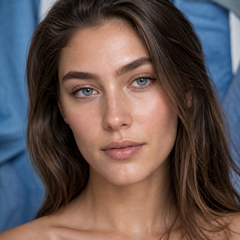
When I build a blue-lens edit, I begin with restraint. Olive Blue and Illusory Blue are distinct Yilala catalog options, but their names are not technical measurements of hue, opacity, limbal definition, enlargement, or coverage. I therefore do not turn “olive” or “illusory” into a made-up promise about how either lens will look on a particular eye. My comparison starts with the facts Yilala publishes, then moves to the visual evidence available on the two product pages, and finally to the wardrobe and lighting in which the lens will be photographed or styled.
For the live references, I keep the Olive Series product page beside the Illusory Series product page and compare only equivalent catalog views.
That approach matters because this is a unusually close specification match. Olive Blue belongs to the Olive Series product page and carries model HC1419. Illusory Blue belongs to the Illusory Series product page and carries model HE1102. Both pages list HEMA+NVP material, a 14.2 mm diameter, an 8.6 mm base curve, 38% water content, powers from plano to -4.50, and a six-month replacement period after opening. In other words, I do not use the specification sheet to manufacture a winner. I use it to establish the shared baseline, then treat the actual catalog imagery as the place to compare appearance.
My short answer is simple: choose the product whose current imagery works more convincingly with your own reference portrait, planned wardrobe, and real lighting setup, provided the prescription and fit are appropriate for you. If the images leave you undecided, I would not force certainty from the names. I would revisit the full Olive Series guide and Illusory Series guide, place the relevant images side by side at the same size, and make the call from a controlled visual comparison. That is the honest premium choice: evidence before adjective.
My comparison at a glance
The table shows why I frame this as a visual and styling decision rather than a contest of materials or dimensions. The published core specifications are aligned; the verified identifiers and collection placements are what distinguish the listings. I also check the live product pages at purchase because availability, selectable powers, packaging presentation, and imagery can change.
| Detail | Olive Blue | Illusory Blue | How I use the detail |
|---|---|---|---|
| Series / color | Olive Series / Olive Blue | Illusory Series / Illusory Blue | I use the live series imagery, not the name alone, to assess appearance. |
| Model | HC1419 | HE1102 | I use the model number to keep carts, notes, and shoot boards unambiguous. |
| Material | HEMA+NVP | HEMA+NVP | Shared published material; not a basis for claiming a relative advantage. |
| Diameter | 14.2 mm | 14.2 mm | Shared published diameter; it does not establish an appearance difference by itself. |
| Base curve | 8.6 mm | 8.6 mm | Shared published value; fit still belongs with an eye-care professional. |
| Water content | 38% | 38% | Shared published value; I do not translate it into a comfort guarantee. |
| Listed powers | 0.00 to -4.50 | 0.00 to -4.50 | Both include plano and listed minus powers; a valid prescription remains essential. |
| Replacement period | Six months after opening | Six months after opening | I date the opening and never treat the maximum period as permission to ignore care instructions. |
What the shared specifications do, and do not, tell me
A close blue colored contact lenses comparison becomes more useful when I refuse to overread the numbers. The shared 14.2 mm diameter tells me the products list the same overall lens diameter. It does not tell me that the printed color occupies the same area, that the apparent iris size will be identical, or that either option will look more natural. Those would require product-specific print measurements or controlled imagery. Likewise, the shared 8.6 mm base curve is a product parameter, not a universal fit statement. Contact lenses are medical devices, and an eye-care professional determines whether the prescription and fit are appropriate.
I apply the same discipline to HEMA+NVP and 38% water content. These are useful catalog facts, yet I do not convert them into fabricated wear testimony. I have not claimed that one feels softer, lasts longer during a day, moves less, or is more comfortable. The pages give both options the same published material and water content, so a responsible comparison keeps those rows level. Comfort, ocular response, and safe wearing time are individual clinical matters, not copywriting opportunities.
The listed power range also deserves precise language. Both pages show 0.00 through -4.50, with the available steps displayed on the product listing. That makes both relevant when someone searches for prescription blue beauty contacts, but it does not mean every prescription is covered. Cylinder, axis, add power, and other prescription requirements are not established by this comparison. I would match the exact prescription issued for contact lenses, confirm the selectable option on the live page, and never substitute a glasses prescription by guesswork.
Finally, six months after opening is the published replacement period, not a promise that every opened lens remains suitable for six calendar months regardless of use, storage, damage, deposits, or professional advice. In my prop and wardrobe log, I mark the opening date, keep the two models in clearly labeled cases, and follow the supplied instructions. If a lens is damaged, contaminated, uncomfortable, or associated with redness or vision change, a date in a spreadsheet does not overrule eye safety.
How I compare the color without inventing shade science
I use a small editorial contact sheet. I save the current Olive Blue image from the Olive Series page and the current Illusory Blue image from the Illusory Series page, then place them at equal dimensions against the same neutral digital background. I do not sample one image from a bright crop and another from a shadowed lifestyle photograph; mismatched presentation can make an ordinary lighting difference look like a product difference. If the pages provide multiple views, I compare like with like: product view to product view, close portrait to close portrait, and similar crop to similar crop.
Next I note only what is actually visible in those specific images. I avoid turning a screen observation into a universal statement about every wearer. Photography can shift with exposure, white balance, retouching, screen calibration, surrounding colors, and the model’s natural iris. Even when one catalog frame looks more vivid or subdued on my monitor, I phrase the conclusion as image-specific: “In this published frame…” rather than “This lens always…” That single sentence structure keeps my edit accurate.
For a personal decision, I recommend taking the same disciplined approach with your own unfiltered reference portrait. Use a front-facing photo in soft daylight, without beauty filters, colored lighting, or automatic eye enhancement. Keep that portrait beside the official product images rather than compositing a false try-on and treating it as proof. Our guide to making colored contacts look natural in photos explains why consistent light and camera settings matter. If you want another pair of blue references for context, I would open the Nova Blue vs Thai Blue comparison, but I would not use a different model pair to predict these two.
This method may sound conservative, yet it is exactly how I protect the premium character of a comparison. Luxury editing is not a pile of superlatives. It is control: controlled references, controlled language, and a clear line between a verified product fact and an aesthetic judgment made from a particular image.
My wardrobe-first decision method
Once the product images are aligned, I bring in the wardrobe. I do not begin by declaring that Olive Blue belongs with one color family and Illusory Blue with another, because the verified specifications supplied here do not establish that relative shade behavior. Instead, I photograph the actual fabrics, jewelry, and makeup packaging planned for the look under the light that will be used. Then I compare those wardrobe frames with each live product image. The question is not “Which name sounds right?” It is “Which current product image creates the more coherent composition beside these exact materials?”
I also prepare two wardrobe routes before purchase when the choice is close. Route A uses the Olive Blue catalog image as the eye reference; Route B uses the Illusory Blue image. I keep silhouette, hair direction, background, and crop constant. Only the accent pieces change if the images genuinely call for it. Looking at two complete boards is more revealing than staring at isolated swatches. It also gives the customer or creative team a concrete decision instead of vague language about “mood.”
My final board includes the full product name and model: Olive Blue, HC1419, or Illusory Blue, HE1102. That detail is unglamorous but essential. Series names can sit close together in a busy catalog, and a model number keeps the approved lens, order selection, case label, and call sheet connected. Premium execution often depends on this kind of quiet precision.
Lighting is part of the comparison, not an afterthought
I plan three realistic lighting checks: indirect daylight, the main indoor light used most often, and the actual camera or event light if there is one. I keep the lens choice provisional until I know which environment matters most. A product photograph created under one lighting setup cannot guarantee the same rendering under another, and no responsible editor should promise otherwise.
For content production, I lock white balance and exposure before comparing frames. Automatic camera adjustments can brighten one take, cool the next, and create a false sense that the lens changed. I keep the background, face angle, crop, and distance stable and avoid eye-whitening or iris-enhancement tools. The purpose is not to manufacture a dramatic before-and-after. It is to document the look consistently and let the chosen styling read honestly.
How I approach blue contacts for brown eyes
When someone asks me which option is better as blue contacts for brown eyes, I do not answer with an unsupported coverage claim. Neither the shared diameter, base curve, material, water content, nor product name tells me exactly how the printed design will combine with every brown iris. Natural iris color, lighting, pupil size, camera processing, and the specific lens artwork all affect the visible result. The useful evidence is the closest relevant imagery the product page actually provides, viewed with realistic expectations.
I look for official images that are clear about lighting and close enough to inspect, and I avoid assuming that a result on one model will transfer perfectly to another person. Our guide to blue colored contacts for dark eyes offers a broader decision framework. For this exact pair, however, I return to the two live listings. If neither gives enough visual evidence for your starting eye color, uncertainty is the correct conclusion, not a reason to invent opacity or transformation language.
I also separate aesthetic suitability from medical suitability. A plano lens still sits on the eye and still requires a valid contact-lens prescription and proper fitting in the United States. The FDA states that decorative contacts are medical devices, are not one-size-fits-all, and require a prescription. That applies whether the goal is subtle beauty styling, a fashion image, or vision correction.
My safety and care non-negotiables
I never let an aesthetic comparison outrank eye care. Before buying either model, I would obtain a valid contact-lens prescription, use the exact prescribed parameters, and purchase through a seller that requires that prescription as applicable. I would not share lenses, borrow a pair for a shoot, or treat decorative contacts as cosmetics. The FDA warns that a poor fit can cause serious eye damage and identifies risks including corneal scratches, infection, decreased vision, and blindness.
For handling, I wash and dry my hands before touching lenses or the lens case, use the recommended contact-lens solution, and keep water away from lenses and storage. I follow the eye-care professional’s wear schedule and the manufacturer’s instructions; I do not sleep in lenses unless specifically prescribed for that use. I replace the case on the advised schedule and never “top off” old solution. The CDC’s contact-lens guidance is my public-health reference for healthy wear and care, while our FDA compliance guide explains the regulatory context for colored lenses.
If there is pain, redness, discharge, light sensitivity, blurred vision, swelling, or unusual discomfort, I remove the lenses and contact an eye-care professional promptly. I do not troubleshoot a medical symptom with styling advice, and I do not put the lens back in simply because the six-month period has not elapsed.
My verdict
On verified specifications, Olive Blue and Illusory Blue finish level: both list HEMA+NVP, 14.2 mm diameter, 8.6 mm base curve, 38% water content, powers from 0.00 to -4.50, and six months after opening. Olive Blue is model HC1419 in the Olive Series; Illusory Blue is model HE1102 in the Illusory Series. Those are the defensible product differences available here.
So I choose by evidence and context. I select the Olive Blue listing when its current product imagery is the stronger match for my controlled portrait, wardrobe board, and dominant lighting. I select Illusory Blue when its current imagery wins that same test. If the evidence does not separate them, I do not award a fictional advantage. I keep both on the shortlist, confirm prescription and fit with an eye-care professional, and let the better-supported visual route, not the more evocative name, make the decision.
Official Sources
Frequently Asked Questions
What is the main difference between Olive Blue and Illusory Blue colored contacts?
The verified distinctions are the series, color name, and model number: Olive Blue is in the Olive Series and uses HC1419; Illusory Blue is in the Illusory Series and uses HE1102. Their published core specifications match. I compare appearance through the live product images rather than inventing a technical shade difference from the names.
Do Olive Blue and Illusory Blue have the same specifications?
Yes, in the listed core fields. Both product pages state HEMA+NVP material, 14.2 mm diameter, 8.6 mm base curve, 38% water content, 0.00 to -4.50 powers, and a six-month period after opening. Matching specifications do not guarantee identical artwork, appearance, fit, or individual experience.
Which option is better for brown eyes?
I cannot name a universal winner for brown eyes from these specifications alone. I would compare the clearest official images relevant to your starting eye color and lighting, then keep expectations realistic. If the listings do not provide enough evidence, I would not make an opacity or coverage promise.
Are Olive Blue and Illusory Blue available with prescription power?
Both pages list plano, or 0.00, through -4.50. I would verify the exact live options before ordering and use a valid contact-lens prescription. That listed range does not cover every possible vision requirement, and a glasses prescription should not be converted by guesswork.
Does plano mean I can buy these without a prescription?
No. In the United States, decorative colored contacts are medical devices and require a prescription even when they do not correct vision. I would have an eye-care professional measure and fit the lens rather than treating plano contacts as one-size-fits-all accessories.
Can I wear either pair for six months?
The product pages list six months after opening as the replacement period. I treat that as a maximum published cycle subject to the product instructions, safe handling, lens condition, and professional advice, not a guarantee of suitability for every day in that period. I mark the opening date and stop use if there is damage, contamination, or an eye symptom.
Does 38% water content mean one will be more comfortable?
No relative comfort conclusion follows here because both list 38% water content and HEMA+NVP. I do not claim that either feels better, wears longer, or suits more eyes. Comfort and ocular response are individual, and the correct fit and wear plan belong with an eye-care professional.
How should I photograph Olive Blue and Illusory Blue fairly?
I keep lighting, camera distance, angle, exposure, white balance, crop, background, and editing consistent. I avoid beauty filters and iris-enhancement tools. When comparing catalog images, I match similar image types and describe what is visible in a specific frame rather than presenting it as a certain result for every wearer.