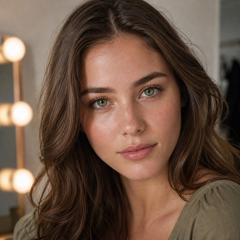
When I edit a colored-contact wardrobe, I do not begin by asking which shade is objectively best. I ask what the color needs to do in the finished image. Should it create a cool focal point, stay close to an earth-toned palette, or add a less expected botanical accent? That is the useful way to compare Yilala’s Illusory colored contacts, because Illusory Blue, Illusory Brown, and Illusory Green share the same core product format while offering three distinct creative directions.
The product is Yilala model HE1102, listed in HEMA+NVP with a 14.2 mm diameter, 8.6 mm base curve, and 38% water content. The available powers run from plano, or 0.00, through -4.50, with the exact steps shown on the product page. The listing gives a six-month replacement period after opening and one pair per pack. Those specifications are the shared foundation; color is the editorial decision layered on top.
I am comparing the range as a brand editor, not reporting a personal wear test. I have not put these lenses on, measured comfort, or verified a result on every iris color and lighting setup. Color contacts can look different according to natural eye color, pupil size, light direction, camera processing, makeup, and screen settings. I therefore treat each shade name as a visual brief, not a guarantee of an exact on-eye result.
My short answer: choose the role before the color
My quickest edit is this: I would shortlist Illusory Blue when the eye should read as the coolest and most obviously transformed element; Illusory Brown when I want the lens to cooperate with warm neutrals and a lower-contrast beauty story; and Illusory Green when I want a color statement that feels earthy but still unusual. That is a styling hierarchy, not a claim that one lens will appear brighter, larger, or more natural on every wearer.
If you are comparing blue brown green colored contact lenses on a phone screen, resist choosing from the swatch alone. First decide whether your reference look is cool, warm, or mixed. Then review the lens against the complete palette: hair, brows, complexion products, clothing, backdrop, and expected light. The most polished choice is usually the one that belongs to the whole composition.
The shared Illusory Series specification
Before separating the colors, I keep the product facts in one place. This prevents a shade preference from being mistaken for a fit decision. All three options appear under the same HE1102 listing, but only an eye-care professional can determine whether the stated parameters and a selected power are appropriate for an individual eye.
| Variant | Editorial color direction | Shared model | Shared listed specifications | Best starting palette |
|---|---|---|---|---|
| Illusory Blue | Cool, transformation-forward | HE1102 | HEMA+NVP; 14.2 mm; BC 8.6 mm; 38% water; plano to -4.50; six months after opening | Silver, charcoal, navy, icy pink, crisp white |
| Illusory Brown | Warm, tonal, quietly defined | HE1102 | HEMA+NVP; 14.2 mm; BC 8.6 mm; 38% water; plano to -4.50; six months after opening | Caramel, bronze, cream, chocolate, muted peach |
| Illusory Green | Earthy, distinctive, balanced between warm and cool | HE1102 | HEMA+NVP; 14.2 mm; BC 8.6 mm; 38% water; plano to -4.50; six months after opening | Olive, moss, copper, plum, antique gold |
This is my only variant table because the real comparison is visual, while the physical specification is shared. Diameter is not the same as the printed-color diameter, and the listing does not provide a separate graphic diameter. I would not infer an enlargement effect from 14.2 mm alone. Likewise, a 38% water figure and a HEMA+NVP material description are specifications, not proof that a lens will feel a particular way for a particular person.
Illusory Blue: the cool focal-point edit
Blue is my first direction when the concept depends on a visible shift away from a warm or neutral palette. In a fashion image, blue can become the point around which silver jewelry, charcoal liner, denim, navy tailoring, or pale reflective textures are organized. I would use it deliberately: if every other element is also loud, the eye color can lose its authority. One controlled cool note often looks more premium than five competing ones.
For makeup, I would begin with taupe, cool brown, graphite, soft black, or a restrained rose rather than automatically matching the lid to the lens. Blue-on-blue can work for a stylized editorial, but it needs separation in depth and finish. A matte navy liner beside a brighter iris impression, for example, creates structure without asking two similar blues to blend into one block. Our colored contacts makeup guide develops this full-face approach.
On naturally dark eyes, the final effect may depend heavily on the lens print, iris underneath, and lighting. I would review daylight, indoor ambient light, and direct camera light rather than approving the choice from one flash image. For a more focused decision process, see our guide to blue colored contacts for dark eyes. It explains why opacity, pattern, contrast, and light matter more than the color name by itself.
I would place Illusory Blue first for fantasy styling, futuristic beauty, winter palettes, and character concepts that explicitly require a cool-eyed read. I would place it lower for an understated no-makeup brief unless the rest of the styling intentionally bridges the color change. The aim is coherence, not invisibility.
Illusory Brown: the tonal, versatile edit
Brown is my tonal choice. It can connect naturally with brunette hair, warm brows, bronzer, caramel textiles, tortoiseshell accessories, and cream or chocolate clothing. That does not mean Illusory Brown is certain to look natural on every eye. It means the color family offers the easiest route to a warm, integrated palette because brown already appears throughout many beauty and wardrobe stories.
Illusory Brown is also the option I would compare first with someone’s everyday references. Look at the brow tone, preferred jewelry, typical lip colors, and the environments in which the lenses are intended to appear. Warm restaurant lighting, office LEDs, and window daylight may each shift the perceived balance. Our article on colored contacts for brown eyes is the more useful next read when the natural iris is brown and the goal is controlled change rather than a generic shade recommendation.
I would rank this variant first for soft glamour, neutral wardrobes, vintage-inspired beauty, and portraits where eye color should support the face rather than dominate it. I would not call it the safest or most natural choice without seeing the wearer’s prescription, fit, iris, and intended conditions. Visually versatile and medically appropriate are separate questions.
Illusory Green: the cultivated statement
Green sits in the most interesting middle position for me. It can relate to warm materials, copper, antique gold, terracotta, and still hold its own beside cooler plum, charcoal, or forest tones. That makes green fashion contacts especially useful when a creative brief needs color but blue feels too icy and brown feels too familiar.
Green can also be sensitive to surrounding color. Yellow light may make a green direction feel warmer, while cool daylight can emphasize a different aspect of the palette. Camera white balance and post-processing add another variable. I would photograph a neutral reference card or an unfiltered close-up before deciding whether a styling adjustment is needed. That is not a test of medical fit; it is simply disciplined color evaluation.
I would rank Illusory Green first for woodland fantasy, romantic gothic, copper-led beauty, festival styling, and portraits that need an unexpected but not strictly icy color story. It is my bridge option: more chromatic than brown, less conventionally cool than blue, and capable of moving warmer or cooler through adjacent styling.
How I choose for dark or brown eyes without overpromising
I use a three-frame review: one image facing a window, one in ordinary indoor light, and one at the actual distance expected for the final use. I avoid beauty filters, automatic eye enhancement, and aggressive sharpening. A close-up is valuable for checking the graphic transition, while a head-and-shoulders frame reveals whether the color belongs to the full face. Our guide to making colored contacts look natural in photos explains this camera-aware process in more detail.
The word “natural” also needs a defined target. It may mean believable in daylight, harmonious with makeup, subtle at conversational distance, or simply less costume-coded. I ask for that target before choosing. For believable warmth, I begin with Brown; for a cool transformation that still needs integration, Blue; for an earthy but distinctive accent, Green. Then I validate the artistic direction in the intended lighting rather than promising a universal outcome.
Plano and prescription colored contacts: what the range means
The Illusory listing offers 0.00 and minus powers through -4.50, including -1.00 and quarter-diopter steps across much of the displayed range. Availability on a product menu does not tell you which power to order. A contact-lens prescription includes more than the power printed on a glasses prescription, and contact-lens fit needs professional evaluation. Do not convert or copy a spectacle prescription on your own.
Plano lenses change appearance without providing distance correction, but they are still contact lenses and therefore medical devices in the United States. The FDA’s guidance on decorative contact lenses says decorative lenses require a prescription and warns against buying them without examination and fitting by an eye-care professional. Our FDA compliance overview adds Yilala-specific context, while the product page remains the source for the currently listed variant and power menu.
If your two eyes require different powers, confirm packaging and ordering details before checkout rather than assuming one pair can be mixed. The listing states one pair per pack but does not, on the information reviewed for this guide, describe a custom split-power pair. I would resolve that operational question with the seller and verify the prescription with the prescriber.
What I do, and do not, infer from the specifications
A diameter of 14.2 mm describes the lens, but it does not by itself describe how wide the printed color appears. A base curve of 8.6 mm is a product parameter, not a universal fit. HEMA+NVP identifies the listed material formulation, and 38% is the listed water content; neither lets me promise comfort, breathability, hydration, or wear time for an individual. Those outcomes depend on fit, ocular health, care, environment, and professional guidance.
The listing says six months after opening. I treat that as an outer replacement schedule, not permission to wear the lenses continuously or to keep using a damaged, contaminated, painful, or visually compromised lens. Follow the product instructions and the schedule your eye-care professional gives you, and discard sooner whenever those instructions require it. Never sleep in, swim in, or shower in lenses unless a qualified professional and the specific product instructions explicitly permit the relevant use.
This distinction is central to premium product writing: specifications deserve precision, while experience claims require evidence. I can compare color logic and report the listing. I cannot turn a material name into a personal comfort testimonial or convert a replacement period into a recommended daily wearing duration.
Safety is part of the selection, not fine print
No color result is worth bypassing professional fitting, hygiene, or symptoms. The FDA’s page on contact-lens risks describes problems including infection, corneal abrasion, and corneal ulcer and advises removing lenses and contacting an eye-care professional when symptoms occur. The CDC’s contact-lens guidance likewise emphasizes that contact lenses are medical devices and that improper wear, cleaning, and storage can increase the risk of eye infection.
I would wash and thoroughly dry hands before handling lenses, use fresh recommended contact-lens solution, keep lenses away from water, and never share them. A lens case also needs cleaning and regular replacement according to professional and solution instructions. If there is redness, pain, light sensitivity, discharge, swelling, or blurred vision, remove the lenses and seek prompt professional advice; urgent symptoms need urgent care.
Product certification language is not a substitute for a prescription, a valid fit, proper care, or individual clinical advice. “FDA registered” also should not be read as a blanket promise that every use is safe or that the FDA endorses a particular cosmetic result. Review documentation carefully and use our FDA compliance page as a starting point for the brand’s compliance information.
My final comparison
If I were editing three looks from the same series, I would give each a clear assignment. Illusory Blue would lead the cool, high-intent transformation. Illusory Brown would carry the warm, tonal portrait. Illusory Green would anchor the earthy, less expected fashion story. Because the model and listed dimensions are shared, the creative choice can stay focused on palette, after prescription and fit have been addressed professionally.
My best buying advice is therefore not “pick the prettiest swatch.” Choose the visual role, audit the full palette, inspect unfiltered references in relevant light, and confirm the medical details independently. That process makes the decision both more sophisticated and more honest. Explore the current variants and power menu on the Illusory Series product page, then use the supporting guides above to refine the look.
Frequently asked questions
1. What colors are available in the Illusory Series?
The HE1102 product listing shows three variants: Illusory Blue, Illusory Brown, and Illusory Green. I treat them as cool, warm-tonal, and earthy statement directions respectively, while recognizing that the final appearance varies with the natural iris, light, and styling.
2. Are Illusory colored contacts available with prescription power?
The product menu lists plano 0.00 and minus powers from -1.00 through -4.50, with quarter-diopter steps across the displayed minus range. Choose only the power and lens parameters prescribed for you by an eye-care professional; do not substitute a glasses prescription.
3. Which Illusory shade is best for dark brown eyes?
There is no universal winner. I would begin with Blue for the coolest transformation, Brown for tonal warmth, or Green for an earthy color statement, then examine unfiltered examples in lighting similar to your own. Our guides for blue contacts on dark eyes and contacts for brown eyes offer a more detailed framework.
4. Which shade looks the most natural?
“Natural” depends on the wearer and the viewing conditions. Brown is my first editorial shortlist for a warm, integrated palette, but I cannot promise it will be the most natural-looking on every iris. Pattern transition, contrast, makeup, pupil size, and light all influence the result.
5. What are the diameter, base curve, material, and water content?
The product listing states a 14.2 mm diameter, 8.6 mm base curve, HEMA+NVP material, and 38% water content for model HE1102. These are specifications, not a self-fitting guide or a guarantee of comfort.
6. Can I wear the Illusory Series for six months?
The listing gives a replacement cycle of six months after opening. That is not continuous-wear permission or a daily wear-time recommendation. Follow the supplied instructions and your eye-care professional’s schedule, care for the lenses correctly, and replace them earlier if instructed or if their condition requires it.
7. Do I need a prescription for plano decorative contacts?
Yes in the United States. The FDA states that decorative contact lenses are medical devices and require a prescription, even when they do not correct vision. A professional examination and fitting help determine whether a lens is appropriate for your eyes.
8. What should I do if the lenses cause redness, pain, or blurred vision?
Remove them immediately and contact an eye-care professional. Do not put them back in while symptoms continue. Pain, marked redness, light sensitivity, discharge, swelling, or vision changes can require prompt or urgent evaluation.