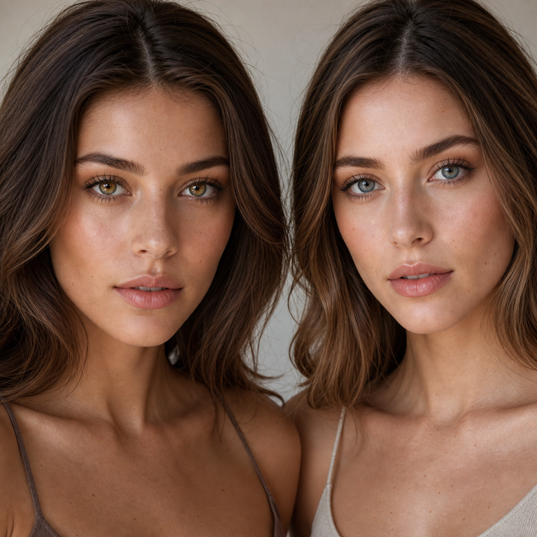
Olive Brown is my warmer, more grounded choice in Yilala’s Olive Series, while Olive Blue is my cooler, more contrast-led choice. If I am building a palette around camel, bronze, cream, rust, or warm neutrals, I shortlist Olive Brown first. If the palette leans toward navy, charcoal, silver, denim, or cool neutrals, I begin with Olive Blue. That is a color-direction decision, not a promise about how either lens will appear on a particular eye. Natural iris color, pupil size, lighting, camera settings, makeup, and lens position can all change the visible effect.
Both are color options on the same Olive Series colored contact lenses listing, model HC1419. The current product panel gives both options the same headline specifications: HEMA+NVP material, 14.2 mm diameter, 8.6 mm base curve, 38% water content, powers from 0.00 to -4.50, and a stated replacement point of six months after opening. My short answer is therefore simple: choose Brown or Blue by palette and styling intent only after an eye care professional confirms the exact product, measurements, prescription, and care plan are appropriate for you.
Olive Brown vs Olive Blue at a Glance
| Decision point | Olive Brown | Olive Blue |
|---|---|---|
| Color direction | Warm, earthy, brown-led olive | Cool, blue-led olive |
| Wardrobe starting point | Camel, chocolate, cream, rust, warm khaki | Navy, charcoal, denim, slate, cool white |
| Metal reference | Gold, bronze, copper | Silver, pewter, cool mixed metals |
| Makeup planning prompt | Terracotta, warm taupe, bronze | Mauve, graphite, cool taupe |
| Question to ask | Do I want the eye color to stay within an earthy palette? | Do I want a cooler accent within the overall look? |
| Shared listed specifications | Model HC1419; HEMA+NVP; 14.2 mm diameter; 8.6 mm base curve; 38% water; 0.00 to -4.50; listing states six months after opening | |
| What the listing cannot decide | Whether the lens is medically suitable, correctly fitted, or visually right for your individual eyes | |
I use this table as a shortlist tool, not a substitute for the product images, package labeling, or a professional fitting. The brown-versus-blue distinction is useful for creative direction. The shared numbers are useful for identifying the product. Neither set of information independently establishes suitability.
How I Read the Olive Color Family
“Olive” is not one fixed color. In fashion and beauty catalogs, it usually sits between green, brown, gray, and sometimes blue. The neighboring hue determines the character of the palette. Olive Brown pulls the idea toward soil, bark, leather, tobacco, and sun-warmed khaki. Olive Blue pulls it toward mineral green, stormy teal, weathered denim, and cool slate. I treat those references as styling vocabulary rather than a literal forecast of the color on an eye.
This distinction matters because product names compress a complicated visual into two words. A shopper may read “brown” and expect a conventional brown, or read “blue” and expect a bright primary blue. The Olive Series naming instead suggests that each option belongs to one related family. I compare the variants against each other first, then against the clothing, makeup, hair color, and lighting planned for the look. I do not infer coverage, edge definition, apparent size, or a final on-eye shade from the names.
The third listed option, Olive Grey, is useful as a reference point even when the choice is only Brown versus Blue. I see it as the neutral branch of the trio. Shoppers who find Brown too warm in concept and Blue too cool in concept can review Olive Grey on the same product page. For a broader browse, Yilala’s Natural Look Lenses collection places the Olive listing beside other restrained color families.
When I Put Olive Brown First
I put Olive Brown at the top of the shortlist when the rest of the look already speaks a warm language. That can mean a camel coat, cream knit, chocolate liner, bronze jewelry, peach blush, rust fabric, or tortoiseshell accessories. The practical goal is continuity. Every element belongs to a related family, so the contacts are not being asked to carry the entire concept.
For a soft daytime editorial, I might map the palette on paper as cream, tan, olive, and muted copper. For an evening concept, I might deepen that map to espresso, antique gold, forest, and black. I have not worn or tested Olive Brown, and I do not present catalog photographs as proof of what another person will see.
Olive Brown can also be the simpler candidate when a shopper wants to explore color without moving the whole wardrobe into cool territory. “Simpler” here refers only to color coordination. It does not mean easier to fit, safer, or more suitable. If brown-led options are the main interest, I also compare the related Earl Series, which currently lists Earl Brown and Earl Grey, and the Muse Series, which lists Brown, Grey, and Coffee variants. Those pages help define the catalog context without making the products interchangeable.
When I Put Olive Blue First
I shortlist Olive Blue when the concept needs a cooler color cue. Navy tailoring, washed denim, charcoal knitwear, graphite liner, mauve shadow, silver jewelry, and cool white fabric give me a coherent starting board. Blue-led olive can also make sense in a character design or fashion story built around water, ice, stone, steel, or twilight, provided the wearer has the required prescription and fitting.
My method is to decide whether the eye color should repeat an existing cool note or introduce one controlled counterpoint. Repetition might pair the variant with navy clothing and silver accessories. A counterpoint might place it against warm beige while keeping the rest of the styling quiet. In both cases, I keep expectations conditional because photographs can differ with white balance, exposure, editing, screen calibration, and surrounding colors.
Blue is often the more directional word in the pair, but directional does not mean more visible on every iris. The listing does not supply enough individualized information to predict that. If I want more catalog references before choosing, I review the Nova Series and Thai Series from Yilala’s wider assortment. The purpose is to sharpen color preference, not to bypass a fitting or assume products with similar headline dimensions behave identically.
What the Shared Specifications Do and Do Not Tell Me
The current Olive Series panel identifies model HC1419 and lists HEMA+NVP, a 14.2 mm diameter, an 8.6 mm base curve, and 38% water content. It offers plano 0.00 and minus powers from -1.00 through -4.50 in the displayed options, with quarter-step increments after -1.00. The listing also says six months after opening. I record these details because they prevent a color comparison from drifting into vague language.
Yet a specification match on a screen is not a clinical fit. Diameter and base curve are only part of lens selection. An eye care professional evaluates the eyes, places trial lenses when appropriate, checks movement and position, assesses vision, and gives wear and care instructions. The FDA’s colored contact lens guidance explains that decorative lenses are not one size fits all and that an eye doctor must measure each eye and evaluate its response to lens wear.
The same caution applies within one series. Olive Brown and Olive Blue share the specifications shown in the primary panel, but shared specs do not guarantee the same fit, comfort, or visual result for an individual wearer. Color variants should not be treated as medically interchangeable solely because their displayed numbers match. Confirm the exact brand, model, parameters, color, and power on the prescription and packaging with the prescriber and seller.
I also separate a power value from a complete contact lens prescription. Choosing 0.00 only means selecting the plano option shown; it does not remove the need for an examination and prescription. The FDA states that decorative contacts are medical devices and are not one-size-fits-all. Its consumer guidance on colored and decorative contact lenses says a valid prescription includes the brand name, lens measurements, and an expiration date.
My Three-Step Color Decision
First, I define the temperature of the complete look without considering the contacts. I place clothing swatches, makeup references, jewelry, and the expected setting into warm, cool, or balanced groups. If warm dominates, Brown earns the first review. If cool dominates, Blue does. If the board is balanced, I decide whether the contacts should blend into the palette or create the one cooler or warmer accent.
Second, I compare official product images under the same viewing conditions. I use one screen, turn off aggressive display filters, and avoid comparing one image in bright daylight with another under a warm indoor lamp. This does not make the screen color authoritative, but it removes some avoidable noise. I also check whether every image clearly identifies the variant rather than assuming its filename, placement, or background tells me the color.
Third, I pause the aesthetic decision until the clinical details are resolved. I bring the exact Olive Series model HC1419 information to a licensed eye care professional. If the prescribed brand, model, measurements, or available power do not align, I do not force the purchase because the palette works. Medical suitability outranks styling preference.
This process is deliberately conservative. It lets me offer a useful catalog comparison without pretending that a remote editor can determine what belongs on someone’s eyes. Shoppers can return to Yilala’s home page to compare the broader catalog, but every candidate still needs its own prescription and professional guidance.
Prescription, Fitting, and Buying in the United States
In the United States, colored contacts require a prescription even when they provide no vision correction. The FDA’s decorative contact lens guidance explicitly includes colored and fashion lenses and advises getting an eye exam, a proper fit, a prescription, and follow-up care. I would not use a seller category, a “plano” label, or a familiar diameter as a replacement for those steps.
A legitimate comparison therefore includes more than selecting Olive Brown or Olive Blue from a dropdown. Check that the prescription is current and written for the exact lens being ordered. Confirm each eye’s required power rather than assuming both eyes match. Review the sealed package when it arrives and make sure the model, color, power, and expiration information correspond to the order. Do not use a package that is open, damaged, leaking, or inconsistent with what was prescribed. Ask the prescriber or seller about any discrepancy before insertion.
I also avoid translating the product page’s “Certification: FDA” line into a broader claim. Regulatory terms such as registration, clearance, and approval are not interchangeable. A catalog article cannot verify a specific device status from a short marketing field alone. US shoppers should use the current prescription, package labeling, seller information, and qualified professional guidance to verify the exact product.
Care for a Reusable Lens Listing
The Olive Series listing says six months after opening. I treat that as the outside replacement statement on the listing, not permission to wear the lenses continuously, sleep in them, or ignore an earlier replacement schedule from an eye care professional. Calendar replacement and daily wear time are different concepts. Follow the prescriber’s instructions and the package directions, and discard a lens sooner whenever those directions require it.
For reusable soft lenses, the CDC’s cleaning, disinfecting, and storage guidance advises rubbing and rinsing as directed, using fresh contact lens solution every time, and never topping off old solution. Clean the case with fresh solution rather than water, empty it, dry it with a clean tissue, and store it upside down with the caps off. Use only the care system recommended for the prescribed lens.
Water does not belong in the routine. The National Eye Institute’s contact lens guidance says not to clean or store contacts in water and to remove them before showering, swimming, bathing, or entering a hot tub. Wash and dry hands before handling lenses. Never use saliva. Do not share lenses, cases, or solution.
Remove the lenses and contact an eye doctor if there is pain, redness, light sensitivity, sudden blurry vision, unusual tearing, or discharge. Those symptoms are not a styling problem to troubleshoot with a different shade. The NEI advises removing contacts and calling an eye doctor if symptoms persist or worsen. Keep backup glasses available so there is no pressure to continue wearing a lens when something feels wrong.
Common Comparison Mistakes I Avoid
The first mistake is choosing from the color name alone. “Olive Brown” and “Olive Blue” establish direction, but they do not establish a precise digital color value or a fixed appearance. I look at labeled product images, note the lighting, and keep any expectation provisional.
The second is using another person’s photo as a forecast. Customer images can provide styling inspiration, but they cannot establish fit or appearance for a new wearer.
The third is assuming shared specifications erase the difference between variants or products. Even inside HC1419, verify the exact color and package details. Across series, do not assume a 14.2 mm diameter and 8.6 mm base curve make one design a substitute for another. A professional fit is product-specific.
The fourth is letting the stated six-month period overshadow daily hygiene. A reusable replacement horizon creates more care obligations, not fewer. Fresh solution, clean hands, a maintained case, no water exposure, and adherence to the prescribed schedule remain central from the first opening until disposal.
The fifth is treating a fashion decision as an urgent purchase. If the prescription, power, product identity, or care system is uncertain, wait. Brown and Blue will still be color options after the clinical questions are answered.
My Final Take
My catalog choice is Olive Brown for a warm, earthy, integrated palette and Olive Blue for a cool, blue-green accent. Neither is the universal pick, and the shared HC1419 specifications do not settle the visual decision or the medical one. The useful order is palette first for the shortlist, professional prescription and fitting for eligibility, then careful verification of the exact package and care instructions.
If both directions work with the wardrobe, I would compare them beside the same neutral clothing swatch and decide which one supports the intended story. I would not buy both merely to experiment unless both exact variants are covered by professional guidance. Start with the live Olive Series listing, confirm current availability and labeling, and let an eye care professional make the decisions a catalog cannot.
Frequently Asked Questions
What is the main difference between Olive Brown and Olive Blue?
The useful catalog difference is color direction: Olive Brown is the warmer, earthier option, while Olive Blue is the cooler, blue-led option. That naming distinction helps with wardrobe and makeup planning, but it does not predict the exact appearance on an individual eye.
Do Olive Brown and Olive Blue have the same listed specifications?
Yes. The current primary panel lists both under model HC1419 with HEMA+NVP material, 14.2 mm diameter, 8.6 mm base curve, 38% water content, powers from 0.00 to -4.50, and six months after opening. Verify the exact package and prescription because shared displayed specs do not establish individual suitability.
Which color should I choose for a warm wardrobe?
I would shortlist Olive Brown first with camel, cream, chocolate, rust, bronze, and warm khaki. Treat that as color coordination guidance only. Review the labeled product images under consistent viewing conditions before deciding.
Which color should I choose for a cool wardrobe?
I would begin with Olive Blue alongside navy, charcoal, denim, slate, silver, or cool white. It can repeat an existing cool note or serve as one controlled accent, but the final visible effect varies by person and setting.
Do I need a prescription for 0.00 colored contacts?
Yes in the United States. Plano 0.00 indicates no corrective power, but decorative colored contacts are still prescription medical devices. Get an eye exam, a product-specific fitting, and a valid prescription from a licensed eye care professional.
Can I use my eyeglass prescription to order these lenses?
Do not assume so. A contact lens prescription includes product and fitting information beyond a glasses prescription. Ask your eye care professional to prescribe the exact brand, model, measurements, and power appropriate for each eye.
Does six months after opening mean I can wear them every day for six months?
No. It is the replacement statement shown on the listing, not a continuous-wear instruction or a universal personal schedule. Follow the package labeling and your eye care professional’s limits for daily wear, cleaning, storage, and earlier disposal.
What should I do if my eyes become red or painful?
Remove the lenses and contact an eye doctor. Seek prompt professional advice for pain, redness, light sensitivity, sudden blurred vision, unusual tearing, or discharge. Do not reinsert the lenses to compare the color or try to solve symptoms with solution alone.