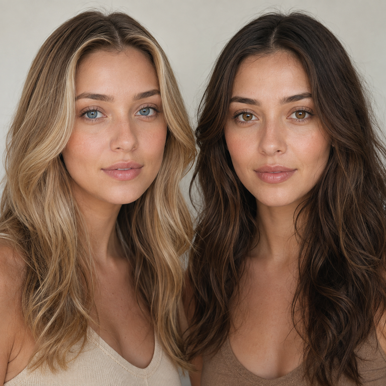
My short answer: I narrow Thai Blue versus Thai Brown by deciding what the finished frame needs to do. I shortlist Thai Blue when the catalog image needs a cooler color cue that stays visible beside restrained makeup and simple clothing. I shortlist Thai Brown when the frame needs a quieter brown cue that can sit inside a tonal beauty story. That is an art-direction choice, not a prediction of how either lens will look on your eyes.
I make that call from the live Yilala Thai Series listing, then compare the two product images at the same crop and under the same viewing conditions. The listing identifies both Thai Blue and Thai Brown as model HE1100 in the same series, with HEMA+NVP material, 14.2 mm diameter, 8.6 mm base curve, 38% water content, powers from 0.00 to -4.50, and a listed replacement period of six months after opening. Those shared details make the page easier to compare, but they do not prove equal fit, comfort, color effect, or appearance on any individual.
In the United States, colored contacts are prescription medical devices even when the selected power is 0.00. The FDA says decorative lenses require a prescription, and a proper contact-lens fitting matters. I treat the color decision as the last creative step, after an eye care professional has confirmed the prescribed brand and lens specifications. A catalog comparison cannot replace that exam or authorize a switch between lens products.
What I am actually comparing
I am comparing two named variants on one current product page, not two promises about a wearer result. Names such as “Blue” and “Brown” are useful catalog labels. They do not tell me undertone, opacity, coverage, enlargement, limbal-ring definition, or what the lens will do over dark irises. A product photograph can help me organize a mood board, but it cannot settle those questions for a particular eye.
That boundary changes the way I edit. I do not zoom into a promotional image and translate pixels into medical or performance claims. Camera white balance, retouching, display calibration, crop size, ambient light, makeup, and the model’s own eyes can all influence what I see. Instead, I ask a narrower question: which variant gives the planned image a more useful color direction in the assets available to me?
If you are still deciding between cosmetic categories rather than these two variants, start with Yilala’s colored contacts buying guide and the complete guide to colored contact lenses. I use those broader pages to separate prescription, occasion, and care decisions from the visual edit.
Thai Blue vs Thai Brown at a glance
| Decision point | Thai Blue | Thai Brown |
|---|---|---|
| Catalog role I test first | A clearly cool-labeled accent in a controlled frame | A brown-labeled accent in a tonal frame |
| First wardrobe board | Black, charcoal, white, denim, or one deliberate cool accent | Camel, cream, chocolate, navy, or muted earth colors |
| First makeup test | Neutral base with one cool or graphic detail | Neutral base with soft brown framing |
| Image-control method | Same crop, exposure, white balance, and screen | Same crop, exposure, white balance, and screen |
| What the name does not establish | Undertone, opacity, coverage, enlargement, ring, fit, comfort, or wearer result | Undertone, opacity, coverage, enlargement, ring, fit, comfort, or wearer result |
| Listed series data | HE1100; HEMA+NVP; 14.2 mm; BC 8.6 mm; 38% water; 0.00 to -4.50; six months after opening | |
The table is a shortlist tool, not a scorecard. Neither side wins on the shared specifications, and I do not assign personality or suitability to a color name. If both directions work with the campaign brief, I keep both until I can review standardized assets and confirm that the prescribed product is available in the required power.
My same-size crop method
I begin with the live product gallery rather than screenshots collected from social posts. I save or open the Thai Blue and Thai Brown catalog assets side by side, set both to the same pixel dimensions, and match the eye-area crop as closely as the source files allow. One image does not get a larger iris, tighter crop, or brighter screen position. Those small presentation differences can make one option seem more prominent before color has done any work.
Next, I check the full face, a medium crop, and the close crop in that order. The full face tells me whether the named color competes with hair, clothing, and makeup. The medium crop shows how the eye sits in the portrait. The close crop is useful for production notes, but I do not let it dominate the decision. Most people will encounter a finished campaign image at a smaller size than a product-page magnification.
I also give each file a plain label: THAI BLUE, THAI BROWN, source URL, and review date. That sounds fussy, but it prevents a mood-board thumbnail from losing its context. If the source image changes, I can return to the current listing rather than treating an old crop as permanent evidence.
Lighting checks before I choose
My first pass uses a neutral display, moderate screen brightness, and no night-shift filter. Then I review each crop against white, mid-gray, and near-black backgrounds. This is not an attempt to simulate eyes or real-world wear. It is a basic editorial check for how the supplied image behaves in common layouts.
I flag any comparison in which the two source images appear to use different exposure, white balance, catchlights, or retouching. If Thai Blue is shown in bright cool light and Thai Brown in softer warm light, I cannot honestly call every visible difference a variant difference. I can still use the images for separate creative directions, but I mark the comparison as non-equivalent.
For a campaign, I plan three controlled captures after fitting approval: neutral daylight, the actual key light for the shoot, and a phone-camera frame under ordinary indoor light. The same camera settings and lens-to-subject distance matter. Even then, the photographs document that specific production, model, and fitting. They do not establish a universal result for future customers.
How makeup changes my shortlist
I build makeup boards after the clean crop review, not before it. Heavy liner, colored shadow, lashes, brow contrast, and reflective highlight can change where the eye lands in the composition. If I choose a lens name while looking only at a finished glam image, I may really be choosing the makeup.
For Thai Blue, my first board is intentionally restrained: neutral complexion, controlled brow, simple liner, and either no shadow color or one cool accent used sparingly. The goal is to see whether the blue-labeled direction has a clear editorial job. I am not claiming the lens will read cool on a wearer. I am testing whether the catalog direction supports a cool-led layout.
For Thai Brown, I start with soft brown framing and a limited tonal palette. Then I make a second board with a crisp black liner so the choice is not trapped in an all-brown concept. Again, this says nothing about blending, coverage, or a natural result. It tells me whether the brown-labeled variant gives the art team a coherent route.
If makeup is the main event, I often reduce the lens decision to support rather than contrast. If the eye-color cue is the story, I simplify the makeup. That single hierarchy decision usually removes more indecision than adding another collage of references.
Wardrobe and background: the tie-breakers
Clothing is my fastest tie-breaker because it occupies more of the frame than the iris. I test Thai Blue references beside black, charcoal, white, washed denim, and one saturated blue item. I test Thai Brown references beside cream, camel, chocolate, navy, and muted olive. These are starting boards, not color rules or undertone prescriptions.
I remove any swatch that makes the frame feel like a costume unless costume is the brief. Matching every element to “blue” or “brown” can flatten the image. A neutral coat, clean neckline, and one repeated accent are often enough to make the lens choice legible without turning the entire portrait into a color theme.
Background color deserves the same check. A blue set can make Thai Blue feel either integrated or lost in the supplied image, while a warm set can shift the overall read of Thai Brown. Because digital displays differ, I send the final board with hex values, lighting references, and the unedited source link. The photographer and retoucher then know which decisions are fixed and which remain provisional.
A five-pass shortlist I can defend
Pass one: prescription gate. I confirm that the shopper or model has a current contact-lens prescription and that the eye care professional has approved the exact lens product or a lawful ordering path. A glasses prescription is not a substitute for a contact-lens prescription. If that gate is not complete, the styling exercise stays hypothetical.
Pass two: listing check. I verify the variant names, model, material, diameter, base curve, water content, power choice, and replacement wording on the current Thai Series page. I do not borrow a specification from another series merely because the storefront layout looks similar.
Pass three: neutral image review. I compare same-size crops before adding campaign styling. I note differences in source lighting and framing. If the assets are not equivalent, I say so rather than manufacturing certainty.
Pass four: one-variable boards. I change one major factor at a time: makeup, wardrobe, then background. This shows whether my preference is really about the lens label or about the surrounding styling.
Pass five: practical decision. I choose the variant whose catalog direction solves the brief with fewer supporting tricks. If both remain viable, the choice goes back to the approved prescription, available power, and the production palette. If neither solves it, I widen the edit rather than forcing an answer. The Nova Series product page, Muse Series product page, and Olive Series product page are reasonable catalog branches to review, but each is a separate product that needs its own professional fitting decision.
What the shared Thai Series specifications mean
The live primary listing groups Thai Blue and Thai Brown under model HE1100 and lists HEMA+NVP, 14.2 mm diameter, 8.6 mm base curve, 38% water content, 0.00 through -4.50 powers, and six months after opening. I record these details because they help prevent ordering errors and keep the comparison tied to the correct page.
I do not convert them into claims the listing cannot support. A shared diameter and base curve do not guarantee fit. A shared material and water percentage do not guarantee comfort. A shared series name does not guarantee identical appearance, and a six-month-after-opening label is not permission to wear lenses for six continuous months. Actual wear, cleaning, storage, replacement, and follow-up instructions must come from the labeling and eye care professional.
The power menu also needs care. Select 0.00 only when that is what the valid prescription specifies for this product. Negative powers on a menu are not an invitation to copy numbers from eyeglasses or an older contact-lens box. In the US, a complete contact-lens prescription identifies more than refractive power and is issued after fitting.
The safety line I will not edit around
The FDA states that all contact lenses, including decorative lenses, must be prescribed by a doctor. It also warns that an incorrect fit or improper use can lead to corneal abrasion, infection, decreased vision, and other serious harm. The CDC likewise says colored or decorative contacts require a prescription and proper fitting, and that improper care raises the risk of infection and complications.
Before handling lenses, wash hands with soap and water and dry them completely. Keep contacts away from water, including showers and swimming. Use the contact-lens disinfecting solution recommended for the prescribed lenses, never water or saliva, and do not top off old solution. Do not sleep in lenses unless an eye care professional has explicitly directed it for that lens. Never share lenses.
The product listing’s six-month period begins after opening, but the prescribed replacement plan and package directions control. Replace the case as advised, keep backup glasses available, and attend follow-up visits. Remove the lenses and contact an eye care professional promptly if there is redness, pain, discharge, blurred or decreased vision, light sensitivity, or persistent discomfort. Urgent symptoms should not wait for a styling project or customer-service reply.
For Yilala’s own site context, I also review the colored contact safety guide and FDA compliance page. Those pages provide brand and shopping context; the official FDA and CDC pages below remain the public-health references for US prescription, fitting, and care guidance.
My final editor’s choice rule
I choose Thai Blue when the brief specifically benefits from a blue-labeled focal cue and the rest of the frame can stay disciplined. I choose Thai Brown when a brown-labeled cue fits the tonal wardrobe and makeup plan with less visual explanation. I do not call either one more natural, more opaque, more enlarging, or more comfortable because the available names and catalog images do not establish those outcomes.
If the two boards are still tied, I stop judging enlarged eye crops. I place each medium portrait into the real deliverable: mobile product tile, campaign banner, email header, or social crop. The version that communicates the planned color story at the final display size gets the editorial vote, provided the exact product has been professionally fitted and prescribed.
That approach keeps the choice useful and honest. It gives Thai Blue and Thai Brown distinct creative jobs without inventing physiology from a product name. It also leaves room for the only wearer-specific answer that matters: what the prescribed lens does on the individual eye under professional supervision.
Frequently asked questions
Is Thai Blue or Thai Brown the better choice?
Neither is universally better. I shortlist Thai Blue for a blue-led editorial direction and Thai Brown for a brown-led tonal direction, then test both in the actual crop, lighting plan, makeup, and wardrobe. Fit, comfort, and wearer appearance require professional evaluation and cannot be decided from the names.
Do Thai Blue and Thai Brown have the same specifications?
The live Thai Series listing places both under model HE1100 and lists HEMA+NVP, 14.2 mm diameter, 8.6 mm base curve, 38% water, 0.00 to -4.50, and six months after opening. Shared listed data does not guarantee the same fit, comfort, or appearance.
Will Thai Blue show on dark eyes?
I cannot predict that from the name or catalog image. Dark-eye appearance depends on the prescribed product, the individual eye, lighting, camera, and other factors. Ask the eye care professional about an approved trial or fitting rather than treating a promotional image as a result guarantee.
Does Thai Brown look natural?
“Natural” is subjective, and the variant name does not prove a wearer result. I can assess whether the supplied Thai Brown image fits a restrained campaign board, but I will not infer blending, opacity, coverage, ring definition, or a natural effect on someone’s eyes.
Can I order 0.00 without a prescription?
Not lawfully in the US. Plano 0.00 decorative contacts are still contact lenses and require a valid contact-lens prescription and proper fitting. The prescriber should confirm the exact product and measurements rather than relying on a glasses prescription or a previous order.
Does the 8.6 mm base curve mean the lenses will fit me?
No. A listed base curve is product information, not proof of fit. An eye care professional evaluates the eye, the complete lens design, movement, vision, and response on the eye. The same printed base curve across products does not make them interchangeable.
Can I wear Thai Series lenses for six months continuously?
No. “Six months after opening” is a replacement-period statement, not continuous-wear permission. Follow the package labeling and the schedule from the eye care professional, remove and disinfect lenses as directed, and never sleep in them unless specifically prescribed for overnight wear.
What should I do if a lens hurts or my eye turns red?
Remove the lens and contact an eye care professional promptly. Pain, ongoing redness, discharge, light sensitivity, or reduced vision can signal a serious problem and needs timely clinical attention. Do not reinsert the lens, rinse it with water, or wait for a photo shoot to finish.
Official Sources
- FDA: Decorative Contact Lenses for Halloween and More
- FDA: Contact Lens Prescription
- CDC: About Decorative Contact Lenses
- CDC: Preventing Eye Infections When Wearing Contacts
Ready to compare the two catalog options? Return to the Thai Series product page, review Thai Blue and Thai Brown at equal size, and have an eye care professional confirm the exact prescribed lens before ordering.