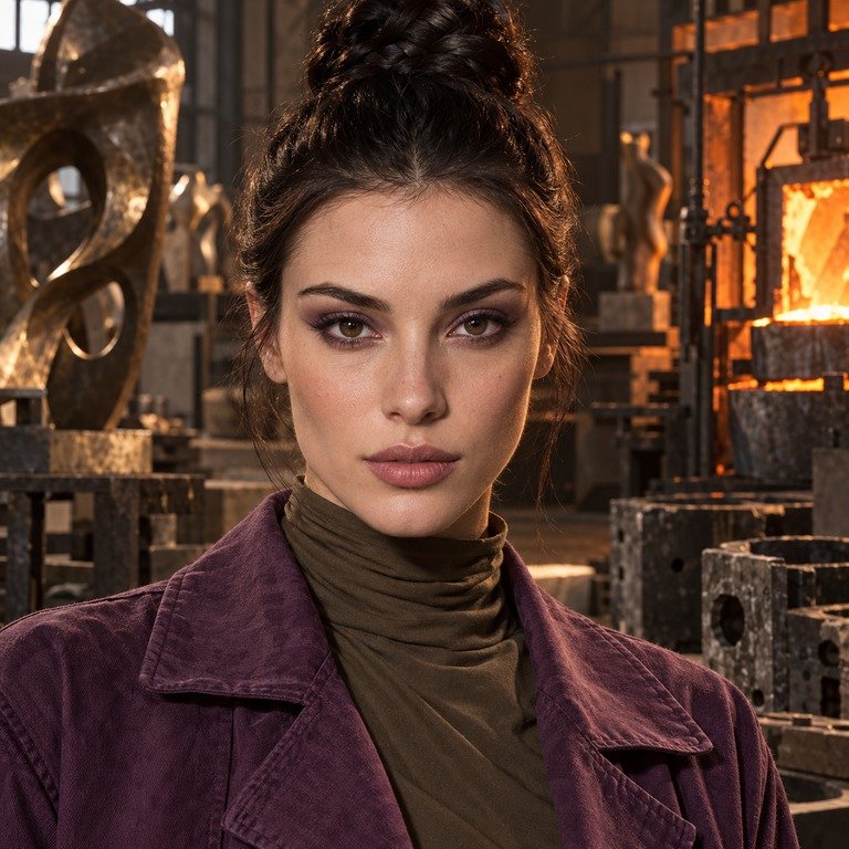
When I compare INYX Purple with Olive Brown for our US catalog, I don’t begin by pretending the color names tell the whole story. I begin with the decision the shopper is actually making: whether a purple-labeled design or a brown-labeled design fits the wardrobe, makeup, lighting, and overall visual direction they have in mind. My short answer is that INYX Purple is the more color-directed shortlist for a cool or deliberately unconventional styling plan, while Olive Brown is the more earth-toned shortlist for a warm, neutral, or softly coordinated plan. Those are styling categories, not promises about the exact hue, opacity, edge definition, or appearance on any individual eye.
For US readers, there is a second answer that comes before color: decorative colored contacts are medical devices and require a valid prescription and proper professional fitting, even when no vision correction is needed. The FDA’s decorative contact lens guidance explains why buying by appearance alone is not enough. I use the catalog comparison below to organize a visual shortlist, not to replace an eye exam, prescription, current product labeling, or fitting verification.
The comparison in one clear view
From an editorial desk, I would separate these two by styling intent before looking for small specification differences. The live INYX Series product page presents INYX Purple within one series, while the live Olive Series product page presents Olive Brown within another. That matters because a shared material or nominal diameter does not turn two separate designs into visual equivalents. It only tells me that several labeled technical fields currently overlap.
| Editorial question | INYX Purple | Olive Brown |
|---|---|---|
| Primary catalog cue | Purple-named option in the INYX Series | Brown-named option in the Olive Series |
| Styling lane I would explore first | Cool palettes, silver-toned accents, graphic makeup, or an intentional color contrast | Warm neutrals, bronze or gold accents, tonal dressing, or an earthy palette |
| What the name does not prove | Exact purple family, brightness, saturation, opacity, ring, or on-eye result | Exact brown family, warmth, depth, opacity, ring, or on-eye result |
| Current shared summary | HEMA+NVP, 14.2 mm current summary, 8.6 mm base curve, 38% water, powers commonly 0.00 to -4.50, generally labeled six months after opening | HEMA+NVP, 14.2 mm, 8.6 mm base curve, 38% water, powers commonly 0.00 to -4.50, generally labeled six months after opening |
| Next verification | Confirm the current SKU, sealed package, prescription, and professional fitting | Confirm the current SKU, sealed package, prescription, and professional fitting |
The table is intentionally conservative. I can use the names and current catalog organization to discuss styling direction, but I won’t invent a lavender, plum, violet, chocolate, amber, olive, or hazel result that the live listing does not state. Product photography can also shift with screen settings, editing, ambient light, and camera exposure. A color name is a useful filing label, not a calibrated swatch.
How I read INYX Purple as a catalog choice
INYX Purple enters my edit as the more deliberate color statement because “Purple” is the variant name attached to it. That still leaves a wide range of possible purple directions, so I keep my language at the level the listing supports. I don’t label it cool violet, smoky mauve, bright grape, or muted plum unless the current product information says so. I also don’t infer an exact printed ring, pattern density, or degree of color change from a thumbnail.
For styling, I would first place INYX Purple beside cool and high-contrast references: charcoal tailoring, denim, black knitwear, silver jewelry, berry-toned lipstick, or a clean graphic liner. This isn’t a rule that those items must be used together. It is a practical way to build a mood board around a color-directed accessory. A purple-named contact can either harmonize with nearby cool colors or act as the single unexpected note in a neutral outfit.
The INYX Series catalog guide gives useful series context, and the comparison of INYX Pink versus INYX Purple shows how I separate two named color directions without treating either name as a guarantee of an exact on-eye shade. That same editorial restraint applies here. I can compare the styling language around a product, but only the current listing, sealed packaging, and qualified fitting professional can confirm the actual item and whether it is appropriate for a particular prescription.
There is also a specification conflict worth pausing over. The current INYX summary lists 14.2 mm, while legacy or longer-description material has shown 14.5 mm. I would not silently choose whichever number suits a comparison. I would use the current 14.2 mm SKU summary for catalog work, disclose the 14.5 mm legacy conflict, then advise the shopper to verify the exact current SKU, sealed package label, and professional fitting before ordering or using the lenses. Diameter is a medical-device parameter, not a styling detail to resolve from an old paragraph.
How I read Olive Brown as a catalog choice
Olive Brown enters my edit as the more earth-toned option because “Brown” is part of the listed variant name and “Olive” is the series name. I keep those two pieces distinct. The wording does not authorize me to claim a precise green-brown blend, a golden undertone, a hazel transformation, or any specific effect on dark or light irises. It simply gives me a brown-led catalog direction inside the Olive Series.
My first styling board would use warm and grounded references: cream, camel, rust, chocolate, olive clothing, softly brushed brows, bronze details, or gold-toned jewelry. Olive Brown could also sit in a minimalist wardrobe where texture does more work than color. Linen, suede, matte knits, and softly structured outerwear all give a brown-labeled accessory a coherent setting without forcing a literal head-to-toe color match.
The Olive Series catalog guide is the right internal reference for that family. I would also use the broader brown colored contacts guide for styling vocabulary, while keeping one limit in view: a broad guide cannot establish the exact tone, opacity, edge, or appearance of this SKU. Editorial context helps a shopper ask sharper questions; it does not substitute for current product information.
Why matching specifications do not settle the decision
The current summaries place both options in HEMA+NVP material with a 14.2 mm diameter, 8.6 mm base curve, and 38% water content. Listed powers commonly run from 0.00 to -4.50, and the products are generally labeled for six months after opening. Those numbers are useful for identifying what is being listed. They are not a shortcut to deciding that the two products will fit identically, feel identical, provide equal coverage, or create the same visual result.
That distinction is especially important in this comparison because INYX has the 14.2 mm current-summary versus 14.5 mm legacy-description conflict. I treat 14.2 mm as the working current catalog value, not as permission to ignore the discrepancy. The sealed package and current SKU details should agree with the prescription and the fitting professional’s verification. If they do not, the shopper should stop and resolve the mismatch with the seller and eye care professional rather than assuming an older description is close enough.
A base curve and diameter are part of a device specification, but equal numbers on two pages do not prove an equal fit for one person. The FDA notes that decorative contacts still require a prescription, and the Yilala eye exam guide explains the role of the exam and fitting in the shopping process. My editorial comparison starts after that professional step, not instead of it.
The same caution applies to the six-month label. It is a replacement schedule statement, not permission to keep a lens for six months regardless of its condition, care history, prescription instructions, or package directions. The six-month disposable colored contacts guide offers more context, but the current package and professional instructions remain the controlling references for the actual pair.
My styling decision framework
I make this comparison easier by starting with the look, not with an imagined eye result. First, I identify the palette already doing the work. If the outfit and makeup are cool, monochrome, graphic, or built around silver, INYX Purple belongs on the first mood board. If they are warm, earthy, tonal, or built around gold and brown, Olive Brown belongs on the first mood board. A mixed palette can go either way, so I then decide whether the contact color should harmonize or create contrast.
Second, I check the visual hierarchy. In that situation, I would simplify the styling around the contacts, whichever name I select. For a quieter outfit, I may give the color label more room by repeating its direction once, perhaps through jewelry metal, a scarf, a lip family, or a small garment detail.
Third, I compare catalog imagery under the same viewing conditions. I use the same screen, similar brightness, and the largest current product images available. I look for consistency across the product page, series guide, and any current detail photographs. If color rendering varies, I record the variation instead of choosing the most dramatic image as the truth. Screens cannot provide an exact physical color match, and edited campaign images should never overrule labeled SKU information.
Finally, I separate the style decision from the medical decision. The style decision is Purple versus Brown as a palette direction. The medical decision covers the valid prescription, fitting, current parameters, package integrity, care instructions, and professional approval. A strong mood board cannot fix a device mismatch, and a matching specification line cannot tell me which color direction belongs in a particular outfit.
Lighting, photography, and makeup planning
For INYX Purple, I would create two reference boards: one tonal and one contrast-led. The tonal board could use charcoal, black, blue, silver, and restrained berry accents. The contrast board could test cream, taupe, or a warm lip so the purple label remains the unusual note. I would avoid naming the lens undertone before the current listing provides one. The purpose of the board is to test relationships between colors, not to predict a wearer-specific outcome.
For Olive Brown, I would also create two boards. One could stay warm with camel, cream, olive fabric, bronze, and softly defined makeup. The other could introduce cooler tailoring or a crisp white shirt so the brown direction is not surrounded by similar tones. This keeps Olive Brown from being treated as a single “natural” formula. Natural-looking is subjective, and the product name cannot establish how a printed design will interact with every iris, pupil, light source, or camera.
US prescription, fitting, and care boundaries
In the United States, plano decorative contacts are not ordinary fashion accessories. The FDA classifies decorative contact lenses as medical devices, and a valid prescription is required. A seller should request prescription information rather than letting a shopper bypass the process. The right sequence is an eye exam, a prescription that includes the needed contact-lens details, professional fitting, purchase from a lawful source, and verification that the received package matches the prescribed product.
Purchasing rules also sit outside the color comparison. The FDA’s decorative contact lens guidance emphasizes having a prescription and buying from a seller that requires it. I would match the order, prescription, and package rather than treating a similar-looking catalog option as interchangeable.
Symptoms outrank the styling plan. FDA guidance says to remove decorative contacts and call an eye doctor if there is redness, ongoing pain, or discharge. I would also treat a sudden vision change or marked light sensitivity as a reason for prompt professional care. Don’t wait for an event, photo session, or return window to pass.
The National Eye Institute’s healthy vision guidance also emphasizes clean hands, correct disinfection, regular replacement, and eye exams. For me, those official instructions set the boundary of any catalog article. I can organize Purple versus Brown as a visual choice, but I cannot turn editorial taste into medical clearance.
What I would verify before choosing either listing
I would first check that the product page is current and that the exact variant is selected, not merely shown in a lifestyle image. Next, I would compare the listing with the prescription and sealed package label, including series name, color name, power, base curve, diameter, lot information, and expiration date. For INYX, I would explicitly flag the 14.2 mm current listing and 14.5 mm legacy-copy conflict for professional verification rather than assuming one is a harmless typo.
I would also inspect the package for intact seals and readable labeling. If the current SKU, prescription, order confirmation, and box do not align, the safe editorial answer is not “close enough.” It is to pause and ask the seller and prescriber to resolve the discrepancy. The same principle applies if a power range shown online does not include the prescribed value. A catalog range is not an invitation to select a nearby power.
Only after those checks would I return to the wardrobe question. INYX Purple earns the shortlist when the styling goal is cool, contrast-led, or intentionally color-directed. Olive Brown earns it when the goal is warm, tonal, earthy, or restrained. If neither current product page gives enough visual or technical information, I would keep shopping rather than filling the gaps with guesses.
Official Sources
- FDA: Decorative Contact Lenses for US prescription, fitting, purchasing, and risk guidance.
- FDA: Types of Contact Lenses for contact-lens categories and tint terminology.
- National Eye Institute: Keep Your Eyes Healthy for eye exams and contact-lens hygiene basics.
Frequently Asked Questions
Is INYX Purple better than Olive Brown?
Neither is universally better. I would shortlist INYX Purple for a purple-led, cool, or contrast-focused styling plan and Olive Brown for a brown-led, warm, tonal, or earthy plan. The final purchase still depends on a valid prescription, proper fitting, current SKU details, and sealed-package verification.
Can I buy either color without vision correction?
Plano power does not remove the prescription requirement in the United States. Decorative contacts are medical devices, so you still need a valid prescription and professional fitting even if the selected power is 0.00.
Do the shared specifications mean the two lenses fit the same?
No. Shared labels such as HEMA+NVP, 14.2 mm, 8.6 mm base curve, and 38% water do not prove equal fit, comfort, coverage, or visual results. Your prescriber should verify the exact lens and current package against your fitted prescription.
Which one looks more natural on dark eyes?
The names alone cannot answer that. I won’t infer opacity, ring design, enlargement, coverage, or dark-eye appearance from “Purple,” “Olive,” or “Brown.” Review current imagery as catalog context, then rely on the exact product information and professional fitting rather than a name-based prediction.
What diameter is currently listed for INYX Purple?
The current INYX summary is 14.2 mm, but legacy or longer-description material has shown 14.5 mm. Check the selected current SKU, sealed package, prescription, and fitting professional’s records before treating either number as applicable to your order.
How long can these contacts be used after opening?
They are generally labeled for six months after opening, but that is not a blanket promise that every opened lens remains usable for the full period. Follow the current package, care instructions, replacement schedule, and your eye care professional’s direction, and discard a lens when instructed.
Can I use water to rinse or store colored contacts?
No. Follow the prescribed contact-lens solution and care system rather than using water. Don’t rinse or store lenses in tap, bottled, distilled, lake, pool, or shower water, and ask your eye care professional if the care instructions are unclear.
What should someone do if their eyes become red or painful?
Remove the contacts and contact an eye care professional promptly, especially with worsening pain, light sensitivity, sudden blurry vision, unusual watering, or discharge. Don’t put the lenses back in until a qualified professional tells you it is appropriate.
My final editorial choice
I would choose between these listings by deciding which color direction the styling needs. INYX Purple belongs on the first board when I want a cool, contrast-led, or clearly color-directed accent. Olive Brown belongs there when I want a warm, earthy, tonal, or quietly coordinated accent. I would not claim an exact shade or wearer-specific result for either based on the name.
Before any order, I would verify the live listing, valid prescription, professional fitting, selected power, current SKU, and sealed package. I would give special attention to the INYX diameter discrepancy: 14.2 mm in the current summary versus 14.5 mm in legacy material. Once those device details are resolved, the comparison can return to where an editor is useful: building a thoughtful Purple or Brown styling story without asking the catalog to prove more than it actually says.