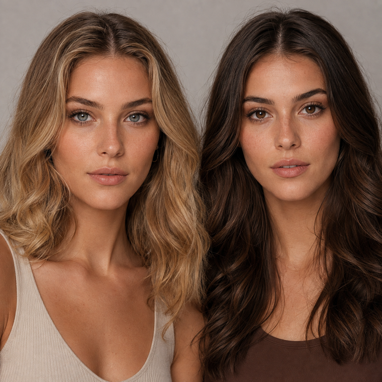
My short answer: choose Earl Grey when your concept needs a cooler, quieter eye-color cue that can support silver jewelry, charcoal tailoring, blue-based makeup, or a crisp monochrome frame; choose Earl Brown when you want the eye detail to sit more easily beside camel, cream, bronze, tortoiseshell, or other warm wardrobe notes. If both palettes appear in your closet, I would shortlist both from the same Earl Series page and compare matched catalog crops before deciding. Color direction is an editorial choice, while suitability is a professional fitting decision.
I make this distinction as a Yilala brand editor working from product information and catalog imagery. I am not describing a personal wear test, and I do not turn a photograph into a promise about what anyone will see in the mirror. Cameras, screens, lighting, makeup, styling, and a person’s own eyes can all change the impression. My job here is narrower: to show how I organize a fair Earl Grey vs Earl Brown comparison, identify the shared specifications, and help you arrive at a more coherent shortlist without pretending a color name can answer a medical or fit question.
Earl Grey vs Earl Brown at a glance
Both options are variants of Yilala’s Earl Series Colored Contact Lenses, model HE1104. The current primary listing gives both colors the same core data: HEMA+NVP material, 14.2 mm diameter, 8.6 mm base curve, 38% water content, powers from 0.00 through -4.50, and a stated replacement point of six months after opening. I use those listing values rather than conflicting claims that may appear in lower-page promotional copy.
| Decision point | Earl Grey | Earl Brown |
|---|---|---|
| Editorial color family | Grey, useful in cooler or neutral visual stories | Brown, useful in warmer or tonal visual stories |
| Wardrobe starting point | Charcoal, navy, black, optic white, cool denim | Camel, cream, chocolate, olive, warm denim |
| Makeup starting point | Taupe, slate, cool rose, restrained silver | Bronze, cocoa, peach, muted gold |
| Shared model and specifications | HE1104; HEMA+NVP; 14.2 mm diameter; 8.6 mm base curve; 38% water; 0.00 to -4.50; six months after opening | |
| What the name cannot decide | Prescription, fit, care routine, or the final appearance for an individual | |
The table is a styling map, not a performance ranking. I would not call grey more dramatic or brown more natural without controlled, person-specific evidence. I also would not infer fit from diameter and base curve alone. Two colors sharing the same published specifications does not guarantee the same fit, comfort, or visual result for a particular person. In the United States, even plano decorative lenses require a valid prescription and professional fitting.
How I read the two color names
I treat “Grey” and “Brown” as catalog coordinates. They tell me which direction to investigate, not exactly how the finished result will behave. A grey label points my edit toward cooler neutrals. A brown label points it toward earth tones. That first division is useful because it reduces a broad choice to two art directions, but it is still only the beginning.
For Earl Grey, I build a reference board with charcoal knitwear, black satin, washed blue denim, white shirting, pewter accessories, and cool rose cosmetics. I look for whether the lens image belongs naturally in that group. For Earl Brown, I use oatmeal, camel, chocolate leather, olive cloth, warm ivory, bronze, and peach. This is not a rule that locks either option into a season. It is a way to test visual relationships with materials you may already own.
If your wardrobe is mixed, choose the outfit first. A person who owns mostly black may still prefer Earl Brown when the intended look includes a cognac bag and bronze lid. Someone wearing a tan coat may prefer Earl Grey when the rest of the frame is icy blue and silver. I choose for the complete image, not from a generic warm-versus-cool personality quiz.
For broader color planning, I would keep Yilala’s guide to choosing a colored contact color open beside the product tab. If the real question is simply whether brown or gray better serves the wardrobe, the brown vs gray colored contacts comparison provides another useful editorial frame. Neither replaces the live product listing or advice from an eye care professional.
My catalog-image comparison method
Catalog images are most useful when I remove avoidable comparison errors. I download or open the clearest Earl Grey and Earl Brown product images, then view them at the same size. I crop to the same eye area, keep equal space around the iris, and avoid comparing a close portrait with a distant face shot. A larger crop can make detail appear more prominent even when the product is unchanged.
Next, I compare images under similar apparent lighting. I do not place a bright, front-lit grey image beside a shadowed brown image and call the difference a property of the lenses. I look for highlights in the eye, direction of facial shadows, white balance in the skin and sclera, and any signs that one image has stronger contrast or saturation. If those conditions differ, I label the comparison inconclusive and look for another pair of images.
I also neutralize the page around the pictures. A warm beige browser background can influence how grey reads; a cool white background can shift the impression of brown. Placing same-size crops against the same neutral field makes the choice less vulnerable to surrounding color. I check on more than one calibrated or reasonably neutral screen when available, because display settings and night modes can alter the palette.
Finally, I write observations in modest language: “this image reads cooler beside charcoal” or “this brown image connects with bronze in this frame.” I do not convert those observations into claims about opacity, coverage, enlargement, a limbal ring, undertones, dark-eye outcomes, or customer results. Product photography can guide a shortlist, but it cannot reproduce an individual fitting or predict a personal result.
Lighting is part of the styling brief
Before choosing a color, I ask where the finished look will be seen. Daylight by a window, warm restaurant light, office LEDs, stage lighting, flash photography, and a phone camera are different environments. My preferred shade for an editorial board can change when the destination changes, even though the lens has not.
For a daytime wardrobe story, I compare both variants in catalog images that appear softly and evenly lit. I avoid making the decision from a single heavily graded social crop. For an evening concept, I test each color’s relationship with the intended makeup and clothing under a lamp close to the venue’s color temperature. This exercise is about palette harmony, not simulating the lens on an eye.
Makeup choices that keep the comparison fair
Makeup can either connect the lens color to the face or compete with it. When comparing the two Earl variants, I begin with the same makeup intensity on both reference boards. A bare-eye grey crop should not be judged against a brown crop surrounded by deep liner, large lashes, and metallic shadow. That would test two complete looks, not two color directions.
I pay close attention to the brow and lip because they can dominate a comparison. If one board has a very warm brow product and the other has a neutral brow, the lens choice may be getting credit for a difference created elsewhere. I repeat the same idea with blush and lip color: hold them constant first, then explore alternatives after selecting a direction. Yilala’s makeup tips for colored contacts can help organize that broader look.
Cosmetics and lens handling should remain separate tasks. I wash and dry my hands as directed before touching lenses, and I follow the sequence supplied by the eye care professional and product instructions. Styling does not justify improvising with hygiene, solution, wear time, or a prescribed care plan.
Wardrobe and occasion: my practical tie-breakers
When both color families work, I use wardrobe repetition as the first tie-breaker. Pull five outfits you expect to wear in the next month. Photograph them in similar light, reduce each to its main color blocks, and count which lens board has more convincing connections. Earl Grey may have an editorial advantage in a rotation built around navy, graphite, cool denim, and silver. Earl Brown may connect more readily to cream, camel, olive, chocolate, and gold.
For everyday visual planning, I also reference Yilala’s everyday colored contacts guide. For a formal event board, the colored contacts for weddings guide offers occasion-specific questions. These links support the styling process; the prescription and fitting still come first.
What the shared specifications do and do not tell me
The current primary Earl listing identifies model HE1104 and lists HEMA+NVP, 14.2 mm diameter, 8.6 mm base curve, and 38% water content for the series. It offers 0.00 and minus powers from -1.00 through -4.50 in quarter-step increments after -1.00. The page states six months after opening. I record those facts exactly because a comparison is only useful when both variants are tied to the correct live listing.
I do not use those numbers to prescribe a lens. Diameter and base curve are not a self-fitting shortcut, and an eyeglass prescription is not automatically a contact lens prescription. A contact lens prescription includes lens-specific information determined by a licensed eye care professional. If your required brand, measurements, or power are not available, the responsible response is not to choose the closest menu option.
I also treat the six-month statement as an outer replacement point from the product listing, not permission to wear the lenses for six uninterrupted months or to ignore a professional’s shorter schedule. The opening date should be recorded, and lenses should be discarded earlier whenever the eye care professional, product instructions, condition of the lens, or symptoms require it. Yilala’s six-month vs daily and monthly guide explains why replacement format is a separate decision from color.
If HE1104 is not prescribed for you, I would pause the color decision. The FDA states that decorative contact lenses are medical devices, are not one size fits all, and require a prescription that includes the brand name and lens measurements. Its consumer guidance on colored and decorative lenses is direct on this point. The FDA’s decorative contact lens safety page also advises an eye exam, proper fit, a prescription, and following care directions.
My US safety gate before any color choice
For a US reader, I put a four-part gate ahead of checkout: current eye examination, valid contact lens prescription, confirmation that the exact brand and lens measurements match that prescription, and a care plan explained by the eye care professional. Plano 0.00 changes the optical power, not the legal or medical status of a decorative contact lens.
I then check the handling routine. The CDC advises washing hands with soap and water and drying them completely before handling lenses, keeping lenses away from water, avoiding sleep in lenses unless directed by an eye care provider, using recommended disinfecting solution, and replacing the case at least every three months. Its contact lens infection prevention guidance is a useful pre-purchase checklist.
For reusable lenses, cleaning and storage are not optional background details. The CDC says to rub and rinse reusable lenses with fresh solution, avoid topping off old solution, clean the case with solution rather than water, and let the case dry upside down with the caps off. Saline does not disinfect lenses. The full steps appear in the CDC’s cleaning, disinfecting, and storage guidance. Follow the eye care provider’s directions and the solution system’s label, especially for hydrogen peroxide systems.
Remove the lenses and contact an eye care professional if you have redness, pain, decreased or blurred vision, discharge, light sensitivity, or other concerning symptoms. Do not share lenses. Do not expose them to shower, pool, hot-tub, or tap water. Do not use decorative lenses obtained from a seller that bypasses prescription verification.
A five-step shortlist I would use
- Confirm eligibility first. Ask a licensed eye care professional whether the exact Earl Series model and available parameters are appropriate for your prescription and fitting. Stop if they are not.
- Define one real use case. Name the outfit, occasion, likely light, makeup level, and viewing distance. “I want a change” is too broad to produce a disciplined color choice.
- Build matched boards. Use same-size Earl Grey and Earl Brown catalog crops with equal surrounding space. Pair each with the same outfit image before testing alternate makeup or accessories.
- Choose the relationship. Decide whether you want palette continuity or deliberate contrast. Grey is my cooler starting coordinate; brown is my warmer one. Neither label predicts a personal result.
- Keep uncertainty visible. If photography does not support a confident distinction, say so. Revisit the live Earl Series guide, compare other approved choices, or wait for professional guidance rather than inventing certainty.
If neither Earl color serves the concept, I compare the wardrobe board with another series rather than bending the brief. The Muse Series product page and Olive Series product page are two catalog alternatives, but each product requires its own live-specification check and professional prescription match.
Frequently asked questions
Is Earl Grey cooler than Earl Brown?
I use Earl Grey as the cooler editorial starting point and Earl Brown as the warmer one because those are their stated color families. I still compare matched product images and the complete outfit. The names alone do not prove a precise undertone or predict an individual’s result.
Which Earl color should I choose for an everyday wardrobe?
I would count the colors repeated across five frequently worn outfits. Grey may coordinate more easily with charcoal, navy, black, cool denim, and silver; brown may coordinate more easily with cream, camel, chocolate, olive, and gold. Choose only after confirming the exact lens through a valid prescription and fitting.
Can I judge the two colors from different product photos?
You can shortlist from them, but the comparison is weaker if crop size, light, camera processing, makeup, or pose differs. I prefer same-size crops, similar apparent lighting, a neutral background, and notes that distinguish image observations from product facts.
Do Earl Grey and Earl Brown have the same specifications?
The current primary Earl Series listing presents both under model HE1104 with HEMA+NVP, 14.2 mm diameter, 8.6 mm base curve, 38% water, powers from 0.00 to -4.50, and six months after opening. Shared specifications do not guarantee fit, comfort, or visual result.
Can I order 0.00 Earl lenses without an eye exam?
Not responsibly in the United States. The FDA treats decorative contacts as prescription medical devices even when they do not correct vision. A licensed eye care professional should examine and measure your eyes, prescribe the exact lens, and provide fitting and care directions.
Does six months mean I can wear the same pair every day for six months?
No. It is the listing’s stated replacement point after opening, not a continuous-wear schedule or a promise that every pair remains usable until that date. Follow the schedule from your eye care professional and product instructions, record the opening date, and discard earlier when directed.
Can I clean reusable Earl lenses with water or saline?
Do not use water. The CDC says to keep contacts away from water and use the recommended disinfection system. Saline can rinse in some directed routines, but it does not disinfect. Follow your eye care professional and the solution manufacturer’s instructions exactly.
What should I do if my eyes become red or painful?
Remove the lenses and contact a licensed eye care professional promptly. Redness, persistent pain, decreased or blurred vision, discharge, or light sensitivity can signal a problem that should not be solved by changing color, solution, or wear time on your own.
My final edit
I would choose Earl Grey for a concept led by cool neutrals, silver, navy, slate, or crisp monochrome, and Earl Brown for one led by earth tones, gold, camel, cocoa, or cream. When the wardrobe combines both, I let the specific outfit, lighting plan, and makeup board decide. I compare only matched catalog images and keep photography-based observations separate from product facts.
The color decision comes after the safety decision. Verify the live HE1104 specifications, obtain a valid US contact lens prescription and professional fitting for the exact lens, follow the prescribed care routine, and accept that shared specifications cannot guarantee fit, comfort, or visual result. That is the clearest way I know to make an aesthetic choice without asking a color name to do a clinician’s job.