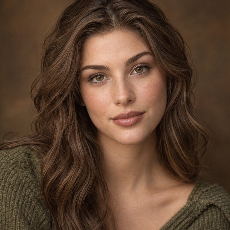
My direct answer: I shortlist Illusory Brown when a look needs a warm, polished brown reference that can sit easily with bronze, cream, camel, chocolate, or softly romantic styling. I shortlist Olive Brown when the brief is earthier, more textural, and more graphic, with khaki, linen, rust, tobacco, black, or botanical references. That comparison comes from Yilala’s current catalog imagery and styling briefs, not from personal wear or a promise about either lens on your eyes. In the United States, decorative colored contacts are medical devices that require a valid contact lens prescription and a proper fitting, including lenses selected in 0.00 plano power.
I approach this as a brand editor, not as a wearer reporting comfort or performance. I have not worn or tested either option. I compare the live listings, supplied images, collection context, and the visual role each brown can play in a wardrobe or makeup story. Natural iris color, pupil size, lighting, white balance, camera processing, screen settings, and the professionally assessed fit can all affect the eventual appearance. I therefore will not claim that one has greater opacity, a stronger limbal ring, more enlargement, better dark-eye coverage, or a more comfortable fit.
Illusory Brown and Olive Brown at a glance
| Comparison point | Illusory Brown | Olive Brown |
|---|---|---|
| My current catalog-image read | A warm brown-led direction presented with polished, dimensional fashion imagery | An earthy brown-led direction presented with a more grounded, patterned visual mood |
| Styling brief I would assign | Bronze, cream, camel, chocolate, warm rose, soft tailoring, luminous evening makeup | Khaki, rust, linen, tobacco, black, utility texture, botanical and autumn references |
| Series and model | Illusory Series, HE1102 | Olive Series, HC1419 |
| Current shared listed specifications | HEMA+NVP, 14.2 mm diameter, 8.6 mm base curve, 38% water, displayed 0.00 to -4.50 power range, six months after opening | HEMA+NVP, 14.2 mm diameter, 8.6 mm base curve, 38% water, displayed 0.00 to -4.50 power range, six months after opening |
| What the overlap does not prove | The same fit, comfort, centering, color coverage, apparent size, wearing time, or suitability for an individual eye | |
| Quick editorial choice | Choose the Illusory direction for a polished warm-neutral story | Choose the Olive direction for an earthy, textural story |
The table is a shortlist tool, not a clinical comparison. The two pages publish the same headline material and measurements, yet they are separate models. Similar numbers do not make HE1102 and HC1419 interchangeable. Verify the current SKU, sealed package label, color, power, measurements, expiration information, and prescription before ordering.
What the live catalog confirms
The Illusory Series product page identifies model HE1102 and currently groups Illusory Brown with Illusory Blue and Illusory Green. Its main panel lists HEMA+NVP, a 14.2 mm diameter, an 8.6 mm base curve, 38% water content, a displayed degree range of 0 to -4.5, and six months after opening. The visible selector shows 0.00 and selected minus powers from -1.00 through -4.50. The Olive Series product page identifies model HC1419, places Olive Brown beside Olive Blue and Olive Grey, and currently shows the same headline specifications and displayed power choices.
I record those details because they keep the comparison honest. Material, diameter, base curve, water percentage, power menu, and replacement wording are product facts. They are not shortcuts to an individual fit assessment. A 14.2 mm diameter does not reveal how either design will center on a particular cornea. An 8.6 mm base curve is one measurement, not a universal fit code. A 38% water figure does not support a claim about personal hydration or hours of comfort. HEMA+NVP does not let me infer that two different models will behave identically.
The displayed power menu also needs precise language. Both pages commonly show plano 0.00 and minus powers from -1.00 to -4.50, with quarter-step values after -1.00. That menu does not include every number between 0.00 and -4.50, and it does not show plus powers, cylinder and axis values for astigmatism, or multifocal additions. I would never round a prescription, copy an eyeglass prescription, or select the nearest available number. Yilala’s guide to reading a contact lens prescription is a useful orientation, but the prescribing eye care professional determines the exact lens.
How I read the current imagery without inventing an eye result
Product names can tempt an editor to fill in missing evidence. I resist that. I do not assume that “Illusory” means a stronger optical illusion, and I do not assume that “Olive” proves a visible green cast. Neither name establishes exact warmth, depth, opacity, ring definition, or performance on dark brown eyes. My visual notes refer only to the current catalog assets and the way those assets are styled.
In the current Illusory presentation, I read Illusory Brown as the warm brown branch of a fashion-led three-color family. The imagery supports a polished, dimensional, beauty-editorial mood. I would place the supplied reference beside bronze metal, cream satin, camel tailoring, cocoa knitwear, warm rose makeup, or a chocolate liner. I am describing the relationship among the page image and those styling materials. I am not saying the lens itself will display any exact chocolate, amber, caramel, or bronze shade once placed over an individual iris.
The Illusory Series color guide is useful when the decision is still inside HE1102. It gives Blue, Brown, and Green separate styling jobs while keeping their shared listed platform in view. Brown becomes the warm-neutral route in that collection context. If the planned look begins with cool silver, navy, or an explicitly green reference, I would revisit the other variants rather than force Brown to solve a different color brief.
Olive Brown’s current catalog treatment reads earthier and more structured to me. The creative direction makes sense beside washed linen, olive twill, rust cotton, dark leather, bronze hardware, houndstooth, dense knitwear, and warm off-white. The imagery also supports a more graphic styling board, one where a defined lash line, matte taupe, muted terracotta, or khaki clothing can carry some of the composition. These are observations about the page art and styling context. They do not establish a darker edge, a green undertone, or a certain pattern result on every wearer.
The Olive Series guide places Brown within a three-way choice that also includes Grey and Blue. I use that context to test the brief. If the goal is to remain in a brown-labeled color family, Brown stays on the board. If the concept calls for an explicitly grey or blue cue, the companion variants are more direct catalog references. Color labels organize the edit; they do not forecast what a camera or another person will see.
My styling edit for Illusory Brown
I would start an Illusory Brown board with polished warm neutrals. A cream blouse under a camel jacket, a chocolate slip dress, bronze earrings, or a warm taupe knit gives the brown label room to belong without making the entire outfit one note. For evening imagery, I might add a soft rose lip, a satin bronze lid, or a controlled espresso line. For daytime imagery, matte beige fabric, warm denim, tortoiseshell accessories, and a quieter cheek color would keep the story approachable.
Photography changes the decision. I would request neutral white balance, window and indoor setups, and both close and medium portrait crops. The medium crop shows whether the eye styling supports the face or dominates the image. I would not choose the most dramatic frame and call it the true color. A shift across assets shows that lighting and processing matter.
Illusory Brown is also my first shortlist when the word “brown” needs to connect several refined elements rather than signal outdoor texture. Think smooth leather rather than canvas, soft tailoring rather than utility wear, or a luminous makeup finish rather than a dry, heavily smoked eye. Those distinctions belong to my art direction. They are not restrictions on who may select the product, and they say nothing about medical suitability.
My styling edit for Olive Brown
For Olive Brown, I begin with texture. Linen, brushed cotton, suede, weathered leather, ribbed knitwear, and woven accessories give the collection’s earthy presentation a coherent setting. My palette might include khaki, camel, tobacco, rust, cream, espresso, and black. I would choose one or two of those references near the face, then simplify the rest so the portrait does not become a stack of competing earth tones.
Makeup can echo the mood without touching the lens. Matte taupe, muted apricot, terracotta, softly smoked brown, or a restrained khaki accent can support the board. Cosmetics, creams, powders, sprays, and tools should be handled according to the sequence your eye care professional recommends, with clean hands and no product transferred to the contact lens. Styling advice cannot correct poor hygiene or an unsuitable fit.
Olive Brown can bridge warm clothing and cooler dark details. A rust blouse with a black jacket or cream linen with charcoal liner creates contrast without abandoning the earthy brief. I would compare the current product image at consistent screen brightness and never treat a campaign photograph as a calibrated color sample.
How I break a tie between two brown options
First, I remove the lens names from the mood boards. One board contains smooth warm neutrals, polished metal, softly tailored shapes, and luminous beauty references. The other contains natural fibers, botanical color, darker graphic accents, and visible texture. If one board already resembles the shopper’s wardrobe or event concept, the catalog decision usually becomes easier: Illusory Brown for the polished warm-neutral board, Olive Brown for the earthy textural board.
Second, I check the light in which the look matters. A studio portrait, restaurant dinner, convention floor, outdoor ceremony, and office setting can render the same colors differently. I would not build a purchase around one ring-light close-up if the lenses are intended for ordinary indoor light. The broader natural brown colored contacts guide helps place other brown families around this decision without claiming that any option will look natural on every iris.
Third, I separate aesthetic preference from product eligibility. If an eye care professional fits and prescribes only one exact model, that decision settles the shortlist. If both exact models are professionally approved, I compare the current package information and imagery. If neither is approved, I choose neither. A close visual tie is never a reason to substitute one series for another.
Finally, I write one plain sentence explaining the choice: “Illusory Brown supports the polished bronze and cream styling board,” or “Olive Brown supports the khaki, linen, and rust styling board.” If that sentence predicts opacity, enlargement, comfort, or dark-eye coverage, I have overread the catalog.
Prescription, fitting, and US safety boundaries
The FDA’s decorative contact lens guidance says all contact lenses, including decorative lenses, must be prescribed by a doctor. It also says the prescription should include the brand name, correct lens measurements, and expiration date. That is why I would bring the exact HE1102 and HC1419 listings to an appointment rather than asking generally for brown contacts. Plano 0.00 changes the optical power choice; it does not remove the prescription requirement.
A proper fitting is more than comparing numbers on a screen. The National Eye Institute contact lens overview explains that an eye doctor uses trial lenses to assess fit and vision. This matters when two products share headline specifications. Neither a matching base curve nor a matching diameter proves equal centering, movement, vision, or response on the eye.
For reusable lenses, the six-month wording must be read narrowly. It is the catalog’s stated replacement period after opening, not permission to wear the contacts continuously, sleep in them, or keep a compromised lens until the calendar deadline. Record the opening date, follow the wearing schedule and care system prescribed for the exact lens, and replace it sooner if the professional or package directions require it. Yilala’s colored contact lens cleaning guide can support the routine, but it does not replace the instructions supplied with the lens or solution.
The CDC’s contact lens infection prevention guidance advises washing with soap and water and drying hands completely before handling lenses. It also says to keep contacts away from water, use recommended solution, avoid mixing old and fresh solution, and replace the case at least every three months. I would remove lenses before showering or swimming and avoid sleeping in them unless an eye care professional has specifically directed overnight wear for that exact lens.
If pain, marked redness, light sensitivity, discharge, swelling, or sudden blurred vision develops, remove the lenses and contact an eye care professional promptly. The MedlinePlus overview of corneal ulcers and infections notes contact lens use as a risk factor and advises prompt attention when infection symptoms, worsening pain, or affected vision occur. Do not switch from Illusory Brown to Olive Brown as a test, reinsert the lens for a photo, or wait for an event to end.
My final catalog recommendation
I would select Illusory Brown when the styling board is polished, warm, softly tailored, and built around cream, bronze, camel, warm rose, or chocolate. I would select Olive Brown when the board is earthy, tactile, and more graphic, with linen, khaki, rust, tobacco, black, or botanical references. That is the clearest distinction I can support from the current catalog and styling context.
Neither option receives an automatic technical advantage. The live pages currently overlap on HEMA+NVP, 14.2 mm diameter, 8.6 mm base curve, 38% water, the commonly displayed 0.00 to -4.50 power range, and six months after opening. Shared specifications do not prove shared fit, comfort, or visual behavior. Verify the current SKU and package, use the exact valid prescription, and let the professional fitting decide whether either model belongs on the final shortlist.
Once those checks are complete, review the Yilala color comparison archive or browse the natural-look lens collection for adjacent styling ideas. My CTA is simple: bring the two exact product links to your eye care professional, confirm which prescribed model is appropriate, then return to the current imagery and choose the visual story that fits your wardrobe.
Frequently asked questions
What is the main catalog difference between Illusory Brown and Olive Brown?
I use Illusory Brown for a polished warm-neutral brief and Olive Brown for an earthy, textural brief. That distinction comes from current catalog imagery and collection styling, not a promise about exact shade, warmth, opacity, ring definition, or the result on a particular iris.
Do Illusory Brown and Olive Brown list the same specifications?
The current pages list HEMA+NVP, 14.2 mm diameter, 8.6 mm base curve, 38% water, commonly displayed powers from 0.00 to -4.50, and six months after opening. They remain separate models, HE1102 and HC1419, so shared numbers do not make them interchangeable.
Which one will look more natural on dark brown eyes?
I cannot verify a universal answer from the catalog. Neither product name nor the shared measurements establish opacity, coverage, color blending, or visibility on dark irises. Natural eye color, pupil size, lighting, print design, centering, and camera processing can all change the impression.
Does 0.00 power mean I can buy either lens without a prescription?
No. In the United States, plano decorative contacts are still prescription medical devices. You need an eye exam, a valid contact lens prescription, a proper fitting, and a seller that handles prescription verification.
Can I switch between HE1102 and HC1419 if the base curve and diameter match?
Not on the strength of those two numbers alone. Ask the prescribing eye care professional whether each exact brand and model is appropriate. Different designs can share headline measurements while fitting, centering, or interacting with the eye differently.
Does six months after opening mean I can wear the contacts every day for six months?
No. It is the stated replacement ceiling after opening, not a continuous-wear promise or a personal daily schedule. Follow the professional and package instructions for wear, cleaning, storage, and earlier disposal when damage, contamination, or symptoms occur.
How should I choose between the two for a photo or event?
Start with the styling board and actual lighting. I would shortlist Illusory Brown for bronze, cream, camel, and polished warm neutrals; Olive Brown for khaki, rust, linen, tobacco, and stronger texture. Get the exact lens prescribed and fitted before the event, and do not treat a campaign photo as a reliable preview.
What should I do if a lens causes redness, pain, light sensitivity, discharge, or blurred vision?
Remove it and contact an eye care professional promptly. Do not reinsert it, try the other color, or wait for a styling commitment to finish. Keep the lens and packaging available if the professional asks to inspect them.