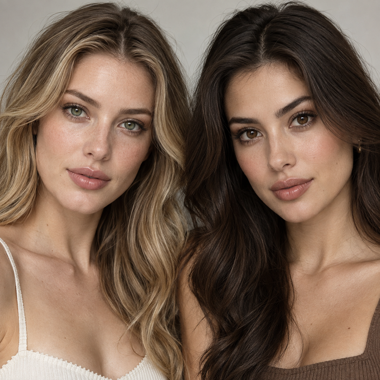
My short answer: choose Illusory Green when you want the cooler, more unusual color story to lead your styling; choose Illusory Brown when you want a warmer, more familiar neutral that connects easily with bronze, camel, cream, and chocolate. This is a catalog and styling comparison, not a report of personal lens wear. Both colors belong to the same Yilala Illusory Series Colored Contact Lenses listing, model HE1102, so the meaningful choice here is aesthetic direction rather than a difference in the published construction.
For US shoppers, color does not replace a contact-lens prescription or a professional fitting. The FDA says decorative contacts are medical devices, are not one size fits all, and require an eye exam and a valid prescription that includes the brand and lens measurements. That applies to plano 0.00 lenses as well as corrective powers. A listed 14.2 mm diameter and 8.6 mm base curve tell you what the product page specifies; they do not tell you that the lens is appropriate for your eyes. Ask a licensed eye-care professional to confirm the exact product and parameters before ordering, and use only a seller that verifies prescriptions. If Illusory Green or Brown is not prescribed for you, the styling comparison does not make it a suitable substitute.
The two options share HEMA+NVP material, 38% water content, a 14.2 mm diameter, an 8.6 mm base curve, listed powers from 0.00 to -4.50, and a stated replacement period of six months after opening. Shared numbers do not guarantee equal fit, comfort, or appearance, and they do not predict how either color will interact with an individual iris, lighting setup, camera, makeup, or wardrobe.
My Editorial Read of Illusory Green and Illusory Brown
I treat this as a cool-versus-warm styling decision. In the product gallery, Green introduces a more chromatic direction, while Brown stays closer to an earth-tone family. That distinction sounds simple, but it changes the rest of an outfit plan. Green can become the intentional color accent around which I edit clothing and makeup. Brown can function as the visual bridge among several warm neutrals without asking every other element to match it exactly.
I would not call either option universally subtle or dramatic. Those labels depend too heavily on the wearer, ambient light, white balance, viewing distance, and the colors around the face. Instead, I compare the product names and published imagery as design cues. Green points toward moss, olive, forest, sage, teal, charcoal, and cool metallic references. Brown points toward cocoa, espresso, caramel, terracotta, ivory, warm denim, and gold. Those are styling associations, not promises about what anyone will see after application.
If the choice still feels too narrow, I use the wider catalog to set context. Yilala groups this model under fashion contact lenses. Shoppers who want to compare it with softer wardrobe concepts can browse the natural-look lens category, while more character-led planning is easier to frame from the cosplay lens collection. Category names describe merchandising intent; they do not replace the advice on a prescription.
One Decision Table for the Two Color Stories
| Decision point | Illusory Green | Illusory Brown |
|---|---|---|
| Editorial direction | Cooler, more chromatic, less expected | Warmer, earthier, more neutral-led |
| Useful wardrobe families | Black, charcoal, navy, moss, sage, silver | Cream, camel, rust, chocolate, warm denim, gold |
| Makeup planning cue | Taupe, muted plum, cool brown, restrained silver | Bronze, peach, terracotta, warm brown, soft gold |
| Costume or character cue | Woodland, arcane, futuristic, sea-inspired | Vintage, grounded fantasy, western, autumnal |
| Choose it when | You want eye color to act as the deliberate accent | You want eye color to connect a warm tonal palette |
This table is a decision aid, not a result chart. It gives me a clean route from color name to styling plan while keeping the product specifications in their proper role. A base curve is not an aesthetic score, water content is not a style ranking, and a shared material does not erase individual fitting needs.
When I Would Build a Look Around Illusory Green
I would start with Green when the brief needs one cool focal idea. A black knit, charcoal jacket, or dark navy dress can provide a quiet base, while a moss accessory or muted silver detail repeats the color story without turning the outfit into a literal green theme. For spring, sage and stone keep the palette light. For fall, forest, oxblood, and weathered brown can make it more complex. The useful principle is repetition in small doses: one related wardrobe note is usually enough to make the choice feel intentional.
For makeup planning, I would keep the color relationships controlled. Taupe, mushroom, cool cocoa, and muted plum sit near Green without copying it. A clean black or deep brown liner can give structure, while silver-toned jewelry supports a cooler edit. I would avoid assuming that a green cosmetic near the eye must match the lens name. Exact matching can flatten a palette; neighboring shades often create a clearer editorial hierarchy.
Green also gives costume planning a recognizable prompt. A woodland character could use bark brown, fern, and textured linen. An arcane look could use ink, pewter, and violet. A futuristic concept could pair graphite with one electric accessory, leaving the lens option as part of a broader cool scheme. For additional character references, Yilala’s cosplay colored contacts guide is a useful internal route. I still separate costume concept from medical-device suitability: a compelling palette is not permission to skip a fitting.
Photography deserves its own note. Green fabric, colored LEDs, and aggressive post-processing can alter how a color is represented in a frame. Before a shoot, I would create a small reference board with the intended lighting temperature, clothing swatches, and makeup shades. That keeps the visual goal specific without predicting the lens on a model. If accurate product identification is needed in a commercial brief, record “Illusory Green, model HE1102” rather than relying on an edited reference image alone.
When I Would Build a Look Around Illusory Brown
I would begin with Brown when the wardrobe already contains several warm neutrals and needs a consistent center. Cream, tan, camel, tobacco, rust, and chocolate can sit together because they vary in value and temperature while sharing an earthy vocabulary. Brown can also work in a simpler blue-denim story: an indigo shirt, ivory tee, cognac belt, and warm metal accessories create an easy editorial structure.
Makeup planning can follow the same logic. Bronze, peach, terracotta, cinnamon, and soft gold form a coherent family, but I would choose only two or three at once. For example, a matte warm-brown crease with a restrained gold accent creates clearer focus than layering every warm shade available. A rosy or berry lip can add contrast if the rest of the look feels too monochromatic. Again, these are color-composition suggestions, not statements about the lens in use.
Brown can support character work without being limited to everyday styling. I can map it to an autumn traveler, a vintage portrait, grounded fantasy, western tailoring, or a sepia-inspired editorial. Texture becomes especially useful here: suede, brushed cotton, wool, aged brass, and linen all create depth even when the color range stays narrow. Shoppers comparing adjacent warm concepts can also look at the Olive Series or the Thai Series, then return to HE1102 for the exact published specifications.
For a camera plan, I would watch the background. Beige skin-tone backdrops, warm lighting, brown hair, and brown clothing can collapse into one band if there is not enough value contrast. Ivory near the face, a darker jacket, or a cooler blue background can separate the layers. This is a set-design observation only. Cameras, screens, and edits vary, so the gallery should be treated as a product reference rather than a universal prediction.
How I Break a Tie Between Green and Brown
First, I look at the colors already doing the work. If an outfit is black, navy, charcoal, or cool gray and needs a distinctive accent, I lean Green. If it is cream, camel, rust, chocolate, or warm denim and needs cohesion, I lean Brown. This approach is more dependable for styling than trying to label one shade “everyday” and the other “statement,” because the surrounding palette can reverse that impression.
Second, I decide whether the eye-color choice should lead or connect. Green is the clearer candidate when I want to build outward from one chromatic idea. Brown is the clearer candidate when I want several warm elements to read as one family. Neither route is intrinsically louder. A green option in a moss monochrome can read conceptually restrained, while a brown option with gold foil, glossy bronze, and high-contrast tailoring can anchor a theatrical design.
Third, I write the complete SKU choice before checkout: Illusory Green or Illusory Brown, model HE1102, plus the power prescribed for each eye. The listing offers 0.00 and minus powers from -1.00 through -4.50 in quarter-diopter steps after -1.00. Do not infer that the published range contains your prescription, and do not select the nearest available number. Confirm brand, measurements, power, and expiration details with the prescriber. If the required option is unavailable, ask the eye-care professional about an appropriate alternative.
Finally, I check the practical order information without letting it decide the medical question. Yilala provides a colored contacts buying guide, along with separate shipping information and a returns policy. Read the current pages before purchase, especially when ordering from the United States, because delivery and return conditions can change. The FDA advises buying only from a seller that requires and verifies a valid prescription.
Shared Specifications: What They Do and Do Not Decide
Both variants are listed as model HE1102 with HEMA+NVP material, 14.2 mm diameter, 8.6 mm base curve, 38% water content, and six months after opening. Keeping those shared facts together prevents a common comparison error: inventing a technical advantage for one color when the product page lists the same construction. On the available catalog information, my Green-versus-Brown decision is about palette and concept.
The same specifications do not guarantee the same fit, comfort, or result for every person. Fit is clinical and individual. Color appearance is also conditional: iris characteristics, pupil size, lighting, nearby colors, camera settings, and display calibration can all affect perception. I cannot responsibly convert a diameter or water percentage into a promise about those variables. The eye-care professional must evaluate the actual prescribed lens and how the eye responds.
The stated six-month period is a maximum replacement schedule after opening, not a direction to wear lenses continuously and not a substitute for professional instructions. Follow the label and prescriber’s schedule, and discard a lens sooner if instructed. Never sleep in contacts unless an eye-care professional specifically directs it for that prescribed lens. Yilala also maintains pages about FDA compliance and quality and certifications; use those for the seller’s current documentation, while using FDA, CDC, and NEI pages for public-health guidance.
US Care Context I Would Keep With Either Choice
The care rules do not change because Green or Brown suits a wardrobe better. The CDC recommends washing hands with soap and water and drying them completely before handling contacts. It also advises using recommended disinfecting solution, rubbing and rinsing reusable lenses as directed, using fresh solution rather than topping off old solution, cleaning the case with solution, and replacing the case at least every three months.
Keep contacts away from water. The CDC and National Eye Institute advise removing them before showering, swimming, using a hot tub, or other water exposure. Never rinse or store contacts in tap water, bottled water, or saliva. Use the care system recommended by the eye-care professional and follow the product labeling. Pack current backup glasses when traveling so there is a practical alternative if lenses need to be removed.
Remove the lenses and contact an eye-care professional if you experience eye pain, persistent redness, blurred or decreased vision, discharge, or another concerning change. Do not use styling plans, an event deadline, or the remaining replacement period as a reason to continue. A fresh aesthetic choice can wait; an eye symptom needs qualified attention.
Frequently Asked Questions
Should I choose Illusory Green or Illusory Brown?
Choose Green for a cooler, more chromatic focal point and Brown for a warmer, earth-tone connection. Base the final order on a valid US prescription and professional fitting, not color preference alone.
Do Green and Brown have different published specifications?
No. The live listing presents both under model HE1102 with HEMA+NVP, 14.2 mm diameter, 8.6 mm base curve, 38% water content, powers from 0.00 to -4.50, and six months after opening.
Can I order 0.00 without a prescription in the United States?
No. The FDA says decorative contacts are medical devices and require a valid prescription even when they do not correct vision.
Does the shared 8.6 mm base curve mean either color will fit me?
No. A shared base curve is a published product parameter, not proof of individual suitability. An eye-care professional needs to measure and evaluate your eyes and prescribe the exact lens.
Which color works with a warm-neutral wardrobe?
Brown is my more direct editorial choice for cream, camel, rust, chocolate, warm denim, bronze, and gold. Green can still work if you want deliberate cool contrast.
Which color suits a cool or fantasy-led concept?
Green gives me the clearer starting cue for woodland, arcane, sea-inspired, graphite, silver, moss, or violet palettes. That is a creative direction, not a prediction of personal appearance.
Can I sleep, shower, or swim in these lenses?
Do not sleep in contacts unless your eye-care professional specifically directs it for the prescribed lens, and remove contacts before showering or swimming. Keep them away from water and follow the prescribed care system.
What should I do if my eyes become red or painful?
Remove the lenses and contact an eye-care professional promptly, especially with persistent redness, pain, discharge, blurred vision, or decreased vision. Do not resume use until a qualified professional advises you.
My Final Editorial Choice
If I am editing for an intentional cool accent, I select Illusory Green. If I am editing for a warm tonal wardrobe, I select Illusory Brown. That is the direct comparison: Green leads the palette; Brown links the palette. I would place the product name and model number on the mood board, keep references free of heavy color filters, and confirm the prescribed parameters before moving from concept to order.
Neither color earns a medical advantage from its name, and neither shared specification settles personal suitability. Use the Yilala lens shop to compare current listings, but let a licensed eye-care professional determine what can be worn. Styling decides the direction only after prescription and fitting requirements are satisfied.