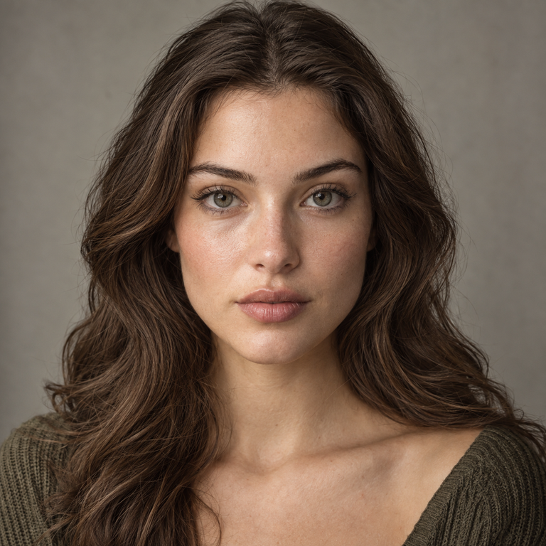
If the styling brief asks me to keep the color direction in the brown family, I select Olive Brown; if it asks for a neutral grey label and a cooler visual reference, I select Olive Grey. That is a conditional catalog decision, not a prediction of either lens on a person. In the United States, either choice requires a valid contact lens prescription and a proper fitting by an eye care professional, including a 0.00 plano choice. The FDA explains that decorative contact lenses are medical devices, not cosmetics or one-size-fits-all accessories, and says all contact lenses must be prescribed by a doctor.
I compare these two as a brand editor working from the live catalog, product photography, and a styling brief. I have not worn or tested them, and I do not turn a shade name or product image into a claim about opacity, enlargement, comfort, fit, or the result on dark eyes. Iris color, pupil size, lens position, illumination, camera exposure, editing, and display settings can all change what a viewer perceives. My useful answer is therefore a selection method: verify the lens first, then match the labeled color family to the creative direction.
My short answer: choose the brief before the shade
For a wardrobe built around camel, cream, chocolate, rust, peach, or gold-colored details, I usually place Olive Brown on the first page of the mood board. I am responding to the word “Brown” and to the established color language of the styling brief. I am not promising that the lens will appear warm, subtle, natural, or brown-dominant on any eye. Those conclusions require an individual, professionally fitted evaluation rather than editorial shorthand.
For a wardrobe built around charcoal, slate, silver-colored hardware, black, navy, icy pink, or clean monochrome, I usually place Olive Grey on the first page. Again, “Grey” is a catalog label that helps organize a visual plan. It does not tell me how light the lens will look, how much of the iris pattern will remain visible, or whether the effect will read cool in every setting.
When both palettes appear in one project, I decide from the visual hierarchy. If the eye color is meant to sit inside a brown-led makeup and wardrobe story, Brown is the more coherent label. If the eyes belong inside a graphite or neutral-led story, Grey is the clearer label. If the brief has no defined palette, I do not invent a result. I compare the current gallery at equal screen brightness, save the exact variant name in the shot list, and ask the wearer to discuss both options with the professional who holds the fitting record.
The verified product facts are the same
Olive Brown and Olive Grey are variants on the same live Yilala Olive Series product page. The listing identifies model HC1419 and publishes HEMA+NVP material, a 14.2 mm diameter, an 8.6 mm base curve, 38% water content, powers from 0.00 through -4.50, and replacement six months after opening. It also lists Olive Blue as the third color and describes the package as one pair in a blister pack.
These numbers help me check catalog identity, but they do not authorize a substitution for a prescribed brand or model. A matching diameter and base curve on a web page do not prove that a lens fits a particular eye. The FDA says a contact lens prescription includes details needed to fill it accurately, such as power, manufacturer or material, base curve, and diameter when appropriate. I treat the prescription and completed fitting as the gate, not as paperwork to address after choosing a color.
| Comparison point | Olive Brown | Olive Grey | What I do with it |
|---|---|---|---|
| Series and model | Olive Series, HC1419 | Olive Series, HC1419 | Record the model and full color name in the brief |
| Material | HEMA+NVP | HEMA+NVP | Confirm against the valid prescription |
| Diameter | 14.2 mm | 14.2 mm | Do not convert the number into an enlargement claim |
| Base curve | 8.6 mm | 8.6 mm | Leave fit assessment to the eye care professional |
| Water content | 38% | 38% | Do not translate percentage into a comfort promise |
| Listed powers | 0.00 to -4.50 | 0.00 to -4.50 | Choose only the power prescribed for the exact lens |
| Replacement listing | Six months after opening | Six months after opening | Track the opening date and follow the professional’s schedule |
| Editorial distinction | Brown color label | Grey color label | Match the label to the palette without forecasting an on-eye result |
The table shows why I do not manufacture a technical winner. The published platform is shared. The defensible distinction is the selected color variant and its role in the brief. Stock, price, packaging, and page content can change, so I review the live listing and cart before an order rather than copying an old screenshot into production notes.
How I read product photography without overclaiming
I use catalog photos as references, not clinical evidence. First, I check that the variant selector, caption, and visible asset appear to refer to the same color. Then I compare only images with reasonably similar crop, lighting, and processing. If one image is bright and close while another is dark and distant, I mark that comparison as inconclusive. Camera white balance alone can shift both skin and lens color, while retouching and display calibration can create differences that are not properties of the product.
I also separate what I can observe from what I cannot establish. I may note that a gallery uses a certain background, makeup family, or styling prop. I may not convert that presentation into a universal statement about the lens on real eyes. A still photograph does not let me verify opacity, limbal definition, enlargement, movement, fit, moisture behavior, or hours of wear. Even a close crop cannot establish a dark-eye result for everyone.
For a broader view of the range, I use the Olive Series color comparison guide as an editorial index, then return to the current product page before finalizing the color name. This two-step workflow keeps inspiration separate from product verification. It also prevents Olive Brown, Olive Grey, and Olive Blue from becoming interchangeable labels in filenames, purchase notes, or retouching instructions.
My Olive Brown styling brief
My Olive Brown board begins with brown as an organizing word, not an outcome claim. I collect fabrics and cosmetics already described with brown-adjacent names: cocoa knit, camel tailoring, tan leather, bronze-colored liner, terracotta blush, muted peach, and cream. The purpose is cohesion. If the production team sees “Olive Brown, HC1419” beside those references, everyone knows which catalog variant is under consideration and which palette led the selection.
I keep the makeup plan controlled so the lens is not forced to carry the entire story. A brown or softly black liner, groomed brows, one restrained cheek color, and a lip selected from the same wardrobe palette give the photographer a clear hierarchy. These are art-direction suggestions, not instructions for making the lens look a certain way. I would use the same careful language in a shopping note: review the Olive Brown option on the live Olive Series listing, then confirm that the prescribed brand, model, measurements, and power agree.
Olive Brown is also the cleaner file-management choice when a campaign already contains several grey accessories. Naming the intended variant in the call sheet removes ambiguity. “Brown contacts” is too loose; “Yilala Olive Brown, model HC1419, subject to prescription verification” is actionable. That level of detail matters more to me than a dramatic adjective that cannot be substantiated.
My Olive Grey styling brief
My Olive Grey board starts with neutral and grey-labeled references: charcoal suiting, slate knitwear, black denim, silver-colored jewelry, navy, white, and a measured cool-pink accent. I use those references to establish a direction for wardrobe, background, and grade. I do not say that Olive Grey will look silver, pale, icy, opaque, or bright. The name is a filing and selection cue, while the actual appearance remains individual and condition-dependent.
For makeup, I might brief graphite or neutral-brown liner, softly structured brows, and one lip or cheek accent drawn from the garment palette. The goal is not to create a fake scientific contrast with Olive Brown. It is to keep the project’s color vocabulary consistent. Readers comparing other grey-labeled catalog options can review my Muse Grey versus Olive Grey comparison or the Thai Grey versus Olive Grey comparison, both of which use model identity and the brief rather than universal appearance promises.
On a shot list, I write “Olive Grey, HC1419” beside the frame references and keep the current product URL nearby. That protects against a common production error: choosing a shade from a saved image whose filename or variant context is missing. If the gallery and selector ever appear inconsistent, I stop the visual comparison and verify the intended asset with the seller before proceeding.
What the shared specifications do not tell me
A 14.2 mm diameter does not tell me how large the colored print is, and it does not establish an enlargement effect. An 8.6 mm base curve is not a self-service fit verdict. A 38% water-content figure is not a comfort rating or a forecast for wear time. HEMA+NVP identifies the published material, but the material name alone cannot tell me how an individual eye will respond. I keep each specification in its proper role: it describes the listing and supports prescription verification.
The 0.00 option also deserves precise language. Plano means no corrective power; it does not mean no prescription, no fitting, or no medical oversight. The FDA specifically includes decorative lenses within the medical-device framework. That is why I never describe plano colored contacts as ordinary fashion accessories.
Finally, “six months after opening” is a replacement listing, not permission to wear the lenses continuously or every day for six months. Actual wear must follow the prescriber’s directions and product labeling, and reusable lenses require the prescribed cleaning, disinfection, storage, and replacement routine. If an eye care professional gives a shorter replacement schedule, that individual instruction takes priority in the wearer’s plan.
Prescription, care, and stop signs
I put safety notes into the brief before the shoot date. The wearer must have the valid prescription for the exact contact lens and a completed professional fitting. No one shares lenses, swaps powers, or borrows a plano pair. Hands are washed with soap and water and dried fully before handling. Only the lens-care system directed by the eye care professional is used, and fresh solution replaces old solution rather than topping it off.
The CDC’s contact lens infection-prevention guidance says to avoid sleeping in lenses unless an eye care provider directs otherwise, remove lenses before swimming or showering, wash and dry hands before handling, use fresh contact lens solution for storage, and follow the replacement schedule recommended by the provider. I build those boundaries into production timing. A photography schedule never outranks eye-care instructions.
The National Eye Institute advises removing contacts for eye pain, red eyes, light sensitivity, sudden blurry vision, unusually watery eyes, or discharge, and contacting an eye doctor if symptoms persist or worsen. I do not ask a wearer to finish a frame, wait for a break, or troubleshoot discomfort for the sake of content. The lens comes out, and the eye care professional directs what happens next.
A practical decision sequence
My sequence has five checkpoints. First, I confirm that the wearer has a valid prescription and that HC1419 is professionally fitted and authorized. Second, I open the current Olive Series listing and verify the selected color, power, model, measurements, material, package, and replacement wording. Third, I choose Brown or Grey from the palette named in the styling brief, without assigning an on-eye effect.
Fourth, I review the available gallery with equal screen conditions and record any limitation in the reference images. Fifth, I check the final cart against the prescription and shot list before purchase. This catches a wrong variant or power while it is still a catalog problem, not a production-day problem.
If those checkpoints do not produce a clear choice, I do not force one. I ask whether the project is primarily brown-led or grey-led. If neither, I keep both as references until the wardrobe and lighting plan are settled. The eye care professional, not the editor, decides whether either lens is appropriate for the wearer.
Frequently asked questions
Are Olive Brown and Olive Grey technically different lenses?
The live listing presents both as color variants of model HC1419 with the same published HEMA+NVP material, 14.2 mm diameter, 8.6 mm base curve, 38% water content, 0.00 to -4.50 power range, and six-month-after-opening replacement line. Their named catalog distinction is color. A professional must still verify the exact prescribed lens and fit.
Which option will look more natural?
I cannot support a universal answer from names or photos. “Natural” depends on the wearer, iris, pupil, fit, light, styling, camera, and personal expectation. I select Brown for a brown-led brief and Grey for a grey-led brief, then leave individual appearance assessment to a properly fitted evaluation.
Will Olive Grey look lighter than Olive Brown?
The catalog names do not establish relative lightness on the eye. Product photos may also differ in illumination, exposure, white balance, crop, and editing. I compare matched assets when possible, but I label the result inconclusive if the photographic conditions are not comparable.
Do these lenses enlarge the eyes?
I do not infer enlargement from the 14.2 mm overall diameter or from gallery images. The listing does not provide enough verified information here to promise a visual enlargement result, and individual anatomy and lens position can affect perception.
Are they suitable for dark eyes?
I cannot promise a dark-eye result without an individual assessment. A shade name and promotional photograph do not establish opacity or color coverage on every iris. The safer editorial approach is to treat the gallery as inspiration and discuss the exact lens with the fitting professional.
Does 38% water content mean all-day comfort?
No conclusion about comfort or wear duration follows from that percentage alone. The live page publishes 38% water content, but individual response and professional directions matter. Wear time should follow the eye care professional’s instructions, and any concerning symptom calls for prompt removal and appropriate care.
Can I buy the 0.00 option without a prescription?
No. In the United States, plano decorative contacts are still prescription medical devices. A licensed eye care professional must examine and fit the eyes and issue a valid prescription for the lens. A seller should require prescription information rather than treating 0.00 as an over-the-counter accessory.
Does six months mean I can sleep or shower in them?
No. Six months after opening is the page’s replacement statement, not a continuous-wear instruction. Follow the prescriber and labeling, avoid sleeping in lenses unless specifically directed, remove them before showering or swimming, and keep them away from water.
My final edit
I shortlist Olive Brown when the approved palette is brown-led and Olive Grey when it is grey-led. I do not rank one above the other on technical specifications because the published panel matches, and I do not invent appearance differences the available evidence cannot support. The choice becomes useful only after prescription and fitting requirements are satisfied.
For the next step, open the Olive Series page, review the live Brown and Grey variants, and check the selected model, color, and power against the valid prescription before adding a pair to the cart. That is the shop action I can stand behind: a precise catalog choice, a coherent styling brief, and no shortcut around professional eye care.