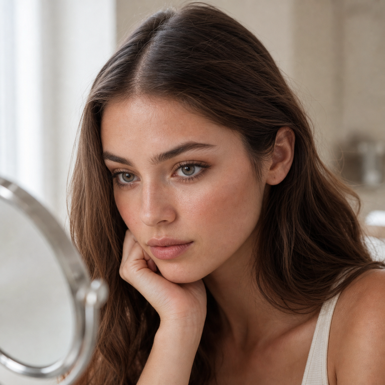
Brown and gray can look like a simple two-swatch decision until I place product-page images beside a warm makeup reference, a cool outfit, and three very different lighting conditions. That is when the choice becomes less about naming a favorite color and more about deciding what role I want the eyes to play in the finished look.
My direct answer: I start with brown when I want the lens choice to stay connected to warmth already present in the makeup, hair, or clothing. I start with gray when I want a cooler visual shift or clearer contrast from a warm palette. For natural colored contacts for everyday wear, I narrow the field with product imagery in daylight, indoor light, and phone-camera light, then take the exact brand and lens measurements to an eye care professional. Color direction comes first in my editorial process, but a valid prescription and proper fitting decide whether a specific lens belongs on the real shortlist.
Brown vs Gray Colored Contacts Is a Styling Decision, Not a Color Ranking
When I compare our catalog, I do not treat brown as automatically subtle or gray as automatically dramatic. Those shortcuts ask a color name to predict an on-eye result that depends on the lens design, the wearer’s iris, pupil size, lighting, makeup, camera processing, and fit. Product-page imagery gives me a styling reference, not a promise that every eye will reproduce the same effect.
I begin by writing one sentence about the intended image. It might be “warm eyes within a tonal bronze look,” “cool contrast against brown eyes,” or “an everyday change that still works with an office wardrobe.” That sentence prevents me from drifting toward whichever product thumbnail is most striking at the moment. It also makes the difference between tint descriptions and visible coverage easier to discuss without assuming performance details that a product page does not state.
Brown colored contact lenses for warm makeup are my first catalog direction when the look already includes copper, caramel, peach, terracotta, camel, or warm neutrals. Gray becomes my first direction when the styling brief calls for silver, charcoal, slate, cool taupe, navy, or a deliberate interruption of an otherwise warm face. Neither route is a rule. I use it as a way to reduce a crowded browser tab to a manageable pair of visual ideas.
I also separate “natural” from “unchanged.” A natural-looking edit can still be visible. What matters editorially is whether the lens color appears to belong with the rest of the styling rather than competing with every other decision. Our guide to making colored contacts look natural in photos expands on the camera side of that distinction.
How I Read Brown Product Imagery
I start with the brown variants as a family, then look for the product name and imagery that fit the mood board. The Berry Series offers Berry Brown beside Berry Grey, so I can keep the series identity constant while comparing the color direction. I would place Berry Brown beside rose-brown, berry-toned, or softly romantic makeup references because the series name and imagery support that editorial conversation. I am not claiming a specific undertone or on-eye blend. I am describing how I would style the page image.
The Thai Series gives me Thai Brown and Thai Grey as another direct pair. I would shortlist Thai Brown when the overall concept needs a bolder fashion cue without leaving the brown category. That choice comes from comparing the named options and page presentation, not from a claim about opacity, enlargement, or coverage.
The Muse Series adds a useful middle step: Muse Brown, Muse Coffee, and Muse Grey. When a brief says “brown” but the references range from medium wood tones to deeper coffee styling, I use those three names to organize the image board. Muse Coffee can hold the deeper brown concept while Muse Brown keeps the straightforward brown label. I would still compare their page images at equal size rather than assume the word “Coffee” predicts how the lens will appear over a particular iris.
For an earth-led wardrobe, I pull up the Olive Series and compare Olive Brown with Olive Grey. For a more tailored, formal mood board, I open the Earl Series and view Earl Brown next to Earl Grey. “Earth-led” and “tailored” are my styling labels for the product names and images. They are not technical lens attributes.
Brown works especially well in my edit when the eye color should connect separate warm elements. A brown lens image can bridge auburn hair and bronze shadow, or make a camel jacket feel intentional beside peach blush. I keep the lip and cheek decisions restrained until the lens direction is settled. Otherwise, every warm feature can become equally loud, and the eye no longer has a clear place in the composition.
How I Read Gray Product Imagery
Gray colored contacts for brown eyes often enter the conversation because the shopper wants a visible color change. I treat that goal carefully. A product image can help establish whether the styling direction feels cool, polished, graphic, soft, or fashion-led, but it cannot tell me exactly how the lens will interact with an individual brown iris. For that reason, I use our broader guide to colored contacts for brown eyes as background, then return to the exact series pages for the available names and listed specifications.
Berry Grey is where I look when a gray option needs to sit inside the same romantic page world as Berry Brown. Thai Grey is where I look when the concept is more fashion-forward in its references. Muse Grey belongs on my comparison board when I am already considering Muse Brown or Muse Coffee and want to test whether cooling the eye direction improves the whole image. Olive Grey and Earl Grey let me run the same exercise for earth-led and tailored mood boards.
With gray, I pay close attention to nearby neutrals. Cool taupe shadow, charcoal liner, soft black mascara, silver jewelry, and navy clothing can make the choice feel connected. Warm skin, warm blush, and warm hair do not disqualify gray. Sometimes that temperature contrast is the point. I simply choose whether I want the gray to join the palette or interrupt it.
I avoid using heavy gray shadow as an automatic match. On a mood board, matching the lens name too literally can flatten the face into one cool block. I often test a softer neutral lid with a precise lash line first. Then I compare the product-page image against the full outfit, not just the eye crop. This is an editorial lighting and styling check only. It does not predict comfort, movement, vision, or clinical suitability.
My Product Pairing Shortlist
When I need a fast working board, I map each series to the variants actually listed on its live product page. The final column is deliberately limited to style direction from product names and page imagery. It does not rate opacity, limbal rings, comfort, coverage, undertone, or on-eye performance.
| Product page | Brown and gray variants | How I use the names and imagery in a style brief |
|---|---|---|
| Berry Series | Berry Brown, Berry Grey | My comparison pair for romantic, berry-referenced, or softly dressed mood boards. |
| Thai Series | Thai Brown, Thai Grey | My comparison pair when the page direction is fashion-forward and visually assertive. |
| Muse Series | Muse Brown, Muse Coffee, Muse Grey | My three-way board for classic beauty references and a choice between brown, coffee, and gray naming. |
| Olive Series | Olive Brown, Olive Grey | My comparison pair for earth-led wardrobes and Mediterranean-inspired page references. |
| Earl Series | Earl Brown, Earl Grey | My comparison pair for tailored, refined, or formal styling references. |
If I were narrowing these for a warm daytime look, I would begin with Berry Brown, Muse Brown, Muse Coffee, Olive Brown, and Earl Brown, then remove any image that feels disconnected from the exact makeup and wardrobe board. If I were building a cooler or higher-contrast look, I would begin with the five gray variants and repeat the same removal process. The point is not to select all of them. It is to make the first comparison consistent enough that the differences are useful.
The Shared Specifications I Keep Separate From Appearance
Across these five live product pages, the selectable product information lists the same core specifications: HEMA+NVP material, 14.2 mm diameter, 8.6 mm base curve, 38% water content, a six-month replacement period after opening, and powers from 0.00 through -4.50. That makes the series easy to place in one catalog spreadsheet. It does not make them interchangeable for a wearer.
Shared numbers do not guarantee the same fit, visual result, or suitability. A diameter and base curve are only part of contact lens fitting, and the way a colored design appears can vary with the wearer and viewing conditions. Even a 0.00 decorative lens requires professional involvement. The FDA’s decorative contact lens guidance states that all contact lenses, including decorative lenses, require a prescription, and it explains that a licensed eye doctor checks whether the lenses fit properly.
That is why I never turn the listed 0.00 to -4.50 range into a self-selection chart. Prescription beauty contact lenses need a current contact lens prescription for the specific lens, not a copied eyeglass number and not a guess based on the last box someone owned. I direct US readers to our guide on eye exams for colored contacts before they move from editorial comparison to purchase.
I also keep the six-month label in its proper place. It is the listed replacement period after opening, not permission to wear lenses continuously, sleep in them, or keep using a damaged or contaminated pair. The wearer still needs the eye care professional’s schedule and the manufacturer’s instructions for wear, cleaning, storage, and replacement.
My Three-Lighting Comparison Before I Settle on a Color Direction
I use lighting checks to judge the mood board, not to simulate a fitting. First, I place the product imagery beside a daylight reference with neutral white balance. This is where I decide whether brown supports warmth quietly or whether gray creates the level of contrast the concept needs. I avoid judging from a highly filtered social image because the filter may have shifted the iris, skin, and makeup together.
Second, I repeat the comparison under ordinary indoor lighting. Warm bulbs can change the relationship between a gray reference and bronze makeup, while cool office light can make a brown reference feel different beside beige clothing. I do not declare one view the “true” color. I note whether the styling still holds when the environment changes.
Third, I check a phone-camera reference with flash disabled, then one with the room’s typical mixed light. Phone processing may lift shadows, sharpen the iris area, or alter white balance. I am looking for a direction that survives those changes without requiring a filter to make sense. I never describe that check as proof of an on-eye result because I am comparing catalog assets and styling references, not wearing or testing the lenses.
At the end, I keep two finalists: one brown and one gray. I label what each does for the whole image in plain language, such as “connects the warm palette” or “adds cool contrast.” If the labels are vague, I have not narrowed far enough. If both are clear, the final creative choice can follow the occasion, wardrobe, and the eye care professional’s fitting outcome.
From Editorial Shortlist to Safe Purchase
Once the style direction is clear, the process becomes medical and practical. The FDA notes that contact lenses can be associated with serious problems including infection and corneal ulcers. Its contact lens risks page says to remove lenses immediately and contact an eye care professional if symptoms of irritation or infection occur. A beautiful color comparison never outweighs pain, unusual redness, blurred vision, swelling, light sensitivity, or discharge.
For routine handling, I point readers to the CDC’s contact lens infection prevention guidance: wash and fully dry hands before touching lenses, keep contacts away from water, use recommended disinfecting solution, and avoid sleeping in lenses unless an eye care professional specifically directs it. I treat those habits as part of the product decision because a long replacement cycle still depends on correct daily care.
US buying rules matter too. The FTC Contact Lens Rule page explains that prescribers provide a copy of the contact lens prescription after fitting and that sellers must obtain or verify prescription information. Our FDA compliance overview provides site context, but it does not replace an individual prescription, professional fitting, or the official requirements.
My final editorial note is simple: choose the color story with care, then let the fitting process determine the actual product. I would rather keep a strong gray idea on the mood board than force a lens that is not prescribed for the wearer. The same is true for brown. Style can guide the shortlist, but eye care sets the boundary.
Official Sources
- FDA: Decorative Contact Lenses for Halloween and More
- FDA: Contact Lens Risks
- CDC: Preventing Eye Infections When Wearing Contacts
- FTC: Contact Lens Rule
Frequently Asked Questions
Are brown or gray colored contacts more natural?
I do not assign “more natural” to a color name alone. I compare each product image with the wearer’s coloring, makeup, wardrobe, and lighting goal, while treating the actual on-eye result as individual and fit-dependent.
Which color do I start with for warm makeup?
I start with brown for copper, peach, terracotta, caramel, or bronze references because it keeps the eye direction connected to the warm palette. I may still compare one gray option if the brief calls for deliberate contrast.
Can gray colored contacts work with brown eyes?
Gray can be a useful creative direction for brown eyes, especially when a cooler shift is wanted. Product imagery cannot promise the amount of visible change, so I keep expectations tied to the exact lens and professional fitting.
How do I compare Berry, Thai, Muse, Olive, and Earl?
I compare variants within each series first, then place the winning brown and gray images beside the same makeup and outfit reference. This limits the number of changing variables and keeps the shortlist readable.
Do shared lens specifications mean the products fit the same?
No. The pages list shared material, diameter, base curve, water content, replacement period, and power range, but those facts do not guarantee the same fit, appearance, or suitability for an individual wearer.
Do I need a prescription for 0.00 colored contacts?
Yes. In the United States, decorative contacts are medical devices and require a prescription even when they have no vision-correcting power. An eye care professional also evaluates fit and eye health.
Does six-month disposable mean I can wear them every day for six months?
No. It is the listed replacement period after opening, not a continuous-wear instruction. Follow the prescribed wearing schedule, care directions, storage rules, and earlier replacement advice if the lens is damaged or the professional directs it.
What should I do if a colored contact causes redness or pain?
Remove the lens immediately and contact an eye care professional. Do not put it back in while symptoms continue. Redness, ongoing pain, blurred vision, unusual light sensitivity, swelling, tearing, or discharge need prompt attention.