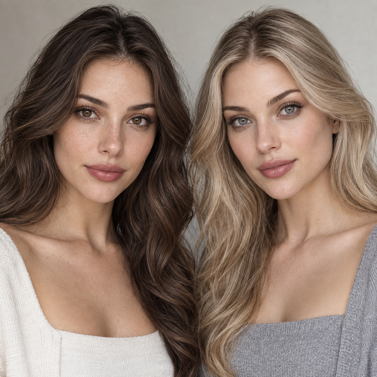
If your wardrobe and makeup usually lean warm, earthy, or softly golden, I would shortlist Muse Brown; if you build looks around cool neutrals, silver, charcoal, navy, or crisp monochrome, I would shortlist Muse Grey. That is a styling recommendation, not a prediction of how either color will appear on your eyes. I compare these two options from the current Yilala catalog, their labels, and controlled styling references. I have not worn or tested them, and individual appearance can vary with natural iris color, lighting, camera settings, makeup, and screen calibration.
For shoppers in the United States, the prescription and professional fit come before color. The FDA says decorative contacts are medical devices, including plano lenses that do not correct vision, and require a prescription. A licensed eye doctor needs to measure each eye, assess lens fit, and issue a valid contact lens prescription that identifies the appropriate product and measurements. The CDC likewise explains that a provider examines the eyes, tries lenses on the eyes, checks the fit, tests vision through them, and gives wear and care instructions. Do not treat the shared 14.2 mm diameter or 8.6 mm base curve as proof that this model is suitable for you. Shared specifications do not guarantee equal fit, comfort, or appearance for any individual.
Muse Brown vs Muse Grey at a glance
Both choices sit on the same Muse Series product page under model HE1101. The live listing names three options: Muse Brown, Muse Grey, and Muse Coffee. Brown and Grey share the listed HEMA+NVP material, 14.2 mm diameter, 8.6 mm base curve, 38% water content, power menu from 0.00 through -4.50, and a replacement period of six months after opening. Because the construction data is shared, my comparison stays in the honest lane: color family, wardrobe coordination, makeup direction, and the questions I would use to choose between them.
| Decision point | Muse Brown | Muse Grey |
|---|---|---|
| Useful first shortlist | Warm, earthy, tan, cream, camel, rust, olive, or gold-led styling | Cool, neutral, black, white, charcoal, navy, denim, or silver-led styling |
| Makeup planning lane | Bronze, warm taupe, peach, terracotta, or brown liner | Cool taupe, slate, mauve, plum, charcoal, or black liner |
| Overall styling role | Keeps a palette tonal and grounded | Adds a cooler counterpoint or supports monochrome |
| Choose it when | You want the lens name to echo warm accessories and fabrics | You want the lens name to echo cool metals and crisp neutrals |
| Do not infer from this | Fit, comfort, or an exact appearance on your eyes; those require professional fitting and individual evaluation | |
I use the table as a first edit, not as a verdict. If your closet crosses both columns, choose the option that repeats most often near your face: jewelry, frames, scarf, collar, eye makeup, and hair accessories. A brown handbag at waist level has less influence on a portrait than silver earrings or a charcoal turtleneck. This near-face rule gives the comparison a practical center without pretending a catalog name can forecast a personal result.
What the live Muse listing confirms
The live listing is the factual anchor for this comparison. It identifies the SKU and model as HE1101, lists Muse Brown, Muse Grey, and Muse Coffee, and gives the same core parameters for the series: HEMA+NVP, 14.2 mm diameter, 8.6 mm base curve, and 38% water content. Its selectable power range runs from plano 0.00 to -4.50 in the options shown on the page. The stated use period is six months after opening, subject to the label, your eye care professional’s instructions, and earlier disposal if the lens is damaged or your provider tells you to stop using it.
I keep those facts separate from styling interpretation. A material name or water percentage does not tell me which shade will suit a specific person. Diameter and base curve are fitting parameters, not beauty scores. The same numbers on Brown and Grey also do not make them interchangeable with another brand or model. A contact lens prescription is product-specific in ways an eyeglass prescription is not, so a glasses prescription alone is not enough to select a contact lens power or fit.
The 0.00 option deserves special attention. Plano means no refractive power; it does not mean the lens is exempt from prescription rules or professional fitting in the United States. The FDA’s consumer guidance on colored and decorative lenses says these products are not cosmetics or over-the-counter merchandise. That distinction matters whether the goal is a subtle wardrobe change, a photo concept, or an event look.
How I compare the two without inventing a result
My catalog method starts with labels and equal treatment. I place Brown and Grey references at the same size, on the same calibrated screen, and under the same page brightness. I do not compare a warm, edited campaign crop for one option with a dim phone screenshot for the other. When source images use different lighting or processing, I mark the comparison as inconclusive rather than filling in the gap with confident language.
Next, I translate each color name into a wardrobe lane. Muse Brown goes into my warm-neutral folder. That folder includes cream knitwear, camel coats, chocolate tailoring, olive utility fabrics, warm denim washes, tortoiseshell accessories, and yellow-gold jewelry. Muse Grey goes into my cool-neutral folder with optic white, charcoal, black, navy, cool denim, slate, chrome, and silver jewelry. These are coordination ideas. They describe how I would art-direct an outfit around the option name, not what the lens will do to an iris.
I also make a small digital mood board for each candidate. I use the same portrait, remove any lens simulation, and change only the clothing swatches, jewelry, and makeup reference colors around it. This keeps the decision focused on styling relationships. I do not digitally paint either lens onto the eye because a mockup could be mistaken for evidence. If I still cannot choose, I compare the two mood boards in grayscale to see whether one depends too heavily on a single accent color.
For more catalog context, I would place this pair beside the existing Muse Brown vs Muse Coffee comparison and the Muse Grey vs Muse Coffee comparison. Coffee gives both sides a common third reference within the same HE1101 menu. That can help a shopper decide whether the unresolved choice is truly Brown versus Grey or whether the middle warm option deserves a place on the shortlist.
Choosing Muse Brown as a styling direction
I would start with Muse Brown when the rest of the look already has warmth and I want the contact choice to repeat that direction. Think ecru instead of stark white, camel instead of cool beige, bronze instead of chrome, and warm tortoiseshell instead of clear acetate. Repetition is the useful idea here. One or two related notes near the face can make an editorial concept feel intentional without requiring every item to match.
For makeup references, my Brown board uses warm taupe, bronze, peach, muted terracotta, and chocolate liner. I would keep the number of competing accent colors low. If the outfit includes rust and olive, for example, I would probably choose a restrained lip and let the fabric palette carry the concept. This is a creative recommendation only; makeup should never touch a contact lens, and hands must be clean and dry before lens handling.
Brown is also the simpler catalog choice when a client brief uses words such as autumnal, sun-warmed, sepia, heritage, or earthy. I treat those words as art-direction cues, not as claims about the product. For a broader browse, Yilala groups this series under natural look lenses, but a category label still cannot promise a particular personal appearance.
Choosing Muse Grey as a styling direction
I would begin with Muse Grey when the concept is cool, graphic, or quietly monochrome. A black blazer, white shirt, faded cool-blue denim, slate knit, or navy dress gives Grey a clear visual context. Silver earrings, chrome hardware, and transparent frames can repeat that context close to the face. The result may still vary from the catalog presentation, so the value of this method lies in planning the surrounding palette.
My Grey makeup board uses cool taupe, muted mauve, slate, plum, and charcoal. For a daytime wardrobe, I would keep contrast moderate and use one crisp element, perhaps a black line or silver stud. For an evening concept, I might deepen the clothing and liner references rather than adding several new colors. Again, these are styling choices around the lens, not reports from wear.
Grey may also solve a practical wardrobe problem for someone whose closet is split between black, navy, white, and cool denim. It can keep the contact choice inside that established system. If the rest of the styling is warm, Grey can instead act as a deliberate contrast, but I would repeat a cool note elsewhere so the decision does not look isolated. The Yilala color comparisons archive offers more examples of this palette-first editing method across other series.
Prescription, fitting, and the limits of shared specifications
The strongest reason not to choose by color alone is that both options are contact lenses. The FDA says an eye doctor must measure each eye to fit decorative lenses and evaluate how the eye responds. Its guidance also says a valid prescription should include the brand name, lens measurements, and an expiration date. The CDC’s overview of contact lens types and fitting describes the examination, trial fitting, vision check, and care instruction process.
A professional fitting addresses questions the product page cannot answer for an individual. Two people can have the same glasses power and still need different contact lens decisions. Even if your current prescription falls inside the listed 0.00 to -4.50 menu, that does not establish that HE1101 is appropriate. Do not convert an eyeglass prescription, substitute a different brand, or select a base curve on your own. Ask the prescriber to confirm the exact lens and power.
The shared Muse specifications are useful for comparing Brown and Grey on paper, but they have limits. They tell us that the listed material, nominal diameter, base curve, water content, power menu, and replacement period are the same. They do not guarantee equal fit, comfort, or appearance. A printed parameter is not a fitting appointment, and a six-month label is not permission to wear a lens for six months regardless of condition, care history, or professional advice.
Yilala’s quality and certifications page provides brand-level background, while the live product page remains the source for this model’s listed specifications. I would bring the exact product page to an eye care appointment so the professional can review the model information. Brand registration or certification language should never replace prescription verification, proper dispensing, or follow-up care.
Care planning for a six-month reusable lens
A six-month-after-opening schedule requires a care routine from day one. Record the opening date rather than relying on memory. Follow the lens label, the solution label, and your eye care professional’s instructions. Use fresh recommended disinfecting solution for each storage cycle. Do not top off old solution, and do not use water or saliva on lenses or the case.
The CDC’s contact lens infection prevention guidance advises washing hands with soap and water and drying them completely before handling lenses. It also says to remove lenses before swimming or showering, avoid sleeping in them unless directed by an eye care provider, rub and rinse reusable lenses with disinfecting solution as directed, and replace the case at least every three months. The National Eye Institute’s contact lens overview also stresses correct disinfection, storage, replacement timing, and professional care.
Keep each lens in its assigned side of a clean case and never share contacts. If a lens has a tear, chip, deposit, or uncertain storage history, do not put it on the eye. Remove lenses and contact an eye care professional promptly if you develop redness, persistent pain, discharge, light sensitivity, sudden blurred vision, or another concerning symptom. The calendar is an outside limit, not a reason to keep using a questionable lens.
Readers who want more brand articles can browse the Yilala colored contact lens guides. I would still place instructions from the prescriber and the specific product labeling above any general blog advice, including this comparison.
My final catalog recommendation
I would choose Muse Brown for a wardrobe led by cream, camel, olive, rust, bronze, tortoiseshell, and gold. I would choose Muse Grey for a wardrobe led by black, white, charcoal, navy, cool denim, slate, chrome, and silver. If both lists describe you, use the near-face rule: pick the option that repeats your most common jewelry, frames, collar colors, and makeup references.
That recommendation stays conditional because color names and catalog images cannot settle an individual outcome. I would not buy either option until a licensed eye care professional confirms the prescription and fit for HE1101. Once that gate is cleared, Brown versus Grey becomes the creative decision it should be: warm continuity or cool structure.
Frequently Asked Questions
What is the main difference between Muse Brown and Muse Grey?
The confirmed catalog difference is the selected color option. I use Muse Brown for warm, earthy styling plans and Muse Grey for cool, neutral, or monochrome plans. They share the HE1101 specifications listed on the product page, but the color choice cannot predict an exact appearance on an individual eye.
Do Muse Brown and Muse Grey have the same specifications?
Yes, the current Muse listing gives the series the same HEMA+NVP material, 14.2 mm diameter, 8.6 mm base curve, 38% water content, power menu from 0.00 to -4.50, and six-month-after-opening schedule. Shared specifications do not guarantee equal fit, comfort, or appearance.
Can I buy Muse lenses in 0.00 power without a prescription in the United States?
No. The FDA treats plano decorative contacts as prescription medical devices. A 0.00 power changes the refractive correction, not the legal or fitting requirement. Get an eye exam, a valid contact lens prescription, and professional confirmation of the exact product before ordering.
Can I use my eyeglass prescription to choose a Muse power?
No. An eyeglass prescription does not contain all the information needed to prescribe and fit contact lenses. Ask a licensed eye care professional to assess your eyes, fit the lens, test vision, and write the contact lens prescription rather than converting the numbers yourself.
Does the 8.6 mm base curve mean Muse will fit me?
No. It is one listed parameter, not proof of suitability. An eye care professional must evaluate the lens on each eye and consider the complete product and your ocular health. Do not infer fit from a common-looking number or from another lens with the same nominal base curve.
Which Muse color works better with warm makeup?
For a catalog styling board, I would start with Muse Brown beside bronze, warm taupe, peach, terracotta, or chocolate references. That is a coordination suggestion only. Makeup, lighting, natural iris color, and screens can change perception, so it is not a promised personal result.
Which Muse color works better with black, silver, and cool denim?
I would shortlist Muse Grey because its color label supports a cool-neutral plan with black, white, charcoal, navy, silver, and cool denim. Brown can still create intentional contrast, especially if you repeat warmth elsewhere. Choose after professional prescription and fitting approval.
How long can I keep Muse Brown or Muse Grey after opening?
The live listing states six months after opening. Treat that as a maximum replacement schedule, not a guarantee that every lens remains usable for the full period. Follow the label and your provider’s instructions, document the opening date, maintain proper disinfection, and discard a damaged or questionable lens sooner.