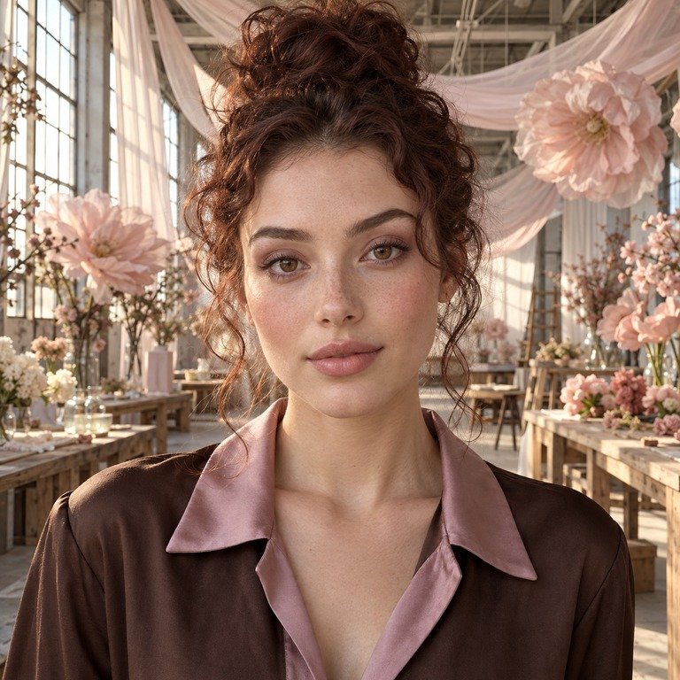
My short answer is that I compare Illusory Brown and Nova Pink by separating the catalog label from the facts I can verify. Illusory Brown is the brown-labeled option in the Illusory series, while Nova Pink is the pink-labeled option in the Nova series, but those names alone do not establish the exact hue, undertone, opacity, edge design, enlargement effect, or appearance on dark eyes. For US shoppers, decorative colored contacts are medical devices that require a valid prescription and proper fitting by an eye care professional, even when the power is 0.00. I would make the styling choice only after that clinical step and after checking the current SKU page and sealed package.
From a brand-editor desk, this is a choice between two different visual directions, not a claim that one lens will produce a certain result for every person. I use the product pages, catalog images, wardrobe plan, makeup palette, lighting, and camera setting to build a shortlist. I do not wear-test lenses for these comparisons, and I do not treat a product name or shared measurements as evidence of individual fit or appearance.
The editorial difference in one sentence
If a styling brief begins with grounded neutrals, tan tailoring, cocoa accessories, or a restrained everyday color story, I would open the Illusory series product page first and review Illusory Brown. If the brief begins with rose, berry, mauve, silver, graphic liner, or a more color-led concept, I would open the Nova series product page and review Nova Pink first.
That is a styling workflow, not a promise about the lenses themselves. “Brown” does not tell me whether the photographed product will read warm, cool, golden, taupe, deep, or muted in a specific setting. “Pink” does not tell me whether it will read rose, coral, lilac, berry, pale, vivid, or nearly neutral. Catalog photography can also shift with white balance, exposure, screen calibration, surrounding colors, and image processing. I therefore keep my first judgment provisional until I compare current images under the same review conditions.
What the current listings actually share
The current product summaries list both series as HEMA+NVP lenses with a 14.2 mm diameter, 8.6 mm base curve, and 38% water content. Powers are commonly listed from 0.00 through -4.50, with the available increments shown on each product page. Both listings generally label the replacement period as six months after opening.
Those repeated figures are useful for checking that I am comparing the right catalog records, but they are not a shortcut to a fitting. A shared diameter and base curve do not prove equal fit, comfort, movement, coverage, or visual effect on an individual eye. Material and water percentage do not settle those questions either. An eye care professional evaluates the wearer and prescribes a suitable brand and parameters rather than matching a shopper to a lens by color name.
There is also a diameter conflict on the Nova page that deserves a plain disclosure. The current summary near the purchasing controls states 14.2 mm, while the longer description lower on the page states 14.5 mm. I would use 14.2 mm only as the current summary value, not as a fact to assume for every unit. Before ordering or using Nova Pink, verify the current SKU, the sealed package label, the prescription, and the measurement with the fitting professional. If any source disagrees, pause rather than choosing the number that sounds preferable.
My comparison table for a styling shortlist
| Editorial checkpoint | Illusory Brown | Nova Pink |
|---|---|---|
| Verified variant identity | Brown-labeled option in the Illusory series | Pink-labeled option in the Nova series |
| Starting styling direction | Review first for neutral, earth-led, tan, cream, camel, bronze, or cocoa wardrobe plans | Review first for rose, berry, mauve, silver, black, or graphic color-led wardrobe plans |
| Shared current summary | HEMA+NVP, 14.2 mm, 8.6 mm base curve, 38% water, commonly 0.00 to -4.50, generally six months after opening | HEMA+NVP, 14.2 mm, 8.6 mm base curve, 38% water, commonly 0.00 to -4.50, generally six months after opening |
| Listing caution | Confirm the current SKU and sealed package rather than relying on a guide or saved image | Current 14.2 mm summary conflicts with a 14.5 mm statement in the long description; verify the SKU, package, and fitting |
| What the name cannot prove | Exact brown tone, undertone, opacity, ring design, enlargement, coverage, or dark-eye result | Exact pink tone, undertone, opacity, ring design, enlargement, coverage, or dark-eye result |
| Decision rule | Keep on the shortlist when current imagery supports the wider neutral styling brief | Keep on the shortlist when current imagery supports the wider color-led styling brief |
The table is deliberately about selection discipline. It does not rank one series over the other, and it does not turn color-family labels into technical claims. I also would not read the category labels on the store as performance definitions. A merchandising category can help organize a shop, but it cannot replace the prescription, package directions, or professional fitting assessment.
How I review the catalog images without overreading them
I begin with the two live product pages rather than a reposted social image or an old screenshot. Then I check whether the displayed variant selector is actually set to Illusory Brown or Nova Pink. Product families contain multiple colors, so a general series image may not identify the selected variant clearly enough for a careful comparison.
Next, I look at the whole styling frame. Hair color, brow color, skin presentation, eye makeup, clothing, background, and lighting all change how a color story reads. I ask whether the image supports my planned palette, not whether it predicts an identical result. If I am building a beige knit, brown liner, and muted lip edit, Illusory Brown is the logical first page to study because of its catalog label. If I am building a charcoal outfit with rose blush or berry accents, Nova Pink is the logical first page. In both cases, the final shortlist still depends on current imagery and professional approval of the prescribed product.
I also compare images at a normal viewing size. Extreme zoom can make print patterns look more prominent than they appear in an ordinary portrait, while a tiny thumbnail can hide distinctions. I avoid using exposure-heavy promotional frames as my only reference. When two images were shot under different lighting, I do not declare one lens brighter, softer, warmer, or more opaque. Those conclusions would require controlled evidence that the catalog does not provide.
For broader context, the Illusory series guide and Nova series guide can help organize the available series names. I still return to the live product pages for current variant and specification checks because editorial guides can outlast a listing revision.
Illusory Brown: the styling brief I would build
I treat Illusory Brown as the starting point for a brown-family edit, nothing more specific until the current photos support it. My mood board would likely begin with camel, oatmeal, cream, chocolate, olive, denim, soft black, or brushed gold. That approach gives the variant a coherent frame without claiming that the lens itself contains any exact shade from the board.
For makeup planning, I would compare restrained brown liner, taupe shadow, bronze accents, peach or neutral blush, and a muted lip against the current catalog image. I might also test the visual plan with clean skin styling and minimal eye makeup, because a simpler frame makes it easier to judge whether the overall palette feels balanced. This is a creative-direction exercise performed with images and swatches, not a report of wearing the product.
Illusory Brown may also be the first option I review for business-casual portraits, coffee-shop editorial scenes, autumn wardrobe stories, and neutral event styling. The reason is semantic and visual organization: the brown label fits those briefs on paper. It does not establish subtlety, realism, or suitability for a workplace. The actual dress code, current imagery, prescription, and fitting remain separate checks.
If the goal is simply to learn how brown and gray families can be framed differently, the site’s brown versus gray editorial guide offers another styling reference. I would use it for palette ideas, not as proof of how Illusory Brown will look on any eye.
Nova Pink: the styling brief I would build
I treat Nova Pink as the starting point for a pink-family or contrast-led edit. My initial board might include rose, berry, mauve, plum, silver, charcoal, black, cool white, or a controlled metallic accent. Again, those are companion colors for the art direction. They do not identify the lens’s exact hue or undertone.
For makeup, I would review the current Nova Pink imagery beside rose blush, berry lip options, plum or brown liner, and either a soft monochrome eye or a clean graphic shape. I would be careful with several strong accents in one frame. If the eye styling, lip, jewelry, and garment all compete, the finished portrait can lose its hierarchy. Sometimes the more useful editorial move is to let one pink-family cue lead while the rest of the styling stays quiet.
Nova Pink may enter my shortlist sooner for a studio beauty concept, concert-inspired palette, costume brief, or fashion portrait where color is part of the story. That does not mean the variant is automatically dramatic, opaque, enlarging, or visible in a specific way on dark eyes. The word “Pink” identifies the store variant. The product photos and package identify the current item, and neither substitutes for an individual fitting.
For a wider color-family discussion, I would pair the live listing with the pink versus purple styling guide. It is useful when deciding whether the complete outfit should lean toward a pink family or a purple family, but it cannot predict a person’s on-eye result.
The fitting and prescription check comes before color
The FDA states that all contact lenses, including decorative lenses that do not correct vision, must be prescribed by a doctor. Its decorative contact lens guidance explains that a licensed eye doctor should examine the eyes, determine proper fit, and provide a prescription that includes the brand and correct measurements. This is why I do not frame 0.00 as “no prescription needed.” Plano describes optical power, not regulatory status.
A fitting is also more specific than copying diameter and base curve from a product page. The site’s contact lens fitting guide can help a shopper prepare questions, while the clinician makes the actual assessment. If Illusory Brown and Nova Pink are not both included in the prescription or approved by the prescriber, a styling comparison does not authorize switching between them.
I would also read the sealed package before handling any lens. The packaging guide is a useful checklist for locating identifiers and dates. Confirm that the series, variant, power, diameter, base curve, lot information, expiration information, and package integrity match what was ordered and prescribed. The Nova diameter discrepancy makes this check especially important.
Care rules do not change with the color story
Once a prescribed lens has been professionally fitted, care instructions outrank the styling plan. The CDC’s contact lens infection-prevention guidance advises washing hands with soap and water, drying them completely before touching lenses, using recommended disinfecting solution, avoiding a mix of old and fresh solution, and keeping lenses away from water. It also advises removing lenses before swimming or showering and avoiding sleep in lenses unless an eye care provider directs otherwise.
NEI likewise advises contact lens users to wash their hands, disinfect lenses, and replace them regularly. For a site-specific overview, the cleaning and storage guide collects practical reminders, but the prescriber’s directions, approved solution labeling, and current product instructions control.
The “six months after opening” language on these listings should be read as an upper replacement label, not permission to wear the lenses continuously for six months or to ignore a shorter schedule from the prescriber. Record the opening date, follow the prescribed wearing and replacement schedule, and discard a lens sooner if directed or if it is damaged, contaminated, expired, or otherwise unsuitable. Never share lenses, and never use tap water or saliva on them.
My final decision framework
I would choose which one to discuss with the fitting professional by working through four questions. First, which exact brand, series, variant, and parameters does the prescription authorize? Second, does the sealed product match the current SKU and prescription, particularly for Nova’s conflicting diameter text? Third, which current catalog imagery fits the wardrobe, makeup, lighting, and photography brief without requiring guesses about opacity or on-eye color? Fourth, can the care and replacement directions fit the planned use without shortcuts?
If both options are professionally approved and the package details check out, I would keep Illusory Brown for a neutral or earth-led brief and Nova Pink for a rose, berry, or contrast-led brief. That is the narrowest honest comparison I can make from the catalog. I would not claim that either is more natural, more noticeable, more comfortable, more covering, or more enlarging without controlled, product-specific evidence and an individual fitting.
Readers who want a broader safety review can use the complete colored contacts safety guide alongside official public-health guidance. The creative choice should stay downstream of eye health, verified product identity, and the prescriber’s instructions.
Frequently Asked Questions
Is Illusory Brown or Nova Pink the more natural-looking option?
I cannot determine that from the names. “Brown” and “Pink” are variant labels, not standardized measures of realism, opacity, pattern, or appearance on an individual eye. Compare current images for styling direction, then rely on the prescribed product and professional fitting rather than a naturalness claim.
Can I buy either color in 0.00 without a prescription in the United States?
No. A 0.00 power does not remove the prescription requirement. US decorative contacts are medical devices, and the FDA says all contact lenses, including non-corrective decorative lenses, must be prescribed by a doctor.
Do the shared 14.2 mm and 8.6 mm figures mean they fit the same?
No. Shared listed measurements do not prove equal fit, movement, comfort, coverage, or suitability for a particular eye. A licensed eye care professional must evaluate the fit and prescribe the appropriate brand and parameters.
Which Nova diameter should I trust, 14.2 mm or 14.5 mm?
The current purchase summary states 14.2 mm, while the longer description states 14.5 mm. Treat that as an unresolved listing conflict. Verify the current SKU, sealed package, prescription, and measurement with the seller and fitting professional before use.
Will Nova Pink appear clearly pink on dark eyes?
The name alone cannot answer that. Base iris color, lighting, camera processing, print design, and other variables can affect appearance. This article does not claim a specific dark-eye result, opacity level, or coverage outcome.
Does Illusory Brown have a dark limbal ring or an enlarging effect?
I would not infer either feature from the variant name. Review the current product images and packaging for documented design information, but do not treat a photo as a measurement or a promise of an individual result.
Can I switch between the two if the listed specifications look similar?
Not on the basis of a website comparison. A contact lens prescription is brand and parameter specific. Ask the prescriber whether both exact products are authorized and properly fitted before switching series or variants.
What should someone do if their eyes become red, painful, or their vision changes?
Remove the lenses and contact an eye care professional promptly. The FDA identifies persistent pain, redness, decreased vision, and discharge as warning signs that need medical attention. Do not put the lenses back in while waiting for advice.